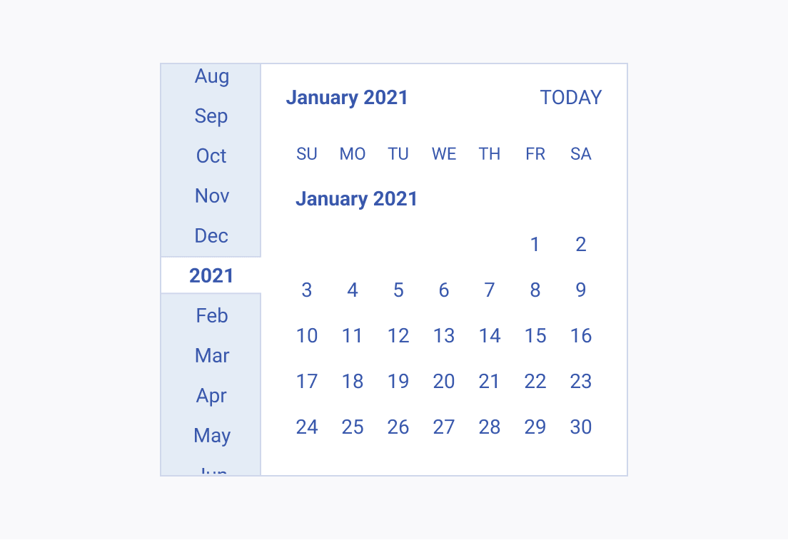
Usage Guidelines
Industry-wise, typography implementation follows some basic principles and established standards.
Styles
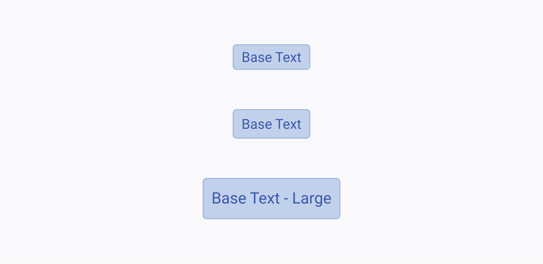
Font size is the easiest way to differentiate texts as the bigger font size implies a higher level of importance, and may mark the beginning of a new page, section, or paragraph.
Each typography style used across the Telerik and Kendo UI components has its own specific usage guidelines. Display and heading styles are set to be used for titles and subtitles in the context of the UI and are not supposed to be used inside the components.
Font Weight
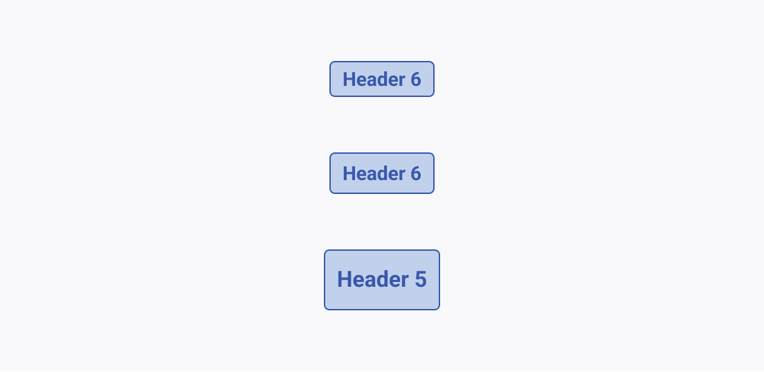
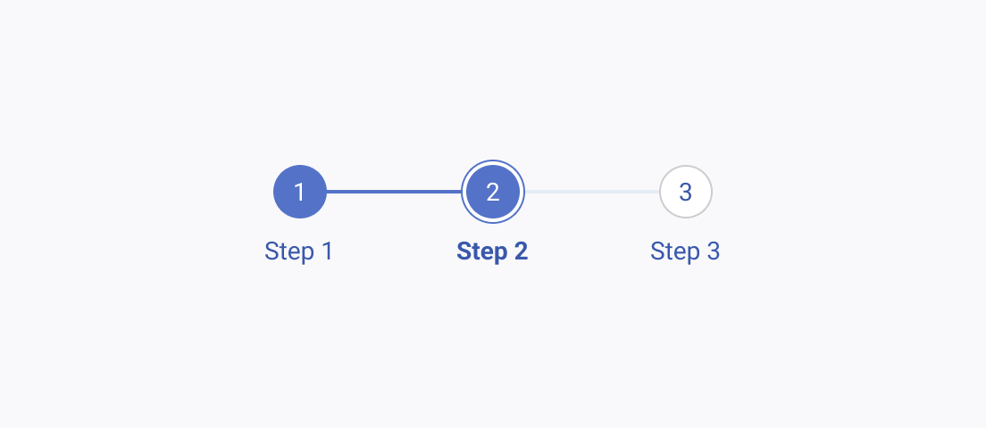
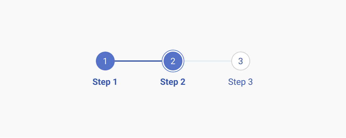
While font weight is yet another indicator of distinction between separate chunks of text, it is not as strong as the font size.
Telerik and Kendo UI components use mostly regular font weight, but some cases pose exceptions where the usage of bold font weight is either necessary or fits better in the context.
Alignment
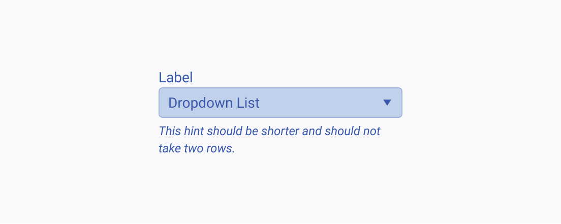
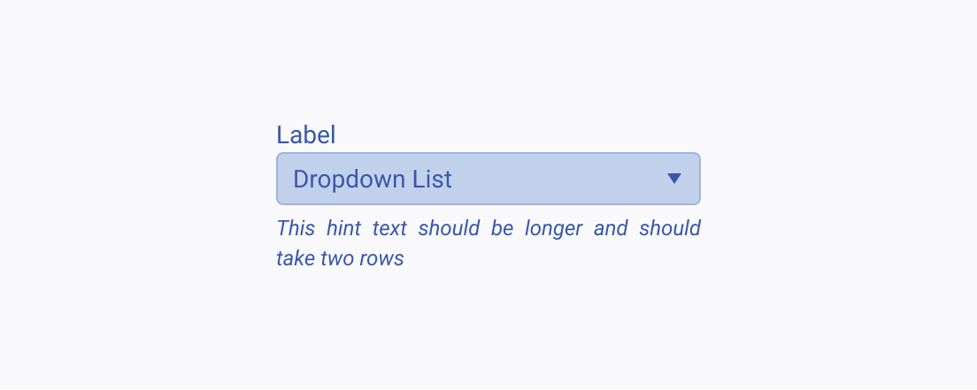
Proper alignment creates order and harmony, and also improves the reading experience.
For bigger chunks of text, Telerik and Kendo UI components use one-sided alignment based on the globalization requirements. On the other hand, components whose inherent design is to show little textual content, such as the Button, Avatar, or Badge, use center alignment.
Letter Case
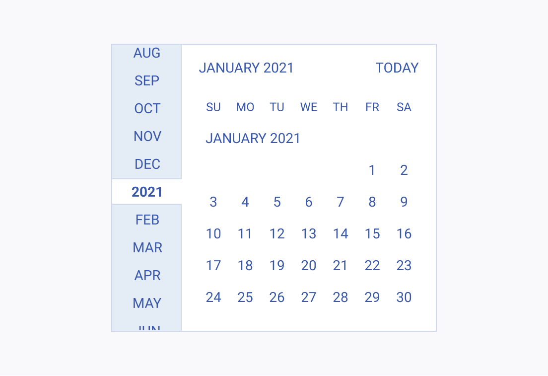
Even though letter case is not a recommended typography approach, it also creates distinction in textual content.
In the context of Telerik and Kendo UI components, letter case is used inside components where the space is limited, and the text elements must have equal font size and line height while serving different purposes.
