UI for WinForms
WinForms NavigationView
- The Telerik RadNavigationView control brings a hamburger menu experience to your application thanks to its collapsible navigation pane and multiple display modes.
- Part of the Telerik UI for WinForms library along with 160+ professionally-designed UI controls.
- Includes support, documentation, demos, virtual classrooms, Visual Studio Extensions and more!

-
Add Hamburger Menu Experience in Your WinForms Application
RadNavigationView is exposed as a stand-alone control inheriting RadPageView. It is a top-level container for your controls that offers pages, content area, display mode options, hierarchy support and more. The control has similar semantics to the RadPageView and you can create a custom view over a collection of pages or customize the control as you see fit via its intuitive API.
RadNavigationView holds the page list in a collapsible navigation pane that behaves differently depending on the selected display mode. It supports four display modes - Minimal, Compact, Expanded and Auto.
-
Header and Footer
The WinForms NavigationView control comes with header and footer areas indicated by separators. Users can easily pin items into the header or footer making them always visible even if there is a scrollbar.
See the WinForms NavigationView documentation: Header and Footer
-
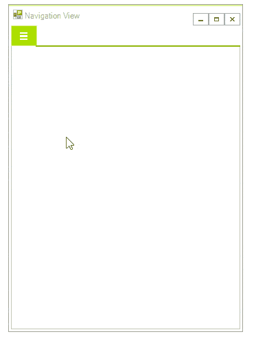
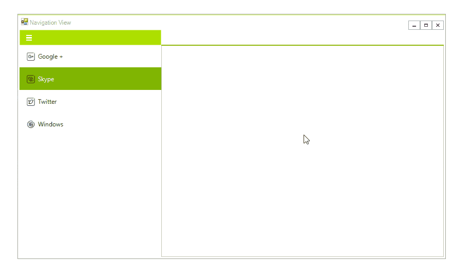
Minimal
This mode displays a header with a hamburger button. Once you click the button, you will see a popup that contains the page icons and names.
-
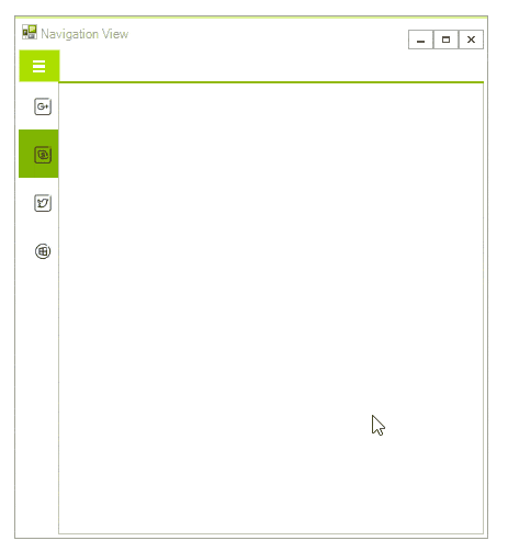
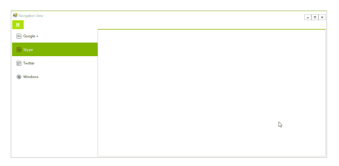
Compact
This mode displays only the icons of the page items without their texts. The icons are always visible and once you click the hamburger button it will expand the navigation pane as a popup above the content area and display the page texts as well.
-
Expanded
With this mode, both the icons and the text of the items are displayed. The pane can be collapsed by clicking the hamburger button, which will display only the icons and will free more space. When the pane is expanded or collapsed the content area changes its size.
-
Auto
This mode switches between the other three modes depending on the available free space. By default, if the width is below 641 pixels it selects the Minimal mode. When the width is between 641 and 1008 pixels it switches to the Compact mode. If there are more than 1008 pixels available it selects the Expanded mode.
-
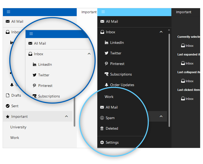
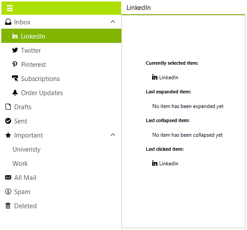
Hierarchy Support
RadNavigationView allows defining sub-items to a page in order to achieve a hierarchical menu style. You can achieve this programmatically or set up your hierarchy at Design Time. If you take the latter and faster approach, you will be able to either add new pages or drag existing pages to a different location thus building nested menus.
-
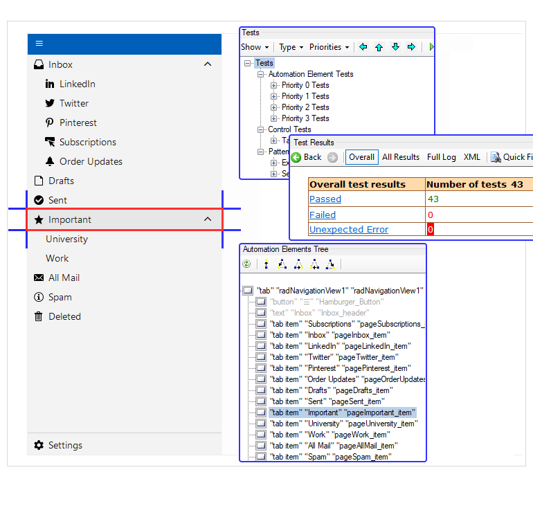
UI Automation (UI Accessibility)
To achieve compliance with accessibility standards and to provide a common practice for automated testing the Telerik UI for WinForms NavigationView supports UI automation, also referred to as UI accessibility.
See the Telerik UI for WinForms NavigationView UI automation documentation