
UI for WinForms
WinForms CheckedDropDownList
- Part of the Telerik UI for WinForms library along with 160+ professionally-designed UI controls.
- Includes support, documentation, demos, virtual classrooms, Visual Studio Extensions and more!

-
Description Items
In addition to the default items, which hold a single line of text, the control also features DescriptionTextListDataItems, which provide additional element to hold description text. -
Keyboard Support
RadCheckedDropDownList delivers convenience through integrated keyboard support. Once the control gets into focus, you can use the arrow keys to navigate through the items. In addition, the underlying list supports keyboard search functionality, which enables the user to navigate to a particular item by starting to type its text. Or, if typing a single character will navigate to the first item starting with this character, just like in Windows Explorer. -
Excellent Data Binding Performance
The CheckedDropDownList in Telerik UI for WinForms comes with a flexible data binding mechanism, including support for binding to any object that implements IList, IListSource or IBindingList. This includes generic lists, arrays and BindingSource. Using virtualization, you can bind the controls to thousands of items in milliseconds, re-enforcing our commitment to excellent performance without sacrificing features. Furthermore, the control exposes specific CheckedMember, which handles the binding of the item’s checkboxes. -
Tokens
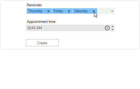
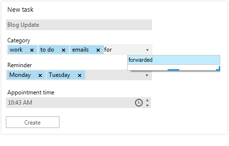
Removing a selected item is as easy as adding one. Just a click away, the tokens offer a familiar close button to remove undesired selections.
-
Faster Selection
RadCheckedDropDownList allows your end-users to choose from a predefined list of values by selecting them from a drop-down checkbox list or by typing and selecting them using auto-complete.
-
Check All Functionality
The control exposes a special “check all” item, which is not part of the item’s collection but enables checking/unchecking all items in the control.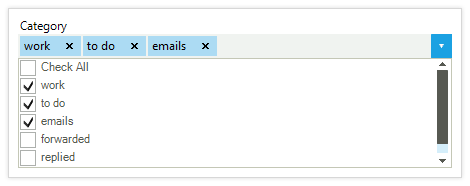
-
Filtering
CheckedDropDownList enables you to filter data by applying a pre-defined filter pattern. The user can filter the combobox items to easily find what he or she is searching for. You can configure the control to filter the items that start with the specified text, or the items that contain the specified text. -
Sorted Lists
CheckedDropDownList supports automatic sorting, based on the Sorted property of the control; simply set it to Ascending or Descending to sort in the respective order, or deactivate it to restore the initial ordering of the ItemCollection. Sorting may be case-sensitive or case-insensitive. Capital letters are displayed first in the former case.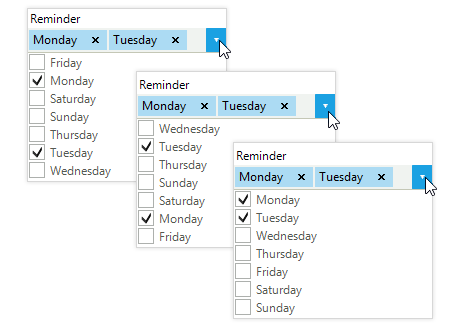
-
Item Size and Customization
An item’s height can be automatically calculated by the control, or predefined to a certain value. You can also fully customize an item’s appearance (colors, fonts, text and image relation and so on) using the
formatting events, or replace the visual items with ones with custom elements or functionality. The underlying ListControl has built-in alternating item color functionality to improve the user experience.
-
Extensive VS.NET Design-Time Support
CheckedDropDownList provides rich design-time support, making customizations and configurations very easy. Some key capabilities include:
- Adding and removing items from the control using only the Visual Studio designer
- The ability to populate new items or modify existing ones using the control Smart Tag to expose the link to open the items collection
- Applying themes in design time and easily switching between them; the ThemeName property in the Smart tag automatically detects the present themes
- Visual Style Builder, Element Hierarchy Editor and Shape Editor productivity tools for full control over the UI
- Options to search the forums or open online documentation in the Smart Tag
-
RTL Language and Localization Support
Business globalization requires multi-lingual applications. CheckedDropDownList supports all Right-to-Left layout, as well as full localization of its strings. See Localization and Right-to-Left Support for the full list of Telerik UI WinForms controls supporting RTL and localization. -
Appearance
The controls ship with a rich set of pixel-perfect themes that enable you to easily build slick interfaces with the look and feel of Windows 8, Office 2010, Office 2013, Metro and so on. Themes can be switched easily, using a single property. You can tweak existing themes or build a new theme from scratch to fit your exact visual demands, using the Visual Style Builder productivity tool. A light element tree enables easy and intuitive styling.
The control is also capable of displaying images, text, multiline text and rich text using standard HTML tags, such as <i>, <b> and <u>.
CheckedDropDownList supports a variety of expand animation styles for a great user experience. You can select among predefined drop-down animations and further customize them to fit your scenario.
