UI for WinForms
WinForms Callout control
- Part of the Telerik UI for WinForms library along with 160+ professionally-designed UI controls.
- Includes support, documentation, demos, virtual classrooms, Visual Studio Extensions and more!
-
Rich WinForms Callout for Professional Applications
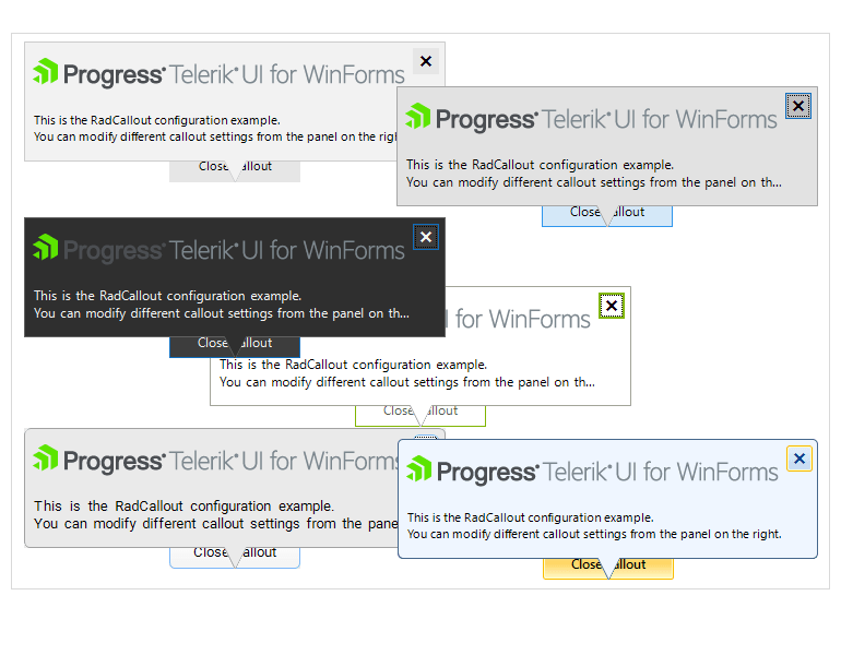
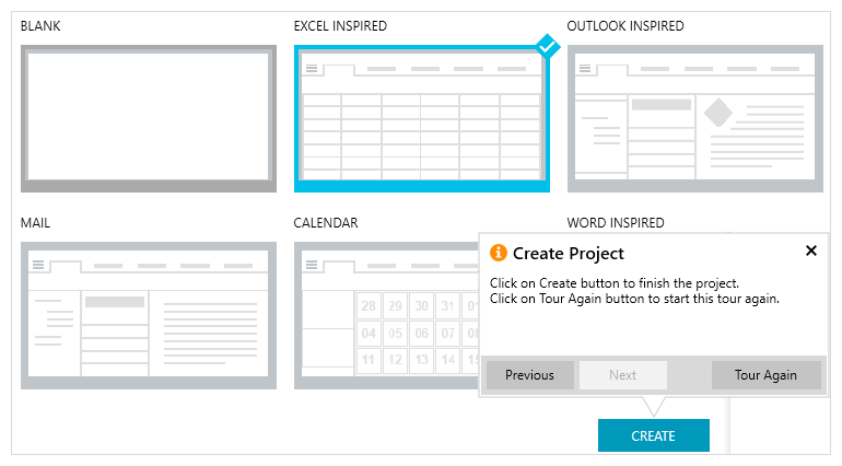
The Callout control for WinForms is a tooltip-like control that can be used in scenarios where additional information, warnings, hints, or other relevant data needs to be displayed to the end user. The appearance of the control can be fully customized to satisfy the needs of your application scenario.
The control form allows users to define different shapes and can host any control, panel or UserControl allowing you to add the information to any of the Telerik UI for WinForms controls as well as incorporate interactivity such as buttons, check boxes, etc.
Documentation on Getting Started with Telerik UI for WinForms Callout Control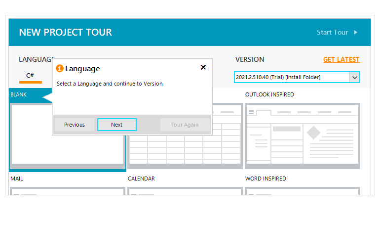
-
Position Adjustment
When the Callout control is shown to a target control- for example the Telerik UI for WinForms Button – the target control is moved, and the Callout will adjust its position accordingly.
This behavior is controlled by a property that allows the Callout control to move with the parent form and its’ default value is set on true. However, if you don’t want the Callout control to move together with the target control of your choice, you should set the property to false. Additionally, if the target control is close to one of the monitor's edges, the arrow is stretched in such a way that the callout form remains on the same monitor as the target control. Once the target control goes to another monitor, the callout will jump with it as well.
Documentation on the Position Adjustment of the WinForms Callout Control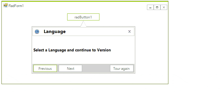
-
User Interaction
The WinForms Callout control enables end-users to easily interact with the content control via actions such as clicking, mouse hoover, navigation, etc.
-
Variety of Shapes
The various elements of the Callout control, such as its body and indicating arrow, can be visually customized with several built-in forms or alternatively, you can create your own forms by applying a custom geometry to the control.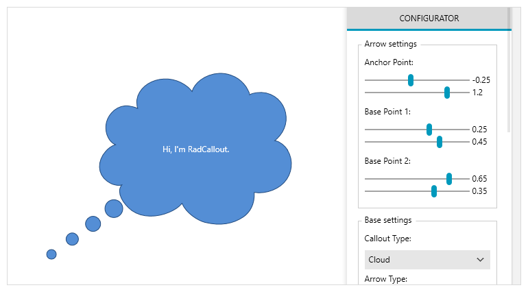
-
AutoClose Feature
The API of the Callout control enables you to define when and under what circumstances the callout will automatically close – it could be when the end user clicks outside the UI element or navigates to another application altogether.
Documentation on the AutoClose Feature of the WinForms Callout Control
-
Animations
The Telerik Callout control allows you to control the animations of the Callout control for WinForms via the CalloutAnimationManager which holds all the animation settings and it is responsible for the callout animations.
Documentation on the Animations of the Telerik Callout Control for WinForms
-
Theming Support
Just like the rest of the controls from the Telerik UI for WinForms, the Callout control comes with a set of themes you can use to create a consistent and modern look and feel of your application and delight your end-users.