UI for WinForms
WinForms BreadCrumb
- Part of the Telerik UI for WinForms library along with 160+ professionally-designed UI controls.
- Includes support, documentation, demos, virtual classrooms, Visual Studio Extensions and more!

-
Build Complicated Navigation System With Ease
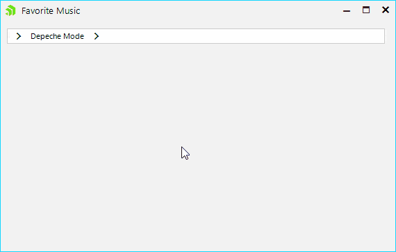
The WinForms Breadcrumb makes hierarchical navigation easy! It can be used to define the application navigation, or to display more complex hierarchical data. There is also built-in support with the Telerik TreeView control, where the breadcrumb will display the currently selected note in the tree and will list all notes up to the root one.
-
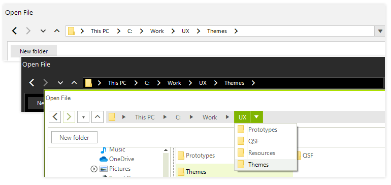
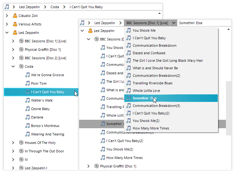
TreeView Integration
RadBreadCrumb provides an easy way to connect it to a RadTreeView control instance and it will show the path to the currently selected node as a sequence of drop-down buttons. Each button can be used to navigate to a specific node in the tree. Breadcrumbs are most appropriate when your data has a deep hierarchical structure with many levels.
-
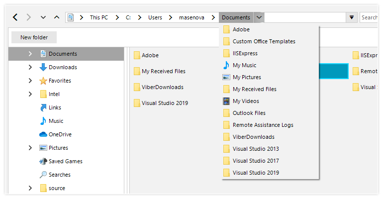
Data Binding
Bind to any IList or IBindingList data source and it will display the data source hierarchical structure, where the user can navigate it. In addition, unbound mode is also supported if you need to populate the items manually.
-
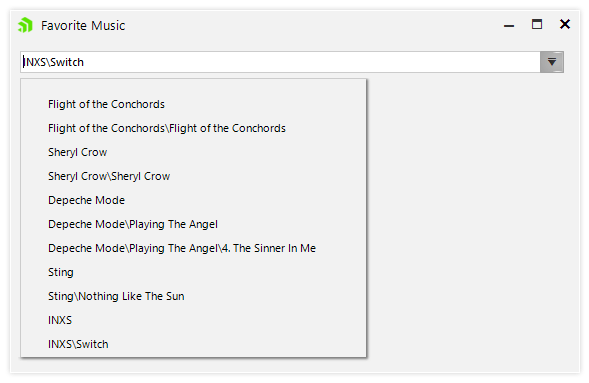
Editing and Auto Complete
Text editing is very useful when the user needs to enter the desired location manually instead of selecting it with the mouse. Complimented by the powerful auto complete mechanism, it makes this task flawless.
-
History
Recently visited places are displayed in a convenient drop down so the user can navigate between them easily.
-
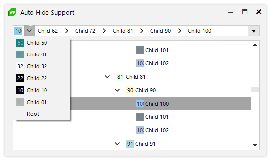
AutoHide Support
Auto Hide comes handy when the hierarchical path is longer than the control length, in which case the WinForms Breadcrumb control will conveniently display the latter part of the hierarchy, so the user is aware of his selection. All the hidden items will be available in the header button.
-
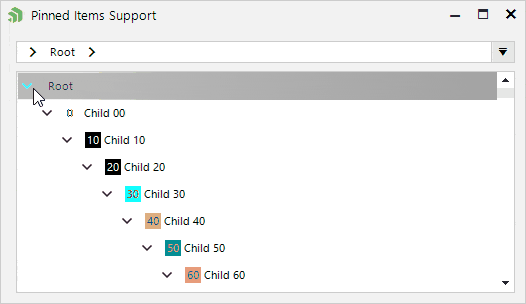
Pinned Items
The header button supports pinning certain items to the top or the button area in cases where frequently used places need to be displayed.
-
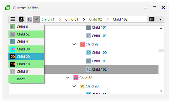
Appearance and Customization
Thanks to the flexibility that the Telerik Presentation Framework provides, any element of the control can be easily customized. In addition, the top left and right area of the control allows adding additional elements such as buttons.
-
Themes
The control is shipped with a rich set of themes that allow you to easily build slick interfaces with the look and feel of some of the latest Windows and Office versions. The themes can be easily switched using a single property.
The Telerik Presentation Framework also features support for custom themes, which can be built from scratch to fit your exact visual demands by using the Visual Style Builder productivity tool.