UI for .NET MAUI
.NET MAUI DropDownButton
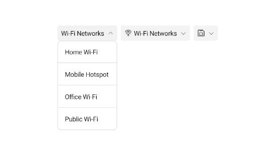
- The .NET MAUI DropDownButton pairs a button surface with a fully configurable drop-down for menus, pickers, and contextual actions — no navigation required.
- Part of the Telerik UI for .NET MAUI library along with 70+ professionally-designed UI controls.
- Includes support, documentation, demos, learning resources and more!
-
DropDownButton — Contextual Actions, Zero Navigation
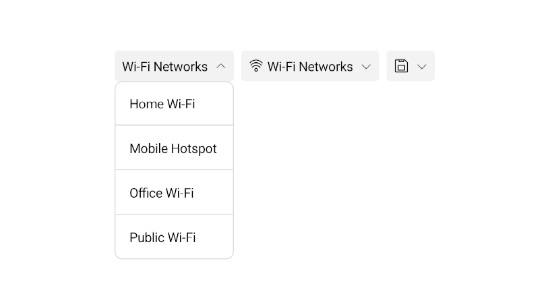
The .NET MAUI DropDownButton combines a button surface with a fully configurable drop-down area that can host any custom content — commands, options, pickers, or contextual UI — keeping users in context without navigating away from the current view. It ships with built-in support for custom content templates, drop-down indicator positioning, open/close animations, visual states, command binding, and a rich events model, all configurable in XAML. The result — developers get a production-ready, fully themeable drop-down trigger out of the box, covering the full range of scenarios from simple action menus to complex data-driven panels.
-
Button Configuration
The .NET MAUI DropDownButton's trigger surface is fully configurable: `Content` and `ContentTemplate` accept strings, views, or data-bound objects; the built-in drop-down indicator can be positioned Left, Right, Top, or Bottom, or hidden entirely via `IsDropDownIndicatorVisible`; and text alignment and decoration properties control label presentation when content is a string. The result — developers can tailor the button's appearance and layout to any design requirement in pure XAML, without subclassing or custom control templates.
See the .NET MAUI DropDownButton Configuration Documentation
-
Drop-Down Configuration
The .NET MAUI DropDownButton gives full control over the drop-down container through `DropDownContent` and `DropDownContentTemplate` for any custom view or data-bound template, explicit size constraints (`DropDownWidth`, `DropDownHeight`, min/max variants), `DropDownContentPadding`, and horizontal/vertical offset properties for precise placement relative to the button. The result — developers can build arbitrarily rich drop-down panels — menus, pickers, color selectors — with exact layout control and no custom popup infrastructure.
See the .NET MAUI DropDownButton Drop-Down Configuration Documentation
-
Animation
The .NET MAUI DropDownButton animates the drop-down on open and close with a configurable `DropDownAnimation` type — Slide (default), Fade, Zoom, or None — alongside `DropDownAnimationDuration` and `DropDownAnimationEasing` properties. The result — developers can tailor the transition feel to match their app's motion design with a few XAML properties, or disable animation entirely for performance-sensitive scenarios.
-
Events
The .NET MAUI DropDownButton exposes `Opening` (cancellable via `CancelEventArgs`), `Opened`, and `Closed` events that fire at each stage of the drop-down lifecycle, complemented by the inherited `Clicked`, `Pressed`, and `Released` events from `RadTemplatedButton`. The result — developers have precise hooks to respond to or intercept any drop-down interaction, including the ability to programmatically prevent the drop-down from opening. -
Command
The .NET MAUI DropDownButton supports MVVM-friendly command binding through `Command` (`ICommand`) and `CommandParameter` properties, executing the bound command when the button is clicked. The result — developers can wire business logic to button interactions without code-behind, keeping view and view model cleanly separated.
-
Visual States
The .NET MAUI DropDownButton integrates with the .NET MAUI Visual State Manager through a `CommonStates` group covering Normal, Opened, Pressed, FocusedPressed, MouseOver, FocusedMouseOver, and Disabled states. The result — developers can define state-specific visual responses in pure XAML, delivering precise interaction feedback across both touch and desktop input models.
See the .NET MAUI DropDownButton Visual States Documentation
-
Styling
The .NET MAUI DropDownButton exposes dedicated styling properties for every visual zone — button surface, drop-down container, and indicator — all integrated with the .NET MAUI Visual State Manager for state-aware appearance across Normal, Pressed, Opened, MouseOver, and Disabled states. The result — developers can fully match the .NET MAUI DropDownButton to their app's design language in pure XAML, with no custom renderers required.