
UI for .NET MAUI
.NET MAUI Gauge
- The .NET MAUI Gauge component offers stunning data visualizations, animations, interactivity and customizations.
- Part of the Telerik UI for .NET MAUI library along with 70+ professionally-designed UI controls.
- Includes support, documentation, demos, learning resources and more!
-
Display and Customize Data with .NET MAUI Gauge
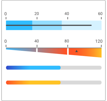
The Telerik UI for .NET MAUI Gauges widget is one of the main .NET MAUI controls for data visualization. In it, you will find highly customizable, animated and user-friendly linear and radial gauges. All configurable to display your data in the exact required layout. The Gauges are a great way to illustrate the magnitude of a value in a given range of upper and lower bounds. This could be speed, distance, temperature or progress of a process.
-
Radial Gauges
The Telerik UI for .NET MAUI Radial gauge (also known as Circular) is designed to visualize the data scale ina circular way. The wide set of features as Labels, Ticks, Indicators, Ranges and Styling API allows you to configure the gauge according to your .NET MAUI application needs.
-
Linear Gauges
Telerik UI for .NET MAUI offers horizontal and vertical linear gauges that display the data on a linear scale. The same as the .NET MAUI Radial gauge control, you can choose from various customization features and options in order to achieve the best look and feel for your users.
See the .NET MAUI Gauge documentation: Vertical type
See the .NET MAUI Gauge documentation: Horizontal type -
Fine-Grained Customizations
Thanks to the flexible API of the .NET MAUI Gauge control you have the freedom to customize it to your design requirements. You can directly configure how various elements of the Telerik UI for .NET MAUI Gauge are displayed in your application, like the shape and color of the needle and bar indicators.
See the .NET MAUI Gauge documentation: Indicators -
Animations
The Telerik UI for .NET MAUI Gauges provide ready-to-use animations allowing you to easily achieve smooth transition effects that will feel native on each platform. One of those are the Bounce, Cubic and Spring presets and the best part is that you can use them directly, by setting a property in the XAML.
