UI for .NET MAUI
.NET MAUI BadgeView
- The .NET MAUI BadgeView is a highly customizable UI control that lets you display badges in your application.
- Part of the Telerik UI for .NET MAUI library along with 70+ professionally-designed UI controls.
- Includes support, documentation, demos, learning resources and more!
-
Display Badges Seamlessly with .NET MAUI BadgeView
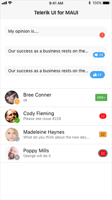
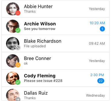
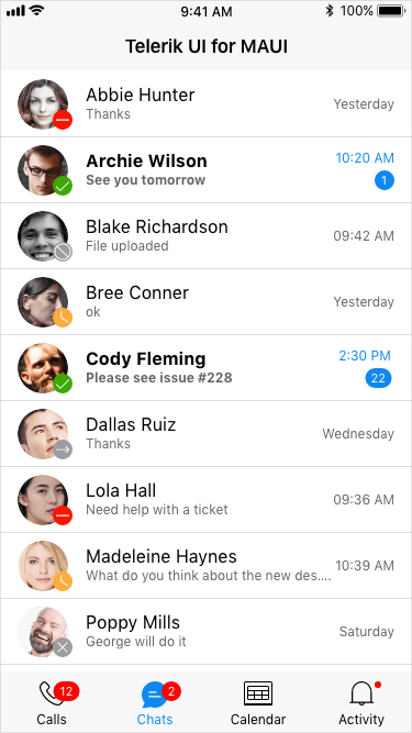
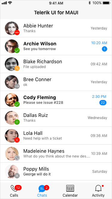
The Telerik UI for .NET MAUI BadgeView is a highly customizable UI control that lets you display badges in an application scenario where notification or update needs to be visualized. Badges are highly effective UX elements that apply to numerous application scenarios – from a badge that visualizes the number of unread emails on your email application to online/offline/away status indicators for a messaging app, and many more. Regardless of the use case you are trying to implement, the .NET MAUI BadgeView control is packed with all the features you need to achieve the desired result!
-
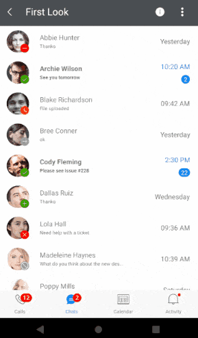
Badge Position and Alignment
The .NET MAUI BadgeView enables you to define the position and alignment of your badge. The control supports multiple options, enabling ultimate flexibility. You can vertically align the badge and position it at the start, center, or end.
See the .NET MAUI BadgeView documentation: Position and alignment
-
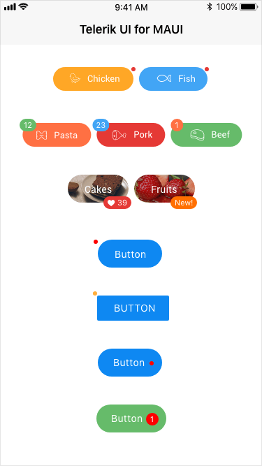
Predefined Badge Types
The .NET MAUI BadgeView control offers a wide range of predefined badge indicator types used in the most common application scenarios. Here are the supported types you can use in your .NET MAUI application:
- Default
- Available
- Away
- DoNotDisturb
- Offline
- OutOfOffice
- Dot
- Add
- Remove
- Rejected
-
Animation Support
The .NET MAUI BadgeView allows you to display the badge indicator using an animation. You can specify the type of animation, its’ duration and easing.
-
Flexible Styling and Customization
The .NET MAUI BadgeView control is highly customizable and offers a wide range of styling capabilities. In terms of styling, you can define any style element from the badge text, its color, margin, font size to background color, corner radius, width, and height. The BadgeView comes with a default and custom template that you can define and customize to your liking.
See the .NET MAUI BadgeView documentation: Styling and Customization