
UI for .NET MAUI
.NET MAUI DatePicker
- Telerik UI for .NET MAUI DatePicker is a feature-rich control that gets a date input from the user.
- Part of the Telerik UI for .NET MAUI library along with 70+ professionally-designed UI controls.
- Includes support, documentation, demos, learning resources and more!
-
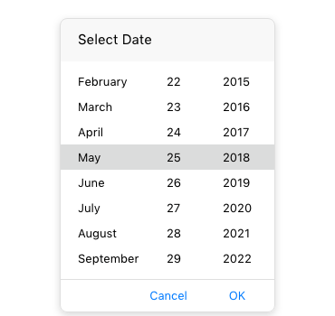
Display a Popup Calendar for Date Selection in Your .NET MAUI App
The Telerik DatePicker control for .NET MAUI provides the end users of your .NET MAUI application with the ability to easily and intuitively select a date via a customizable spinner dialog that lets them pick the month, day and year of the desired date. The component is equipped with powerful features which allow you to do everything from setting a date range to customizing the appearance of the dialog.
See the .NET MAUI DatePicker documentation.png?sfvrsn=ba6d8424_1)
-
Multiple Spinner Options
The .NET MAUI DatePicker is equipped with a string format feature that allows you to set a standard or custom date format string for the spinners. Depending on the format defined, the DatePicker prepopulates the needed spinners in the control.
See the .NET MAUI DateTimePicker documentation: Spinner format -
Templates
If the default templates of the Telerik DatePicker for .NET MAUI don’t fit the needs of your .NET MAUI application, you can easily define custom ones. The DatePicker control provides custom templates for the header, footer, placeholder and more.
See the .NET MAUI DateTimePicker documentation: Templates -
DisplayString format
The display text formatting property of the DatePicker allows you to choose in what format the date will be displayed when a date has been picked.
See the .NET MAUI DateTimePicker documentation: Formatting -
Date range
The Telerik DatePicker control for .NET MAUI gives you the ability to define a date range that the user can select values from.
See the .NET MAUI DateTimePicker documentation: Date ranges -
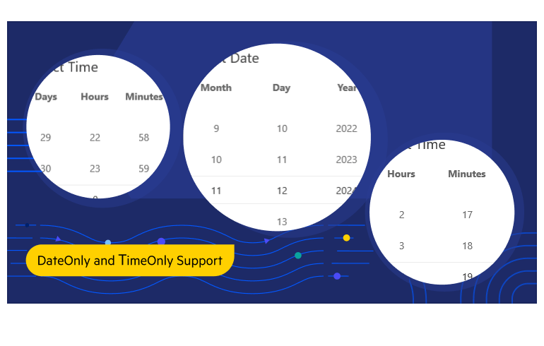
DateOnly Option
If your application needs to store or manipulate only the dates without the times, you can take advantage of the DateOnly struct when working with the DatePicker control and allow more flexibility for users.
-
Flexible Styling API
Looking to style your DatePicker to ensure design consistency across your application? .NET MAUI’s DatePicker offers a range of styling capabilities for spinners, pop-ups, headers, footers, the text displayed when a date/time is picked and many more.
See the .NET MAUI DateTimePicker documentation: Styling -
Commands Support
Telerik’s DatePicker for .NET MAUI provides command support for opening and closing the dialog (Toggle Command) and clearing the displayed date (Clear Command).
See the .NET MAUI DateTimePicker documentation: Commands -
Also Available...
