
UI for .NET MAUI
.NET MAUI DataGrid
- Truly native .NET MAUI DataGrid control featuring stunning performance, filtering, sorting, grouping and much more.
- Part of the Telerik UI for .NET MAUI library along with 70+ professionally-designed UI controls.
- Includes support, documentation, demos, learning resources and more!
-
Everything You Need in a .NET MAUI DataGrid
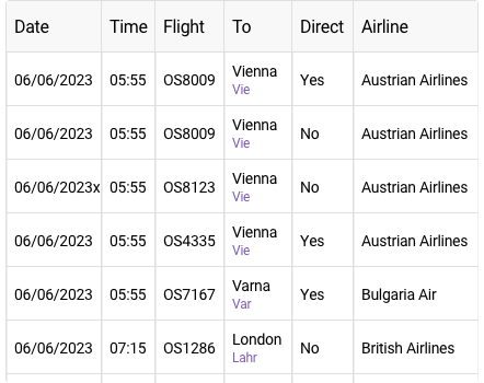
The Telerik UI for .NET MAUI DataGrid is a powerful native control that allows you to easily visualize and edit tabular represented data in your .NET MAUI applications. The control can be populated from various data sources and includes out-of-the-box support for operations like sorting, filtering and grouping and editing and more. Currently, the control is available for iOS, Android, Windows and macOS.
-
High Performance & UI Virtualization
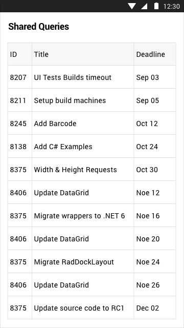
Provide your end users with flawless performance thanks to the powerful grid control data layer. The built-in UI Virtualization makes sure that cell and row elements are created only when needed and only for the currently visible cell and row elements, hence reducing memory footprint and boosting performance to new heights.
-
Search as You Type
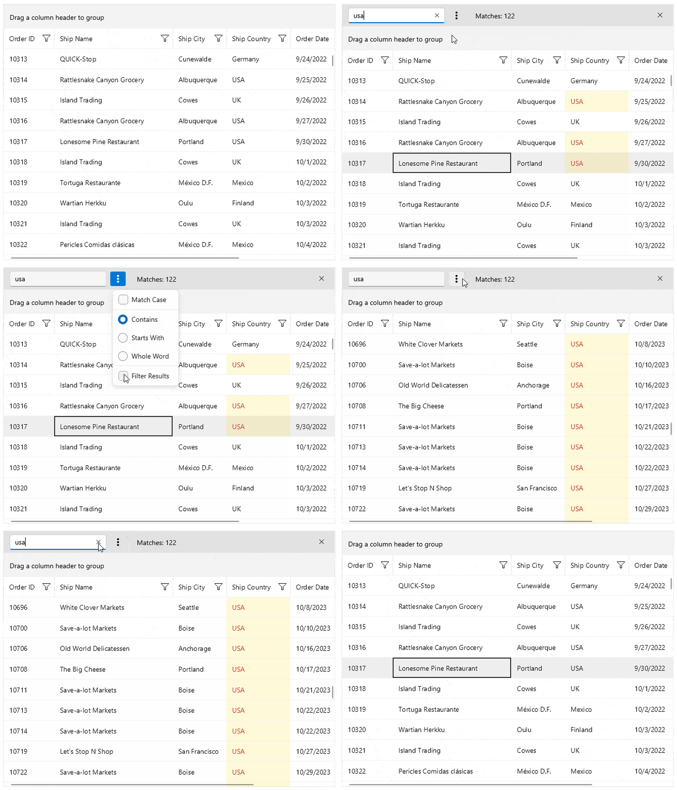
The .NET MAUI DataGrid component allows you to search for specific data by using a configurable built-in search functionality, represented by a search panel UI. The default search behavior is to search as you type.
The DataGrid component provides customizable highlighting of the search results. Additionally, the matched chunks of text are also highlighted to make them easily noticeable.
See the .NET MAUI DataGrid documentation: Search as you type
-
Column and Group Footers
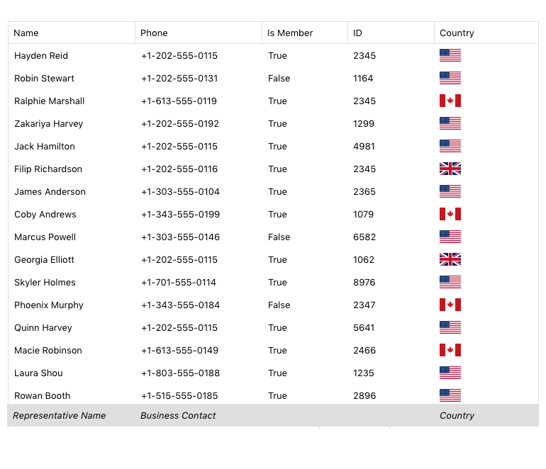
Telerik UI for .NET MAUI DataGrid allows displaying individual footer cells for each column, containing additional information about the column. The component also allows rendering a footer under each group when grouping is used. Similarly, group footers display group summaries.
-
Row Details
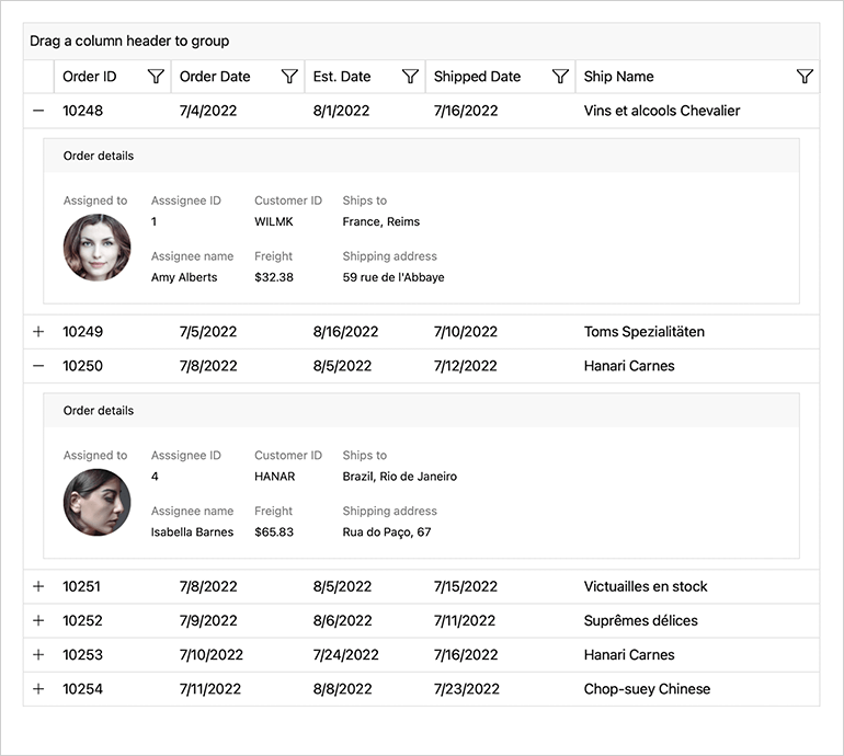
Data grids that display large numbers of columns can be hard to read, especially when observed on mobile devices. That is why we added the Row Details functionality to the .NET MAUI DataGrid. It allows you to display a smaller number of columns on the screen and have the option to expand each row and see additional information. By modifying the row details data template, you decide what data to display and how to visualize it.
-
Rows Alternation
The DataGrid control for .NET MAUI supports alternating row colors so your app users can easily distinguish one row from another.
-
Single and Multiple Selection
DataGrid features single or multiple item selection, as well as controlling the selection—Unit – Cell or Row—thus enabling any selection scenario you want your .NET MAUI app users to have.
-
Load on Demand
Loading a large data set has its challenges. One of the most popular approaches is using incremental data loading as additional items need to be visualized, on demand by the user. Telerik UI for .NET MAUI DataGrid offers automatic data loading once you’ve scrolled to the last available record, or by displaying a customizable button that will initiate loading more data items.
-
DataTable Support
You can bind your .NET MAUI DataGrid to a DataTable and have access to all the cool features. You can add, remove, select, edit item(s) and update DataGrid's ItemsSource. You can also perform commands and operations like filtering, sorting, grouping and selection.
-
Keyboard Navigation Support
The Telerik UI for .NET MAUI DataGrid provides keyboard navigation support for Windows and MacOS, making the navigation experience even smoother. While applying part of the keyboard keys, you can also change the current cell behavior of the DataGrid component.
See the .NET MAUI DataGrid documentation: Keyboard Navigation
-
Empty Template
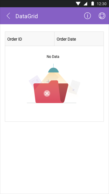
The Telerik UI for .NET MAUI DataGrid control now provides an Empty Template. This feature enables you to inform end-users when the control has no data to display.
-
Column Resizing
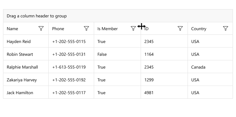
.NET MAUI DataGrid users can easily change a column's width by positioning their finger or the mouse over the column's vertical grid line and dragging it until they achieve the desired column size.
In addition, the DataGrid control exposes an event that is invoked when the user resizes the column. The event gives you information for the resized column and the width the column was resized to.
See the .NET MAUI CollectionView documentation: Column Resizing Events
-
Column Reordering
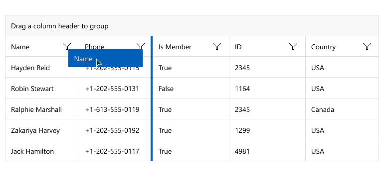
If end users want to switch column positions in a DataGrid, they will be pleased with the column reordering functionality. Users can just drag a column's header to the desired position among the other headers and drop it there, thus changing the columns order.
The .NET MAUI DataGrid exposes a set of events related to the reordering feature. During the event's invocation, you can use the parameters of the event to add additional logic, for example, to cancel column reordering if it doesn't match a specific condition. This becomes handy in scenarios when you don't want to move a particular column to a specific location, for example.
See the .NET MAUI CollectionView documentation: Column Reordering Events
-
Frozen/Pinned Columns Support
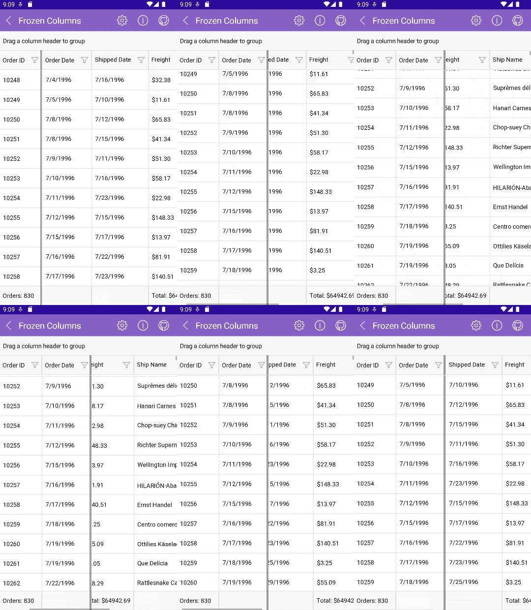
Working with data tables that have a high number of columns can be difficult. Now you can freeze/pin any .NET MAUI DataGrid column or multiple columns to the left side of the grid and have them visible no matter how far across the sheet you scroll.
-
Filtering, Grouping and Sorting
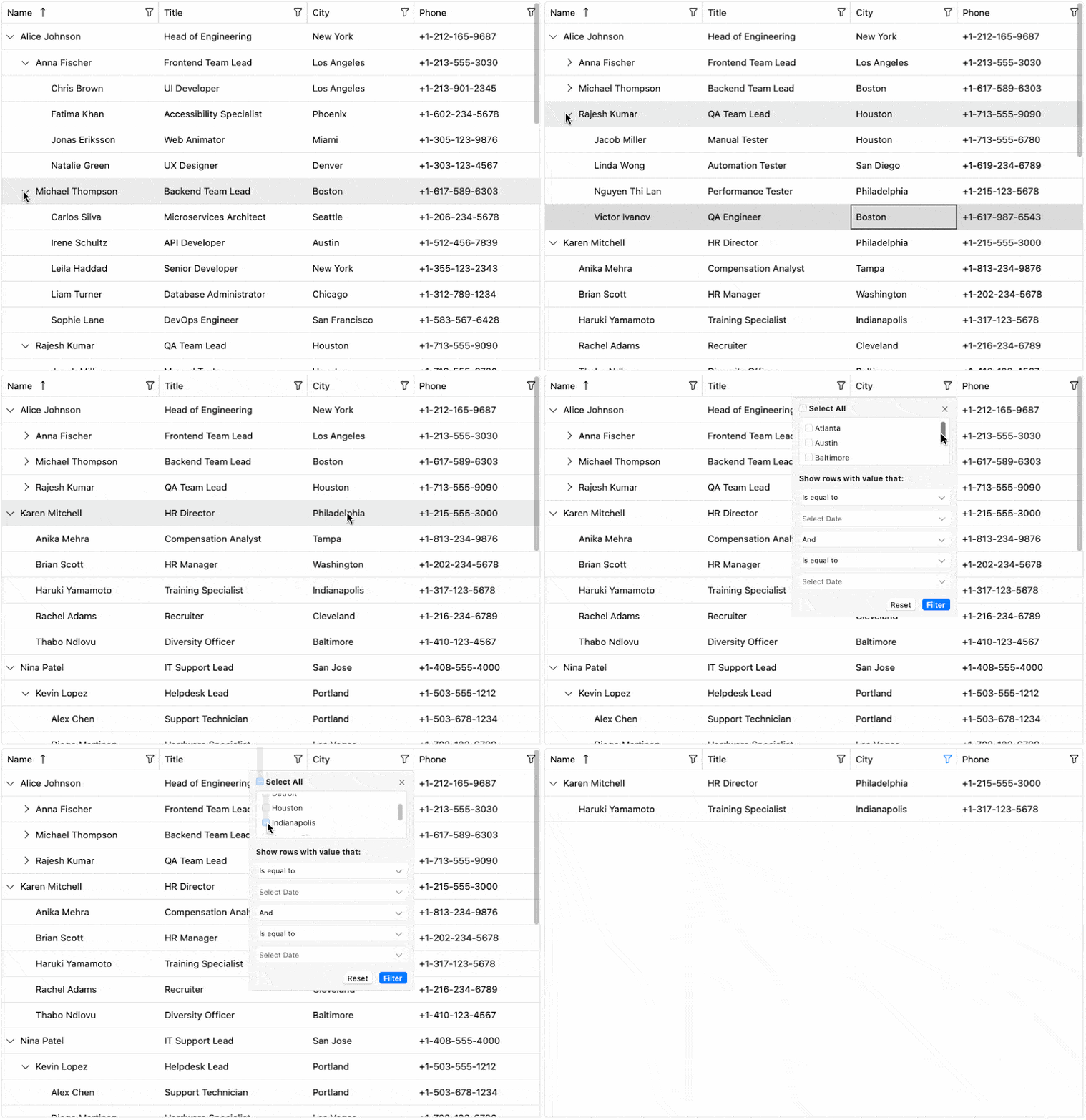
Easily perform SORT, FILTER or GROUP operations on your data via the intuitive user interface or with the convenient API of the .NET MAUI DataGrid. The highly optimized data layer of the control handles these operations instantly. No matter what your goal is for displaying the data in the grid, or the app user’s preferred data view, it can be done with the various out-of-the-box options for sorting, filtering with different types of filter descriptors, expressions and filter editors for the diverse data types, or grouping the data on single or multiple levels with hierarchical view.
See the .NET MAUI DataGrid documentation: Filtering, Grouping and Sorting
-
Grouping UI in .NET MAUI DataGrid
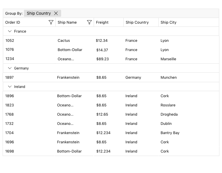
The Grouping UI functionality enables users to drag and drop column headers into the top panel to group data. With built-in Grouping UI, you give the user control over how they view the data, instead of having to hard-code specific views for them. You can enable grouping on multiple levels with hierarchy.
-
Aggregates in .NET MAUI DataGrid
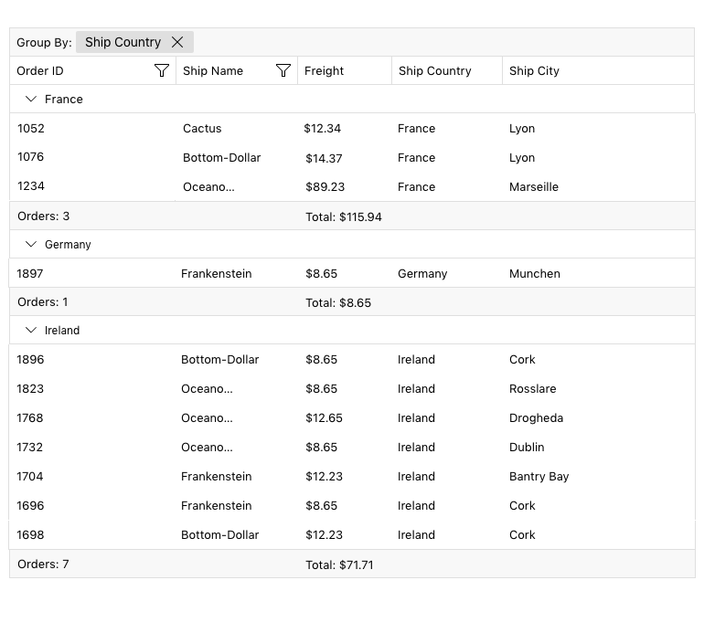
Whenever you need to add a row with totals at the bottom of the Data Grid’s groups or columns, you can use the Data Grid control’s Aggregates support. Take advantage of the built-in support for the most popular aggregate functions: Average, Count, Sum, Min, Max, Count or create a custom aggregate function.
-
Hover States for Column Header
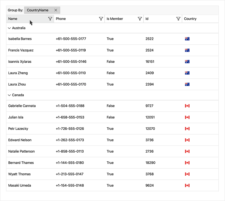
Sometimes we can lose track of the mouse cursor when hovering over big data tables. This .NET MAUI DataGrid addition gives the user a clear visual indication of whether he has hovered over a column header or not.
-
Support for Aligning the Aggregates in Group Header
Achieve polished data presentation with new alignment options for aggregate values within grouped headers. Whether you're summarizing financial totals, counting grouped records, or displaying averages, this enhancement ensures your grouped data is neatly formatted, aligned, and visually consistent for improved readability and professionalism.
See the Telerik UI for .NET MAUI Documentation: Aggregates in Group Header
-
.NET MAUI DataGrid Style and Appearance
The Telerik DataGrid control for .NET MAUI features a built-in styling mechanism for customizing the look of the control and its items.
-
New Row Background Style Selector
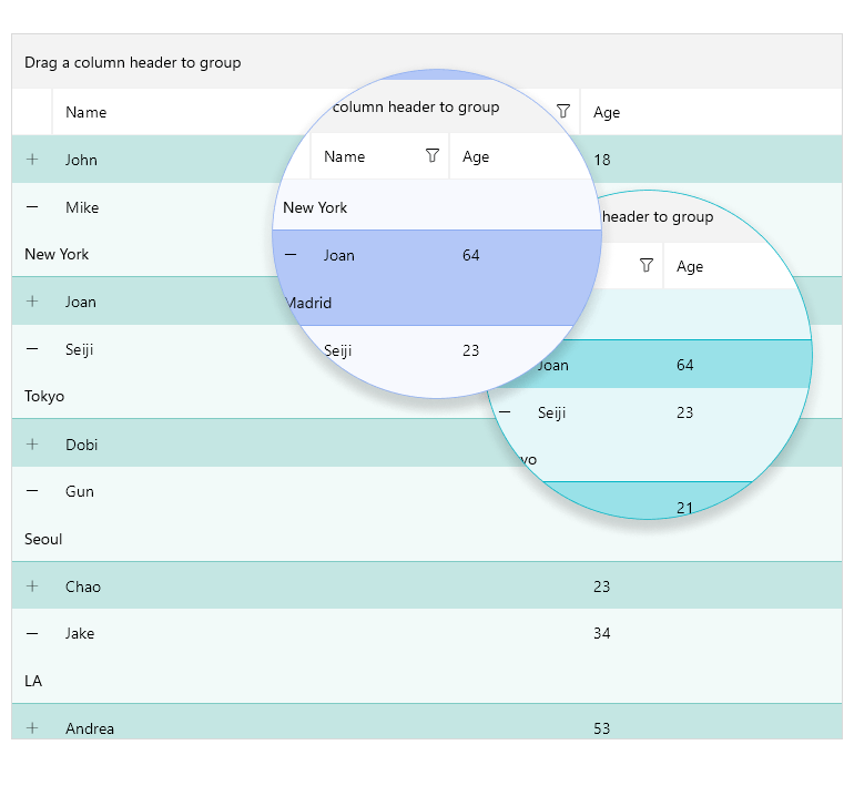
Introduce advanced row-level customization with the new Row Background Style Selector, which allows you to apply different styles dynamically based on the row’s content or state. Highlight priority rows, differentiate alternating records or signal validation issues—all while maintaining a clean and coherent look.
See the Telerik UI for .NET MAUI Documentation: Row Background Style Selector
-
New .NET MAUI DataGrid SKIAColumn
The New DataGrid SKIAColumn in .NET MAUI enhances rendering capabilities, providing smoother and more efficient data presentation. See more info here.
-
Also Available...
The DataGrid component is also available for these popular frameworks:
-
Editing
Telerik UI for .NET MAUI Grid read/write capability allows developers to quickly enable app users to edit data presented in the grid. Depending on the column data type, a relevant editor allows end users to edit content with the appropriate editor type. For instance, if one of the columns is a date, a date-picker will be used to offer the user a change in date field.
-
Prompt-Controlled DataGrid
Interact with Data Using Natural Language Commands
The Prompt-Controlled DataGrid brings AI-driven interaction directly into the DataGrid component, enabling users to work with data using natural language prompts rather than relying solely on clicks, menus or toolbar actions. With prompt-controlled input, users can express intent conversationally to explore, manipulate and understand datasets more easily.
This helps users work faster and more intuitively with data, while allowing developers to introduce AI-assisted experiences seamlessly into their .NET MAUI applications.
See the .NET MAUI DataGrid Documentation: AI Smart Assistant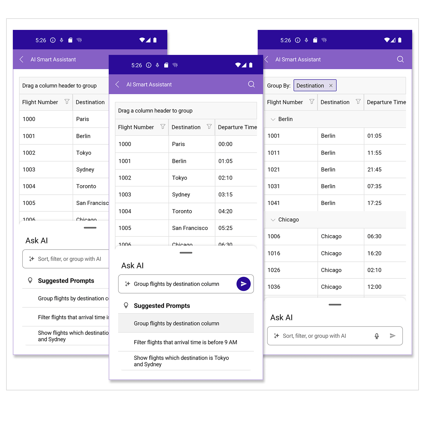
Frequently Asked Questions
-
What is .NET MAUI DataGrid?
The Telerik UI for .NET MAUI DataGrid control allows you to easily visualize and edit tabular represented data in your .NET MAUI applications. Most of the data on the Internet is stored in tables within a database. The DataGrid provides the same abstraction over the data — it has columns and rows, and the intersection of a row and a column is called a cell.
The DataGrid is a part of Telerik UI for .NET MAUI, the most comprehensive UI suite for .NET MAUI! To try it out, sign up for a free 30-day trial and kickstart your cross-platform app development today.
-
How can I try Telerik for .NET MAUI DataGrid?
You can try all Telerik UI for .NET MAUI components by signing up for a 30-day FREE trial. During your evaluation, you will have access to all the components, technical support, documentation and getting-started resources.
See the .NET MAUI DataGrid Getting Started article for a quick tutorial and don’t forget to sign up for a trial to get free support.
-
How many components are included in the Telerik UI for .NET MAUI suite?
Telerik UI for .NET MAUI offers a wide range of 70+ controls to enable your cross-platform development of native Windows, macOS, Android and iOS applications. The .NET MAUI UI library is constantly growing. For upcoming releases information, visit our Roadmap.
-
Does .NET MAUI DataGrid support load on demand?
Loading a large data set on a mobile device has its challenges. One of the most popular approaches is using incremental data loading the moment the items need to be visualized.
The DataGrid supports three different options for using its load-on-demand feature. You can choose the most convenient for you based on your application requirement.
-
Where can I buy the Telerik UI for .NET MAUI DataGrid control?
The DataGrid component is one of over 55 in the Telerik UI for .NET MAUI components library which is also a part of the Telerik DevCraft bundle.
The Telerik UI for .NET MAUI library comes with several purchase options, giving you flexibility based on the needs of your project. The license is perpetual, with subscription options for support and new updates. Please refer to the Telerik UI for .NET MAUI pricing page for more information.
-
What support options does Telerik UI for .NET MAUI offers?
Depending on your needs, Telerik UI for .NET MAUI offers the following flexible support options:
- Lite support: 72-hour response time, 10 support incidents
- Priority support: 24-hour response time, unlimited support incidents
- Ultimate support: everything in Priority support, plus 4-hour ticket pre-screening and phone assistance
Learn more about flexible support and pricing options.
All UI for .NET MAUI Components
Data Controls
Data Visualization
Navigation & Layout
Charts
Editors
- TimeSpanPicker
- TimePicker
- TemplatedPicker
- Slider
- RichTextEditor
- RangeSlider
- NumericInput
- MaskedEntry
- ListPicker
- ImageEditor
- Entry
- Editor New
- DateTimePicker
- DatePicker
- ComboBox
- AutoComplete Updated
Calendar and Scheduling
Buttons
Interactivity & UX
Pdf Viewer
Document Processing
