
UI for .NET MAUI
.NET MAUI ComboBox
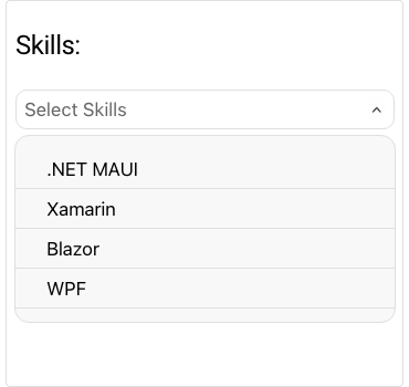
- The .NET MAUI ComboBox control offers an intuitive interface for users to select items from a dropdown list.
- Part of the Telerik UI for .NET MAUI library along with 70+ professionally-designed UI controls.
- Includes support, documentation, demos, learning resources and more!
-
Intuitive Interface for Easy Items Selection with .NET MAUI ComboBox
Telerik UI for .NET MAUI ComboBox offers an intuitive interface for users to select one or more items from a dropdown list. The control comes with a rich feature set, including filtering (search), single and multiple selection, a flexible styling API, dropdown customizations and more.
-
Configuration
Most aspects of this .NET MAUI ComboBox control are easily configurable via exposed properties. You can set placeholder text to guide users what kind of input is expected, and change its color. You can also modify the component’s behavior, for example, whether it should collapse upon item selection/deselection.
-
Data Binding
You can bind your ComboBox to any data source. The control provides you a way to specify which property of your complex business object to be displayed.
-
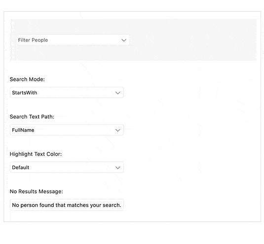
Edit Mode and Search
This control supports editable and noneditable state, and when it’s in editable mode, you can enable the search functionality. The Telerik UI for .NET MAUI ComboBox provides options for both case-sensitive and case-insensitive searching modes. The available search options filters are: Contains, StartsWith, ContainsCaseSensitive an StartsWithCaseSensitive. Following UX best practices, the control highlights the matching text inside the dropdown based on the user’s input after searching is performed.
See the .NET MAUI ComboBox documentation: Edit mode and search
-
Filtering
Use the .NET MAUI ComboBox Filtering feature to enable a fast and intuitive search and selection of options from a large set of data. You can toggle matching options highlighting on and off and take advantage of enhanced styling and customization options for the filtered results.
-
Selection
Single and multiple selection support enables you to easily specify the required selection mode. Multiple selected items are visualized inside tokens.
-
Header and Footer
You can easily add Header and Footer to the dropdown list of the ComboBox control with a single property and define different templates for them.
-
Templates
You can easily change the default templates that come with this control to modify how items are displayed in the dropdown list. What’s more, if the ComboBox is in multiple selection mode, the selected item is displayed inside a customizable token. You can customize the token using the TokenTemplate property.
-
Flexible Styling API
You can modify your .NET MAUI ComoboBox control to match your app’s design by changing any element: the background color, the style of the dropdown box and of the “Clear” and dropdown buttons, the Placeholder text color and the Highlighted text color.
-
UI Virtualization Support
One of the defining features of all Telerik controls is the advanced, built-in UI virtualization that ensures a reduced memory footprint of your application and boosts its performance. With UI virtualization enabled, you can display a large list of items in your .NET MAUI ComboBox without any performance trade-off. When the list (positioned inside the dropdown part) is scrolled, the ComboBox reuses the existing items to display the relevant data instead of creating new ones. -
Also Available...
The ComboBox component is also available for these popular frameworks:
