UI for .NET MAUI
.NET MAUI Slider
- Set value in a predefined min-max range by simply dragging a thumb within the .NET MAUI Slider.
- Part of the Telerik UI for .NET MAUI library along with 70+ professionally-designed UI controls.
- Includes support, documentation, demos, learning resources and more!

-
Overview
The Telerik UI for .NET MAUI Slider component displays a value in a predefined min-max range allowing end users to change it by dragging a thumb along a range track.
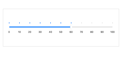
The Slider brings an engaging and interactive navigation experience into your .NET MAUI application thanks to a set of built-in features such as value thumb, range track, backtrack, ticks, labels, tooltip, templates and flexible styling API.

-
Value Thumb
You can change the selected value by dragging the value thumb along the backtrack or touching anywhere on the slider (the thumb, the range track, or the backtrack) depending on the drag mode.

-
Ticks and Labels

-
Tooltips
The .NET MAUI Slider component can display a tooltip to indicate the currently selected value. The tooltip is displayed as soon as the user starts dragging the thumb.

-
Styling
You can customize the look of the .NET MAUI Slider component in a variety of ways. All of the following control elements are customizable: thumb, track, ticks and labels.

All UI for .NET MAUI Components
Data Controls
Data Visualization
Navigation & Layout
Charts
Editors
- TimeSpanPicker
- TimePicker
- TemplatedPicker
- Slider
- RichTextEditor
- RangeSlider
- NumericInput
- MaskedEntry
- ListPicker
- ImageEditor
- Entry
- Editor New
- DateTimePicker
- DatePicker
- ComboBox
- AutoComplete Updated
Calendar and Scheduling
Buttons
Interactivity & UX
Pdf Viewer
Document Processing
