UI for .NET MAUI
.NET MAUI NavigationView
- The .NET MAUI NavigationView component provides top-level single-page navigation within your app.
- Part of the Telerik UI for .NET MAUI library along with 70+ professionally-designed UI controls.
- Includes support, documentation, demos, learning resources and more!
-
Build a Modern Navigational Experience
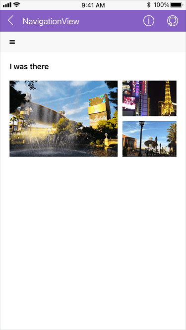
The Telerik UI for .NET MAUI NavigationView component is designed to provide top-level single-page navigation within your app. It makes navigation between different sections of your app a breeze while saving screen space and reserving most of the space for your content. Key features include display modes, navigation header, navigation pane, display position options, animations and hierarchy.
-
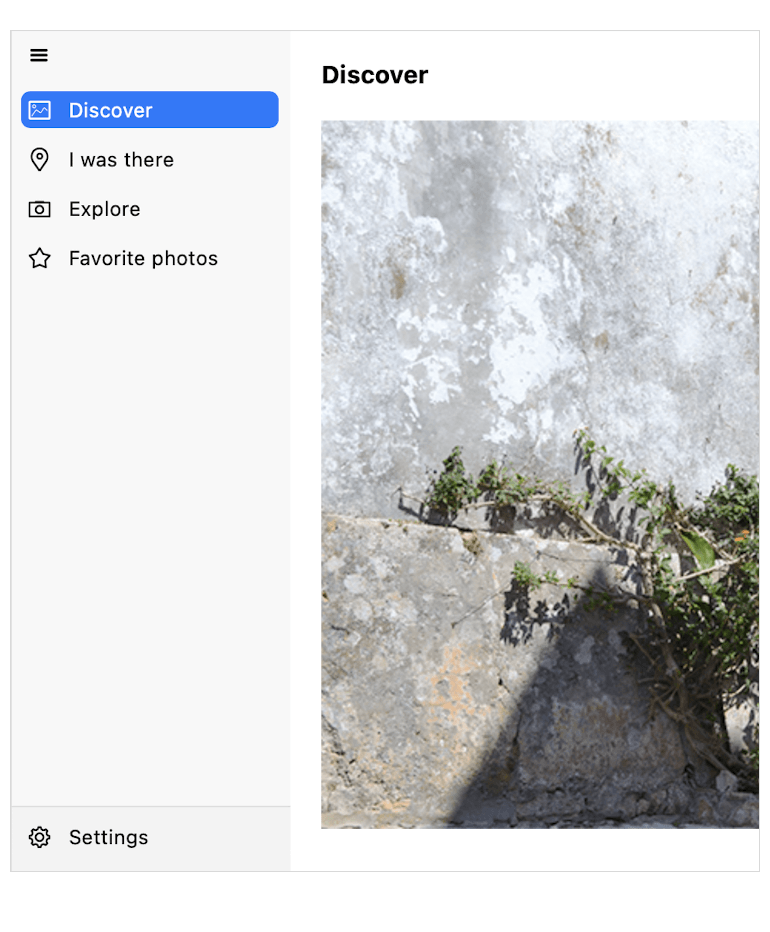
Navigation Header and Pane
The Telerik UI for .NET MAUI NavigationView has a header that contains a toggle navigation button for opening and closing the navigation page and Header Text. The Navigation Pane contains navigation items that switch to a different view upon click.
-
Data Binding
The Telerik UI for .NET MAUI NavigationView component supports data binding. This comes in handy for accurate visualization of non-string items. This functionality comes with easy-to-use API for styling and customizing the navigation items.
See the .NET MAUI NavigationView documentation: Data Binding
-
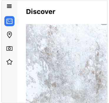
Display Mode – Minimal
This mode displays a header with a hamburger button. Once you click the button, you will see a popup that contains the page icons and names.
-
Display Mode – Compact
This mode displays only the icons of the page items without their texts. The icons are always visible and once you click the hamburger button it will expand the navigation pane as a popup above the content area and display the page texts as well.
-
Display Mode – Expanded
With this mode, both the icons and the text of the items are displayed. The pane can be collapsed by clicking the hamburger button, which will display only the icons and will free more space. When the pane is expanded or collapsed the content area changes its size.
-
Display Mode – Auto
The NavigationView can auto-change the display mode depending on the available free space.