
UI for .NET MAUI
.NET MAUI DateTimePicker
- The Telerik UI for .NET MAUI DateTimePicker is a feature-rich control that gets date and time input from the user.
- Part of the Telerik UI for .NET MAUI library along with 70+ professionally-designed UI controls.
- Includes support, documentation, demos, learning resources and more!
-
Arrange Easily Time and Date with .NET DateTimePicker
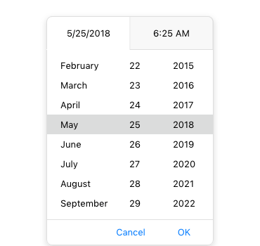
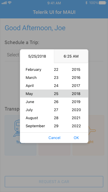
The Telerik UI for .NET MAUI DateTimePicker offers an easy and intuitive interface for the user to pick a date, time or—depending on the used format—a string. This customizable control supports different date and time formats, two picker modes, predefined date ranges and more. Thanks to its flexible styling API, you can customize every aspect of this component, from the spinners and popups to the text that gets displayed when a date is selected.
-
String Format
You can take advantage of the DisplayStringFormat property to quickly set a standard date and time format. This feature gives you the flexibility to create a date picker, time picker or a combination of both.
-
Spinner Format
Depending on your requirements, with this component you can use a standard or a custom date and time format. Depending on what format you go with, the picker visualizes spinner controls with prepopulated values, ready to be picked
-
Placeholder Text
A useful feature designed to communicate what is expected as input from the end users, e.g., “Select Departure Time,” the placeholder functionality allows developers to set what text is to be displayed in the control text area when there is no item selected.
-
Custom Templates
The .NET MAUI DateTimePicker comes with pre-built templates that help you customize its elements. You get templates for the placeholder, for the texts in the dialog header and footer, as well as the picker date/time text.
-
Flexible Styling API
You can customize every aspect of the .NET MAUI DateTimePicker control—from the colors, button styles and borders of the whole component to the look and feel of the Popup and DropDown picker modes. No matter your design requirements, you can be sure that the rich styling capabilities of this control will help you achieve the result you’re after.
-
Commands Support
The Telerik DateTimePicker for .NET MAUI provides command support for opening and closing the dialog (Toggle Command) and clearing the displayed date/time (Clear Command). You can also add a custom logic for the OK and Cancel buttons, for example, to show a popup asking for confirmation before a “Cancel” command is executed.
-
Localization
The .NET MAUI DateTimePicker component supports localization out of the box. This helps format the displayed date and time to a user’s locale and settings and can also help you have the calendar and time picking elements of the popup localized to the end-user’s language of choice.
