
UI for .NET MAUI
.NET MAUI TemplatedButton
- Easily Implement Customizable Buttons with Telerik UI for .NET MAUI TemplatedButton.
- Part of the Telerik UI for .NET MAUI library along with 70+ professionally-designed UI controls.
- Includes support, documentation, demos, learning resources and more!
-
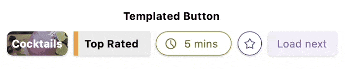
Easily Implement Customizable Buttons with .NET MAUI TemplatedButton
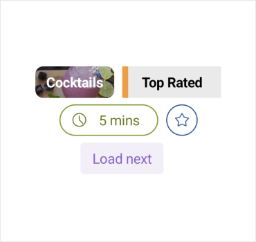
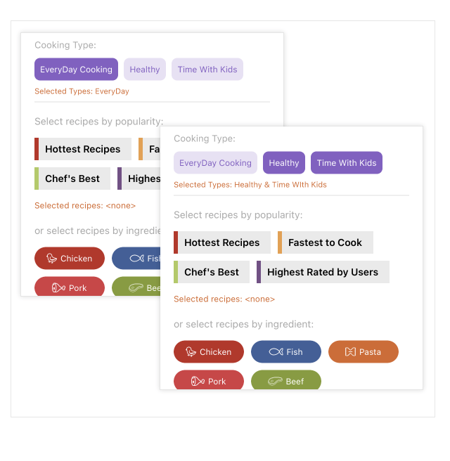
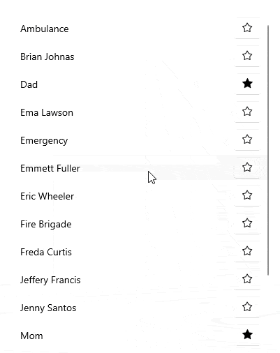
The Telerik UI for .NET MAUI TemplatedButton control serves as a dynamic tool for developers seeking customizable button functionality. Its adaptability extends beyond conventional button structures, allowing precise content alignment, integration of bespoke templates and seamless application of visual states. A notable illustration of its flexibility lies in the creation of loading buttons, effortlessly implemented through the TemplatedButton's features.
-
Fully Customizable Content
The .NET MAUI TemplatedButton control grants developers the ability to define customized content. Alongside the standard Content property, developers have the option to further customize the appearance and structure of the button's content by utilizing the ContentTemplate.
See the .NET MAUI TemplatedButton documentation: ContentTemplate
-
Styling API and Visual States
The .NET MAUI TemplatedButton provides a set of changeable visual assets like normal, pressed, PointerOver, disabled. Additionally, the TemplatedButton offers developers a diverse collection of styling options (background color, borders, text color and many more) by exposing properties that enable customization of its visual presentation.
-
Events
The .NET MAUI TemplatedButton component enhances user interaction by emitting a series of events that enable developers to finely tune the button's behavior based on user actions. The TemplatedButton exposes the following events: clicked, pressed, released.
See the .NET MAUI TemplatedButton documentation: Events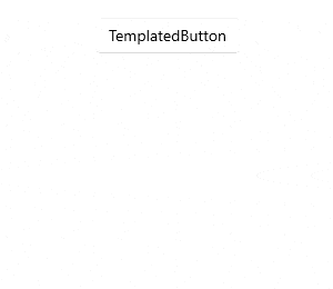
-
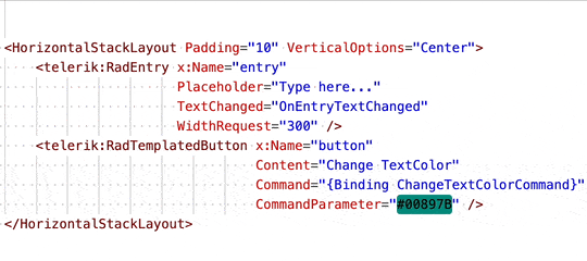
Command with Command Parameter
The Telerik .NET MAUI TemplatedButton empowers developers to attach commands that trigger specific actions upon button clicks. By utilizing the Command property, developers can define the command to execute upon button interaction, while the CommandParameter property allows for further customization by specifying parameters for the command. This feature streamlines application workflows, facilitating enhanced user interactions.
See the .NET MAUI TemplatedButton documentation: Command and Command Parameter
