UI for .NET MAUI
.NET MAUI RangeSlider
- Replace numeric input fields and spinners with an eye-catching and easy-to-use .NET MAUI RangeSlider.
- Part of the Telerik UI for .NET MAUI library along with 70+ professionally-designed UI controls.
- Includes support, documentation, demos, learning resources and more!

-
Select Numeric Ranges with Ease
The Telerik UI for .NET MAUI RangeSlider component allows you to replace numeric input fields and spinners with an eye-catching and easy-to-use slider. It allows users to select a range of numeric values within another range (min-max). The key features include dragging, ticks, labels, tooltip and styling API.

-
Dragging
Users can easily change just the start or end value of a range by dragging a thumb across the presented values or change both start and end values simultaneously by dragging the middle thumb.

-
Ticks and Labels
Add ticks to the range slider's track to enable users to easily identify the range values. You can specify the position of the ticks in the RangeSlider with respect to its track. Additionally, you can add labels for clearer values visualization.
See the .NET MAUI RangeSlider documentation: Ticks and Labels

-
Tooltips
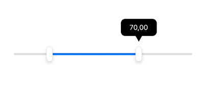
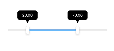
Present additional information to your users by enabling the .NET MAUI RangeSlider Tooltips.

-
Styling
You can apply various customizations to Telerik UI for .NET MAUI RangeSlider elements – range thumb, track, ticks and labels. For example, adjusting the thickness and color of the track or changing the label's font and size is a breeze.

All UI for .NET MAUI Components
Data Controls
Data Visualization
Navigation & Layout
Charts
Editors
- TimeSpanPicker
- TimePicker
- TemplatedPicker
- Slider
- RichTextEditor
- RangeSlider
- NumericInput
- MaskedEntry
- ListPicker
- ImageEditor
- Entry
- Editor New
- DateTimePicker
- DatePicker
- ComboBox
- AutoComplete Updated
Calendar and Scheduling
Buttons
Interactivity & UX
Pdf Viewer
Document Processing
