
UI for .NET MAUI
.NET MAUI ToggleButton
- Easily Integrate Toggle Functionality with Telerik UI for .NET MAUI ToggleButton.
- Part of the Telerik UI for .NET MAUI library along with 70+ professionally-designed UI controls.
- Includes support, documentation, demos, learning resources and more!
-
Easily Integrate Toggle Functionality into Your .NET MAUI App
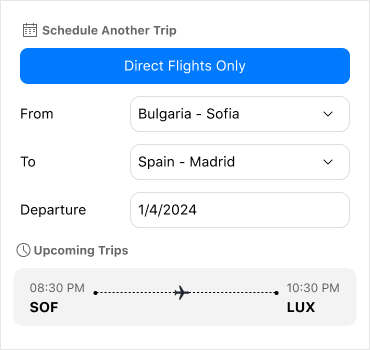
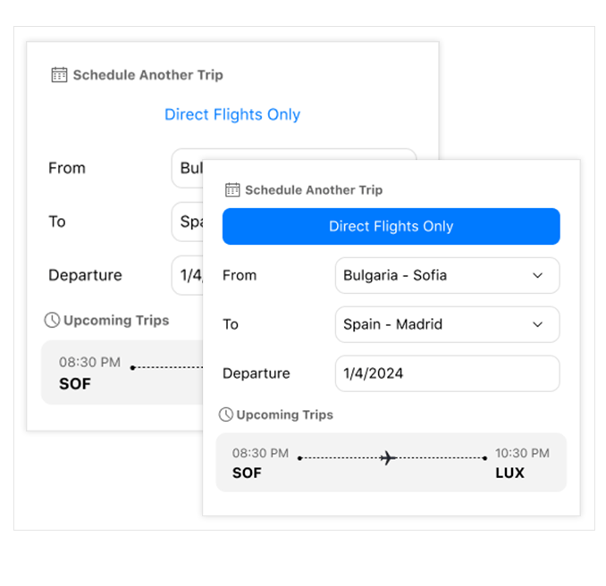
The Telerik .NET MAUI ToggleButton offers a straightforward solution for implementing toggling functionality within .NET MAUI applications. Its primary function revolves around facilitating user interactions by enabling the selection or toggling of options or states within the application's interface. Widely adopted in various scenarios, the ToggleButton is particularly instrumental in capturing binary choices, whether it involves activating or deactivating features, toggling settings or seamlessly transitioning between different modes or views.
-
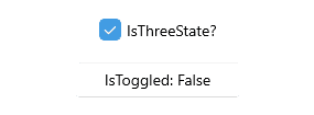
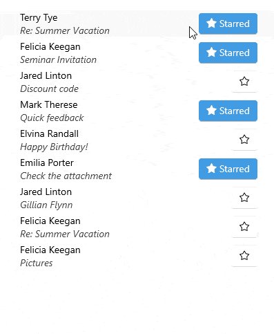
Toggled States
The .NET MAUI ToggleButton control offers developers the ability to define its state as either Toggled, Untoggled or Indeterminate. Developers can easily set and manage the button's state both through UI and programmatically, ensuring seamless integration into various application workflows. The Indeterminate state can be applied through the UI only for three-state checkboxes.
See the .NET MAUI ToggleButton documentation: Toggled States
-
Fully Customizable Content
The .NET MAUI ToggleButton control grants developers the ability to define customized content. Alongside the standard Content property, developers have the option to further customize the appearance and structure of the button's content by utilizing the ContentTemplate.
See the .NET MAUI ToggleButton documentation: ContentTemplate
-
Styling API and Visual States
The .NET MAUI ToggleButton provides a set of changeable visual assets like normal, pressed, MouseOver, disabled, toggled and many more. Additionally, the TemplatedButton offers developers a diverse collection of styling options (background color, borders, text color and many more) by exposing properties that enable customization of its visual presentation.
- Styling API: See the .NET MAUI ToggleButton documentation: Styling API
- Visual States: See the .NET MAUI ToggleButton documentation: Visual States

-
Events
The .NET MAUI ToggleButton component enhances user interaction by emitting a series of events that enable developers to finely tune the button's behavior based on user actions. The ToggleButton exposes the following events: IsToggleChanged, clicked, pressed, released.
-
Command and Command Parameter
The .NET MAUI ToggleButton empowers developers to attach commands that trigger specific actions upon button clicks. By utilizing the Command property, developers can define the command to execute upon button interaction, while the CommandParameter property allows for further customization by specifying parameters for the command. This feature streamlines application workflows, facilitating enhanced user interactions.
See the .NET MAUI ToggleButton documentation: Command and Command Parameter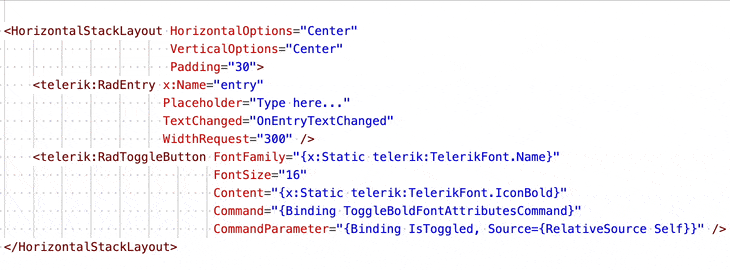
