
UI for .NET MAUI
.NET MAUI ListPicker
- The .NET MAUI List Picker component provides an intuitive UI experience for value selection from multiple options.
- Part of the Telerik UI for .NET MAUI library along with 70+ professionally-designed UI controls.
- Includes support, documentation, demos, learning resources and more!
-
Display a List of Items with .NET MAUI List Picker
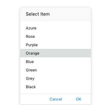
List Picker is one of Telerik’s UI for .NET MAUI Picker components, others include Templated Picker and Date and Time Picker. List Picker is a fully customizable, providing a simple and elegant UI experience that covers a wide range of use cases where you need the user to select a value from multiple options. The List Picker displays a list of items and enables the user to select from that list. The list itself is visualized inside a popup and loops its items infinitely while scrolling. The customizable dialog appearance enables developers to ensure that the List Picker is consistent with the overall user experience of their application.
See the .NET MAUI ListPicker documentation -
Looping
List Picker for .NET MAUI provides a looping functionality which enables you to loop a list of items and infinitely scroll them.
See the .NET MAUI ListPicker documentation: Looping -
Templates
List Picker for .NET MAUI provides developers with two templating capabilities – an item template which defines how the items in a given list are displayed, and a selected item template used to visualize the selected item on the list.
See the .NET MAUI ListPicker documentation: Templates -
Display string format
List Picker for .NET MAUI enables you to define what text will be displayed when no item is selected, or alternatively apply a format string when an item is selected. -
Placeholder Text
List Picker for .NET MAUI offers the useful functionality of a placeholder text. Developers can define what text to be displayed when no item is selected, thus indicating to the end user the data they need to input, e.g. “Select color”.
See the .NET MAUI ListPicker documentation: Visual structure -
Customizable items
List Picker for .NET MAUI is fully-customizable component—its styling properties enable you to style everything from your listed and selected item to the popup, header and footer.
See the .NET MAUI ListPicker documentation: Customizable items -
Command support
List Picker provides developers with the following commands—a Toggle Command which allows you to open and close the dialog, and Clear Command that enables you to clear the displayed data.
See the .NET MAUI ListPicker documentation: Command support
All UI for .NET MAUI Components
Data Controls
Data Visualization
Navigation & Layout
Charts
Editors
- TimeSpanPicker
- TimePicker
- TemplatedPicker
- Slider
- RichTextEditor
- RangeSlider
- NumericInput
- MaskedEntry
- ListPicker
- ImageEditor
- Entry
- Editor New
- DateTimePicker
- DatePicker
- ComboBox
- AutoComplete Updated
Calendar and Scheduling
Buttons
Interactivity & UX
Pdf Viewer
Document Processing
