
UI for .NET MAUI
.NET MAUI CollectionView
- Simplify Handling of Lists with Telerik UI for .NET MAUI CollectionView Component.
- Part of the Telerik UI for .NET MAUI library along with 70+ professionally-designed UI controls.
- Includes support, documentation, demos, learning resources and more!

-
Simplify Handling of Lists with .NET MAUI CollectionView Component
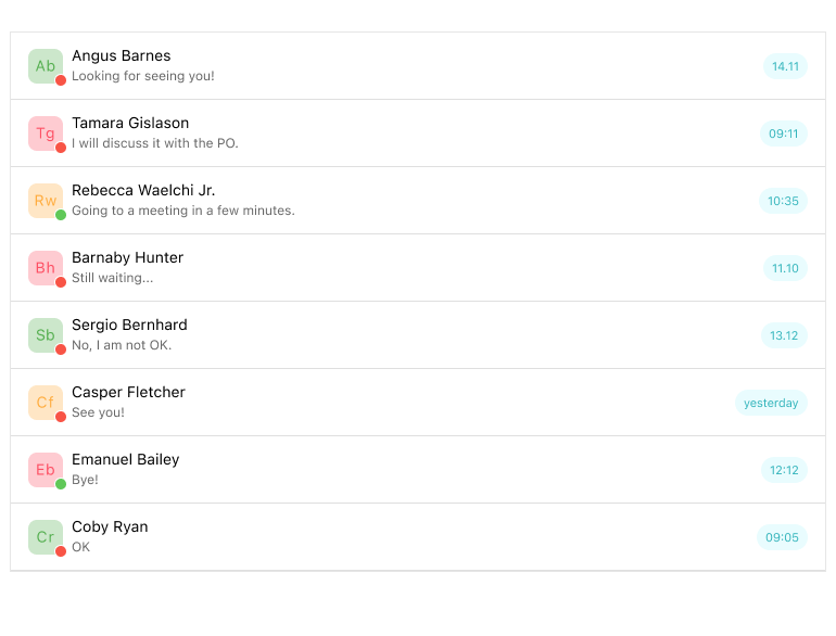
Telerik .NET MAUI CollectionView is a dynamic view component designed for efficient handling of lists of items, offering essential features commonly needed in such scenarios. This component empowers developers to filter, sort and group items as per your requirements. Additionally, it provides a flexible styling API and customizable templates, enabling developers to tailor the appearance and behavior according to their preferences. We are actively working to develop CollectionView to a level where this component will be a replacement for ListView.
-
Data Binding
In cases where business items are more complex than simple strings, .NET MAUI CollectionView simplifies data visualization by supporting data binding through the path property, ensuring accurate representation of information. This functionality enhances user comprehension and usability by enabling developers to dynamically display diverse data sets with precision and clarity.>p>
See the .NET MAUI CollectionView documentation: Data Binding
-
Load On Demand
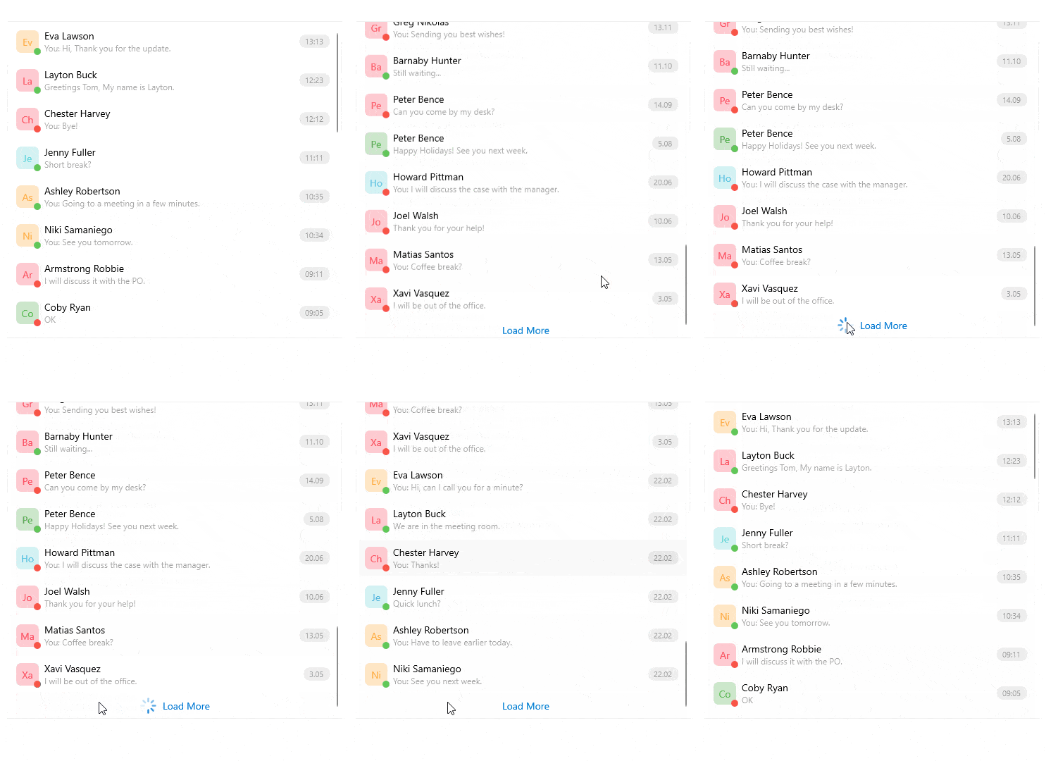
This functionality supports optimal .NET MAUI CollectionView performance when handling large sets of data. Load on demand enables you to load data in increments. For the end user, this is achieved either by clicking a button (manual) or by scrolling towards the end of the visible part of the application (automatic). You can control the minimum number of pre-loaded items and customize the appearance of the UI elements that initiate loading on demand.
See the .NET MAUI CollectionView documentation: Load On Demand
-
Item Appearance
.NET MAUI CollectionView streamlines user interface customization by offering a default appearance for items yet empowers developers to enhance user experience by defining a personalized ItemTemplate (DataTemplate) tailored to specific design preferences and functional requirements.
See the .NET MAUI CollectionView documentation: Item Appearance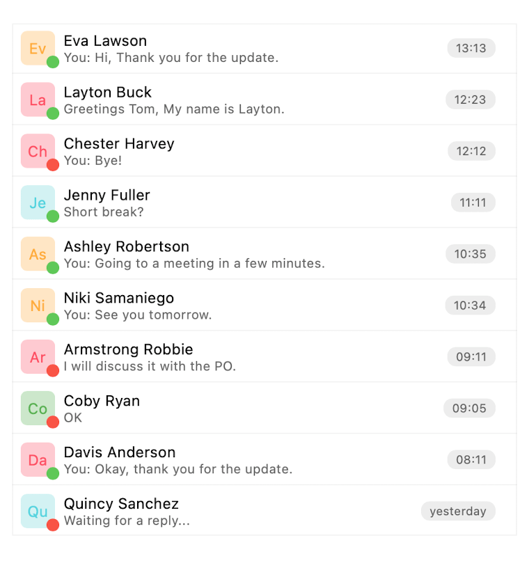
-
Selection
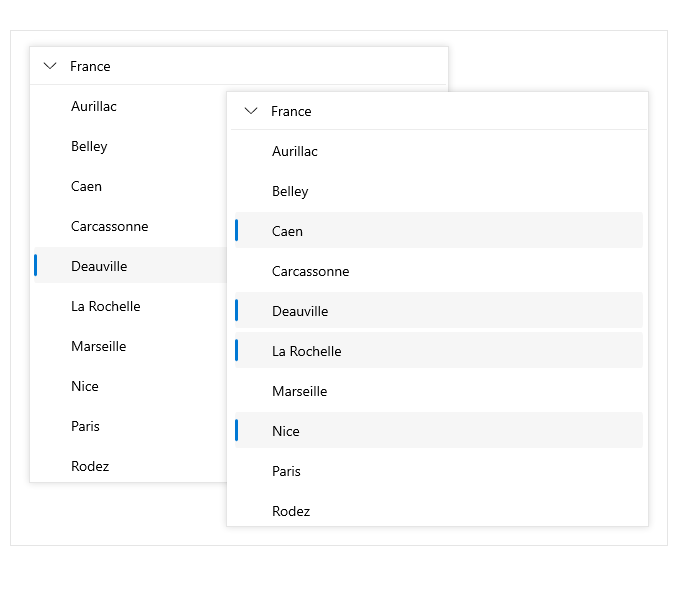
.NET MAUI CollectionView provides a selection feature, enabling users to choose either a single item or multiple items from within the CollectionView. This functionality offers comprehensive visual and programmatic feedback, enhancing user interaction. CollectionView extends flexibility by presenting three distinct selection modes, each dictating the type of selection allowed. Control over these modes resides within the SelectionMode property. (Telerik.Maui.Controls.CollectionView.CollectionViewSelectionMode), offering options including "None" for prohibiting selection, "Single" (the default) for single-item selection and "Multiple" for enabling selection of multiple items.
-
Header and Footer
Use the .NET MAUI CollectionView Header and footer templates to position content above and below the list of items. This feature is useful when you need to visualize specific content (say, a label, or a sum) that cannot be selected.
See the .NET MAUI CollectionView documentation: Header and Footer

-
Scrolling
With the ScrollItemIntoView method offered by .NET MAUI CollectionView, developers gain the ability to seamlessly navigate to specific items within the collection programmatically. This functionality enhances user experience by facilitating smooth and intuitive navigation, ensuring that users can effortlessly locate and interact with desired items within the CollectionView.
See the .NET MAUI CollectionView documentation: Scrolling
-
Grouping, Sorting and Filtering
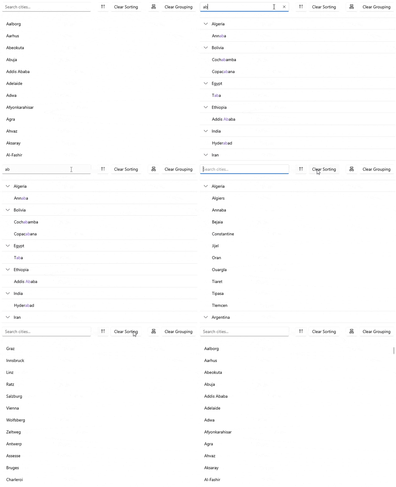
Empowering developers with dynamic data organization, .NET MAUI CollectionView offers the ability to programmatically group data at runtime by incorporating group descriptors into the RadCollectionView.GroupDescriptors collection, facilitating tailored data organization and enhancing user comprehension of displayed content.
The CollectionView control also grants the capability to effortlessly sort visualized data by incorporating various SortDescriptors into the SortDescriptors collection, enhancing usability and enabling users to efficiently navigate and interact with organized data sets.
With the capability to programmatically filter data at runtime, CollectionView empowers developers to dynamically refine displayed content.
-
Grouping - GroupHeaderTemplate and Expandable and Collapsible Groups
.NET MAUI CollectionView simplifies user interaction by automatically displaying a default group header when grouping is implemented, facilitating intuitive navigation, organization and customization of displayed items for enhanced usability.
See the .NET MAUI CollectionView documentation: GroupHeaderTemplate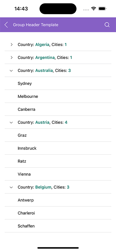
-
Drag and Drop
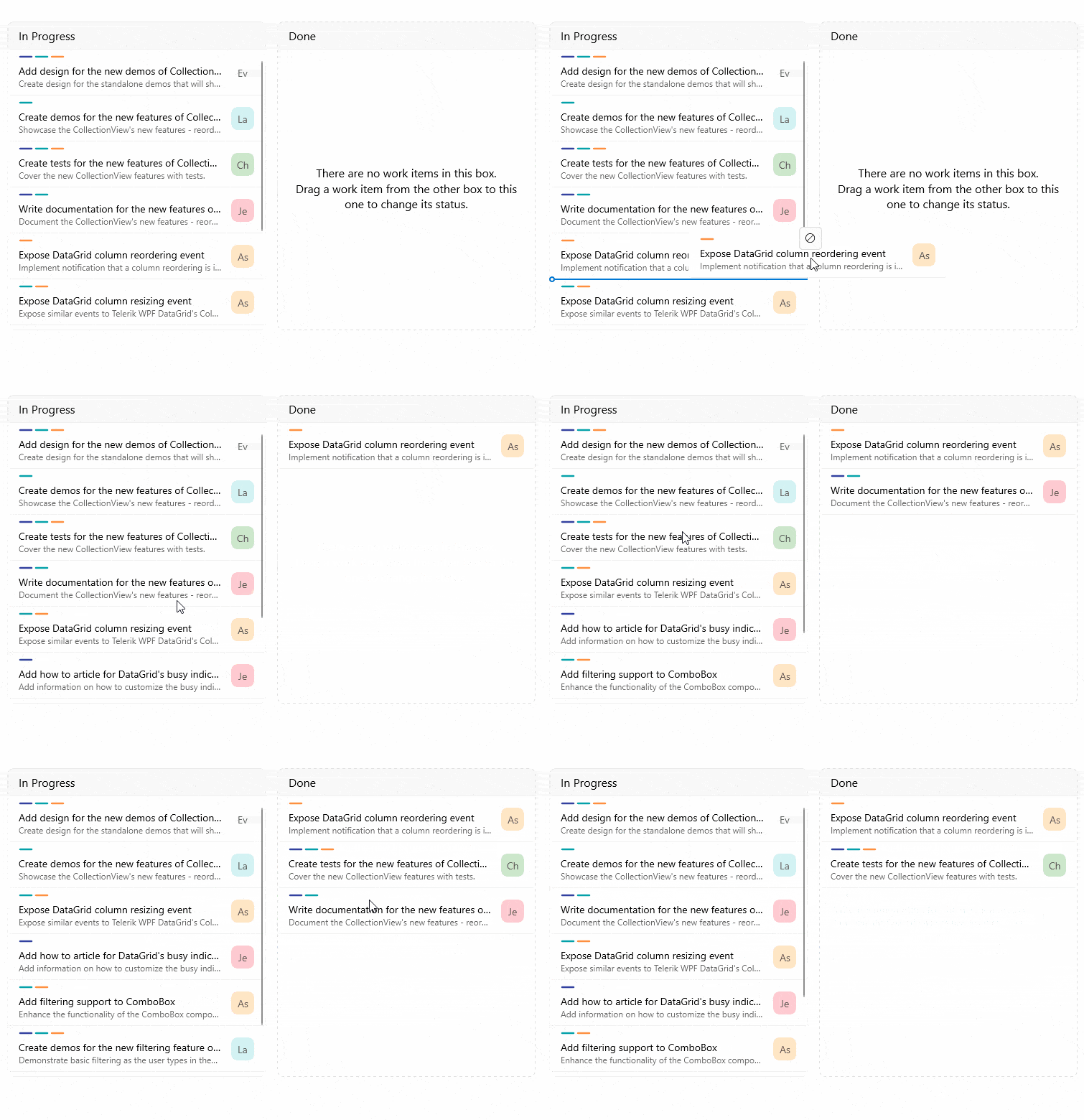
The drag-and-drop functionality offers the end user a convenient option for reordering items in the .NET MAUI CollectionView. The drag-and-drop action initiates a reorder operation on the data. You can also use this functionality in scenarios where the user needs to be able to move items from one CollectionView control to another.
See the .NET MAUI CollectionView documentation: Drag and drop
-
Layouts
The .NET MAUI CollectionView control offers two adaptable layout options through its ItemsLayout property: linear layout and grid layout. You can seamlessly manipulate them to match your requirements. By default, the control adopts linear layout, providing a structured arrangement for displayed content with horizontal or vertical orientation. The grid-like layout can be used to organize data in rows and columns and can also have a horizontal or vertical orientation. It’s a great alternative when you need to display a long list of items from the same category.
See the .NET MAUI CollectionView documentation: Linear Layout

-
Events and Commands
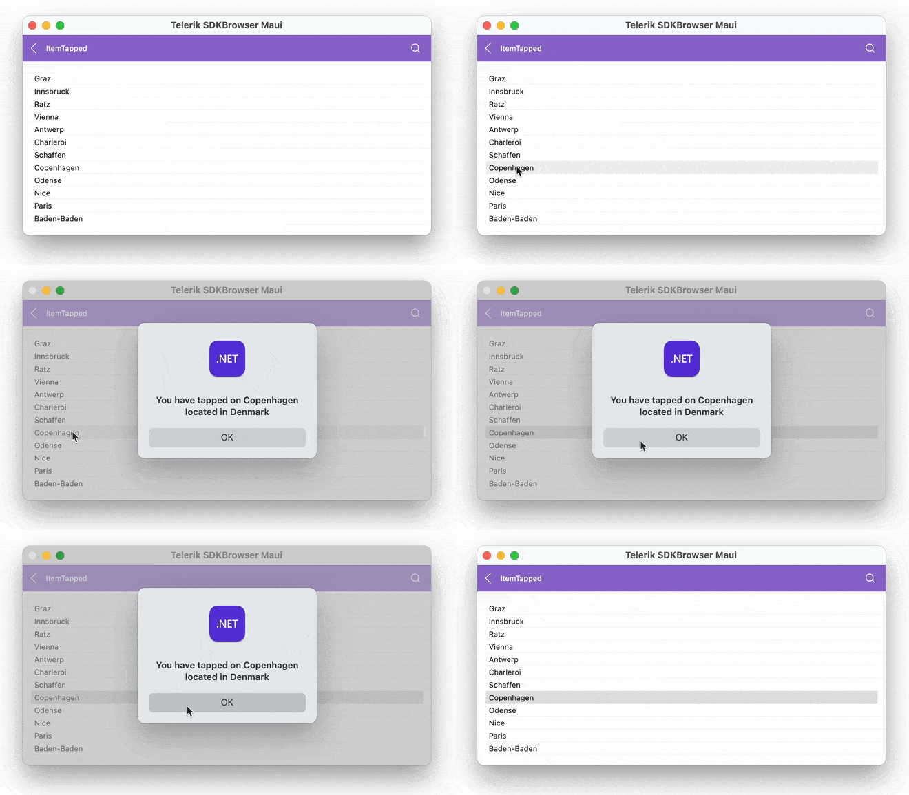
With the Telerik UI for .NET MAUI CollectionView component, users can engage with a variety of events tailored to their interactions, offering enhanced control and flexibility over the UI. By customizing event handling and configuration, developers can seamlessly adapt the UI component to meet specific needs, providing a more intuitive and responsive user experience. Additionally, .NET MAUI CollectionView provides various commands that could be executed with tapping.
-
Item Swipe
.NET MAUI CollectionView provides an item swipe feature, which enables you to offer the end user a familiar behavior: when they swipe, they reveal a designated custom view with buttons, images, etc. This is often used for actions such as “Delete,” “Archive,” “Select” and more.

-
Styling API
Using the .NET MAUI CollectionView control, developers unlock a styling mechanism to refine the appearance of its items, ensuring a unified visual experience. By setting the ItemViewStyle property with a target type of RadCollectionViewItemView, customization becomes seamless and precise, offering granular control over every aspect of the view.

-
Sticky Group Headers
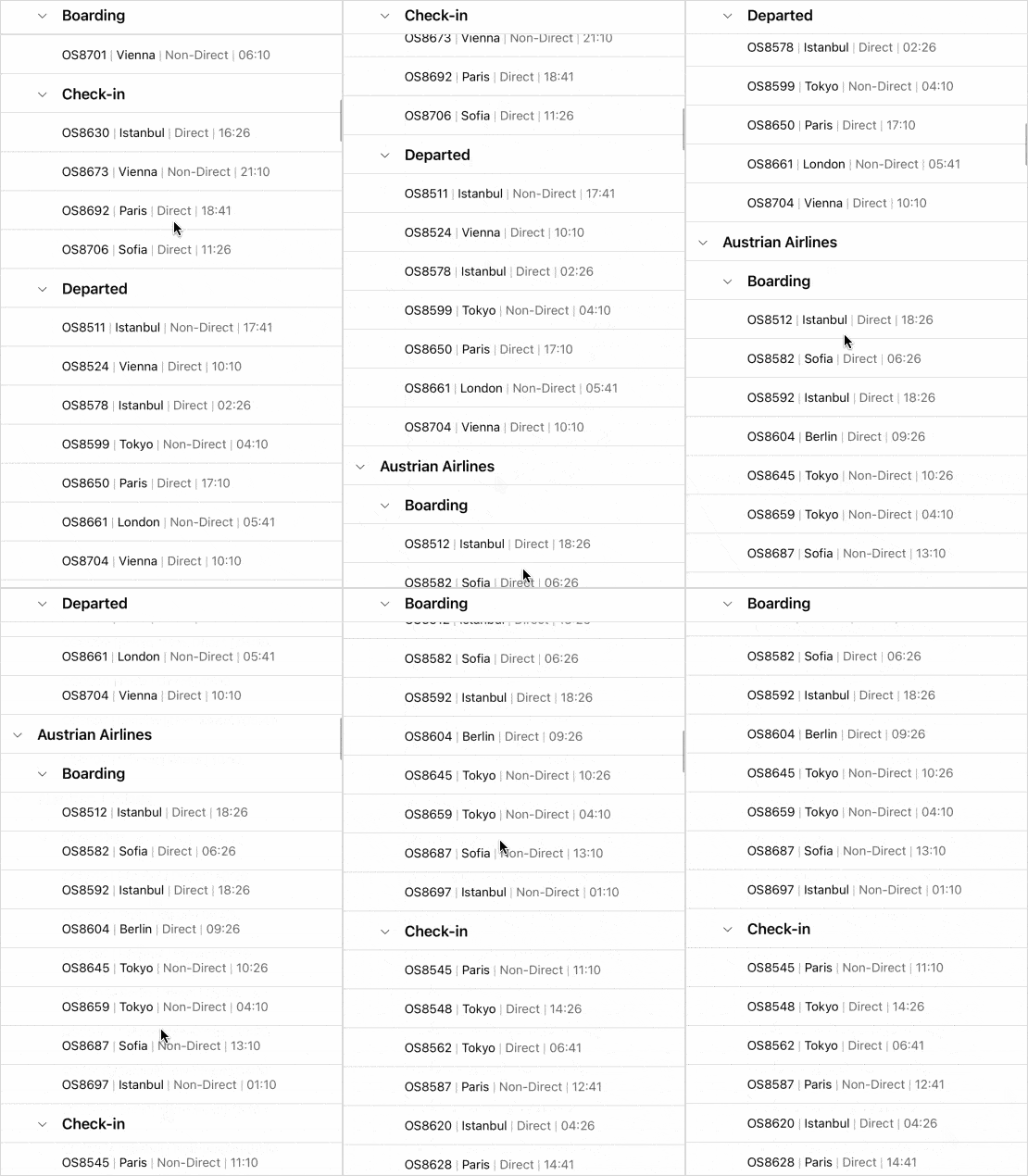
Improve mobile usability with sticky group headers that remain visible at the top of the viewport while users scroll through grouped data. This small yet impactful enhancement ensures context is always preserved, making large data sets easier to navigate on smaller screens.
See the Telerik UI for .NET MAUI Documentation: Sticky Group Headers
-
Keyboard Support on Desktop
Desktop users can now enjoy a full keyboard navigation experience with the CollectionView component. This update boosts accessibility and usability, allowing for quick navigation, selection, and interaction using standard keyboard shortcuts — perfect for power users and enterprise workflows.
See the Telerik UI for .NET MAUI Documentation: Keyboard Support for Desktop

-
Screen Readers' Support
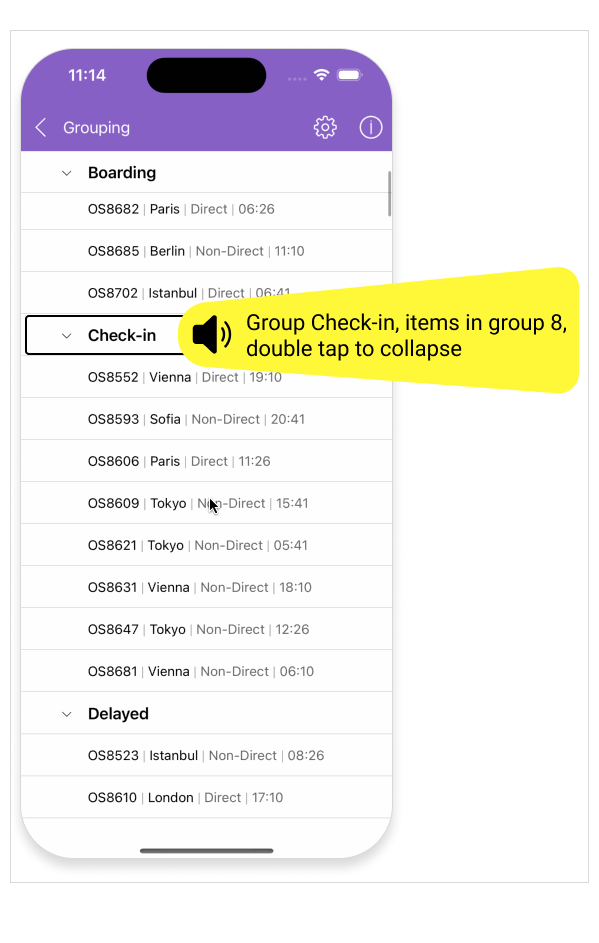
Deliver a more inclusive experience for visually impaired users with added screen reader support for mobile devices. By leveraging accessibility APIs and native platform capabilities, CollectionView can now be seamlessly interpreted by screen readers — ensuring your app is usable by all audiences.
See the Telerik UI for .NET MAUI Documentation: Screen Readers' Support
All UI for .NET MAUI Components
Data Controls
Data Visualization
Navigation & Layout
Charts
Editors
- TimeSpanPicker
- TimePicker
- TemplatedPicker
- Slider
- RichTextEditor
- RangeSlider
- NumericInput
- MaskedEntry
- ListPicker
- ImageEditor
- Entry
- Editor New
- DateTimePicker
- DatePicker
- ComboBox
- AutoComplete Updated
Calendar and Scheduling
Buttons
Interactivity & UX
Pdf Viewer
Document Processing
