
UI for .NET MAUI
.NET MAUI TreeView
- The Telerik UI for .NET MAUI TreeView allows you to display hierarchical structures, such as directories and relational data.
- Part of the Telerik UI for .NET MAUI library along with 70+ professionally-designed UI controls.
- Includes support, documentation, demos, learning resources and more!
-
Present Information in Flat or Hierarchical Format with .NET MAUI TreeView
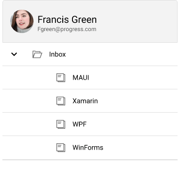
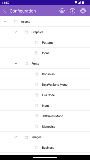
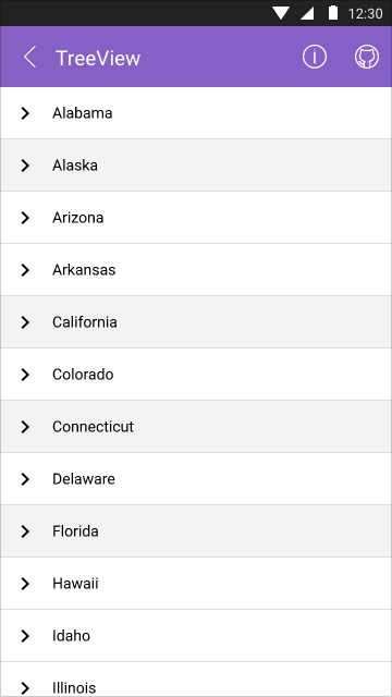
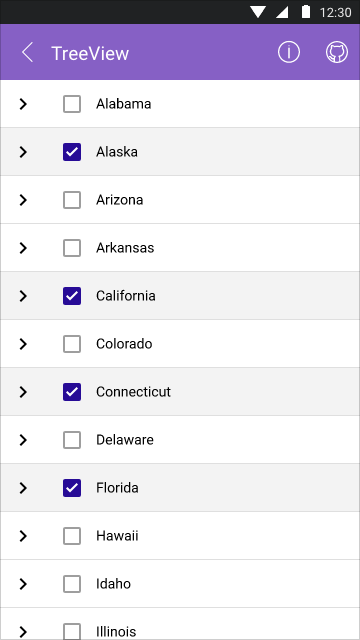
The TreeView control in Telerik UI for .NET MAUI offers a convenient way to present information in a flat or hierarchical format, allowing users to collapse or expand data nodes as needed. It is commonly employed for displaying file structures, organizational hierarchies, or to facilitate navigation within mobile applications. Moreover, it provides extensive customization options and is designed to handle large data sets efficiently. By incorporating UI Virtualization, the TreeView ensures fast item rendering for an optimal user experience within your application.
-
DataBinding
The TreeView component in Telerik UI for .NET MAUI is specifically crafted to simplify data binding, whether you're presenting a linear data structure or a hierarchical one.
-
Virtualization
Enable faster data visualization and effortless display of TreeView items while scrolling, regardless of whether you have a small or large dataset. This is made possible by the integrated UI virtualization feature of the Telerik UI for .NET MAUI TreeView component.
-
Load on Demand
The Load Children on Demand functionality enhances the efficiency of the Telerik UI for .NET MAUI TreeView component when operating with a large number of items. This system allows nodes to load their child nodes dynamically as users expand the parent nodes by clicking the expand icon on desktop or tapping the item on mobile devices.
-
Single and Multiple Selection
Based on your business scenario, you can allow single or multiple node selection inside the Telerik UI for .NET MAUI TreeView component.
-
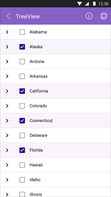
Support for Checkboxes
The Telerik UI for .NET MAUI TreeView component has Checbox support. This functionality allows for the display of CheckBox elements and enables the selection of specific items from the ItemsSource. The selected items are then automatically added to the CheckedItems property of the control, granting users the freedom to perform various actions, such as selecting or manipulating these items as desired.
-
Command Support
You can add custom options to your Telerik UI for .NET MAUI TreeView app by leveraging the command support functionality. The supported commands allow expanding, collapsing, checking, unchecking and scrolling.
-
Styling and Styling Selector
The TreeView in .NET MAUI introduces a conditional styling feature that empowers users to apply distinct Styles to individual items based on specific conditions. This feature enables dynamic customization, allowing each item to have its own unique appearance based on predefined criteria.
-
Item Template
By leveraging the ItemTemplate functionality, you can personalize the appearance of each TreeView node. This enables you to effortlessly insert specific icons within the nodes of the .NET MAUI TreeView, enhancing the customization options for your specific scenario.
-
Expanding and Collapsing
The .NET MAUI TreeView component provides helpful methods that can be leveraged to manage the states of its items. One such method allows for the straightforward expansion or collapse of all nodes, providing users with convenient control over the visibility of the entire tree structure.
-
Intuitive and Easy to Use API
Leveraging the powerful .NET MAUI TreeView API, users can perform all kinds of customizations to the control or take advantage of some handy functionalities such as scrolling the control to a specific view. Here is a small list of things that you can customize:
- Indent – adding indentation to your TreeView nodes is intuitive and easy.
- Expander options – you can easily change the Expander’s width and position to fit your design.
- Item height – when your design requires bigger TreeView nodes, you can leverage the ItemHeight property.
- Bring into View/Scroll into View – you can scroll the items displayed on the screen programmatically and navigate to a certain item by leveraging the ScrollTo method.
