background

UI for .NET MAUI

.NET MAUI ProgressBar

  • The .NET MAUI ProgressBar control indicates the progress of a long-running operation or multi-step action progress.
  • Part of the Telerik UI for .NET MAUI library along with 60+ professionally-designed UI controls.
  • Includes support, documentation, demos, learning resources and more!
NET MAUI ProgressBar component
  • Stay Informed About the Progress of Long-Running Operations with .NET MAUI ProgressBar

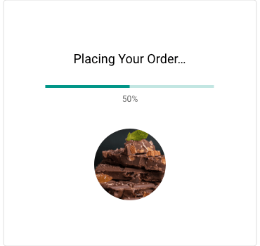
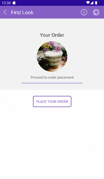
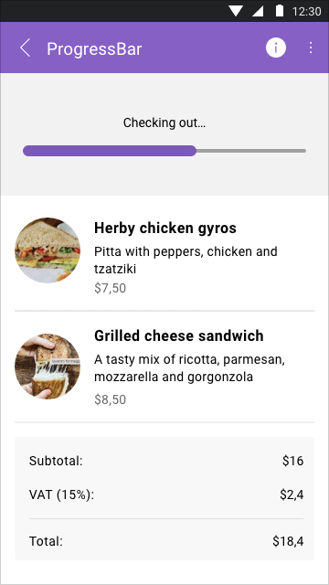
    The Telerik UI for .NET MAUI ProgressBar is used to indicate the progress of a long-running operation on a desktop or mobile device. This control allows you to easily inform users when data is loading on the background or when they need to complete a multi-step action, dynamically visualizing how much has been completed and what remains. You can customize the ProgressBar using the flexible styling API.

    See the .NET MAUI ProgressBar docs

    .NET MAUI ProgressBar Control Overview
  • Indeterminate Mode

    You can use the UI for .NET MAUI ProgressBar in Indeterminate mode when you don’t know exactly what size, how much time or how many steps the operation will take. In this scenario, the handy Indeterminate mode feature will display a bar that doesn’t specify the exact progress, but still indicates an operation is underway.

    See the .NET MAUI ProgressBar docs: Indeterminate Mode

    .NET MAUI ProgressBar Control Indeterminate Mode
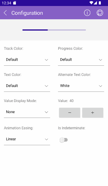
  • Segments, Value Modes and Value Range

    The Telerik UI for .NET MAUI ProgressBar is very flexible, while still easy to configure. With the help of a few properties, you can set anything from display value modes (number, percentage, text, hidden) and value range to whether the progress bar should be segmented or one continuous line.

  • Animations

    You can apply different animation easing and animation duration while changing the value of the ProgressBar. For example, you can choose to animate changes in value (progress change) or show a looping animation when using Indeterminate mode. To customize the user experience further, you can set custom values for animation duration and easing.

    See the .NET MAUI ProgressBar docs: Animations

    .NET MAUI ProgressBar Control Animations
  • Styling API

    To ensure the control matches the look of your app, you can customize all elements of the Telerik UI for .NET MAUI ProgressBar, including the progress fill, track fill, indeterminate fill, label text color, font size and more.

    See the .NET MAUI ProgressBar docs: Styling

    .NET MAUI ProgressBar Control Styling
  • Also Available...

    The ProgressBar component is also available for these popular frameworks:

Frequently Asked Questions

  • What is .NET MAUI ProgressBar?

    Telerik .NET MAUI ProgressBar control is designed to display progress information to the users during a long-running operation or when they need to complete a multi-step action a desktop or mobile device.

    The ProgressBar is a part of Telerik UI for .NET MAUI, the most comprehensive UI suite for .NET MAUI! To try it out, sign up for a free 30-day trial and kickstart your cross-platform app development today.

  • How can I try Telerik UI for .NET MAUI ProgressBar control?

    You can try all Telerik UI for .NET MAUI components by signing up for a 30-day FREE trial. During your evaluation, you will have access to all the components, technical support, documentation and getting-started resources.

    See the .NET MAUI ProgressBar Getting Started article for a quick tutorial and don’t forget to sign up for a trial to get free support.

  • How many components are included in the Telerik UI for .NET MAUI suite?

    Telerik UI for .NET MAUI offers a wide range of 60+ controls to enable your cross-platform development of native Windows, macOS, Android and iOS applications. The .NET MAUI UI library is constantly growing. For upcoming releases information, visit our Roadmap. 

  • How can I customize the appearance of the .NET MAUI ProgressBar?

    You can apply styling options to various ProgressBar elements:

    • Background track - You can specify the color and the thickness.
    • Styling the text - You can define the color of the text which displays the progress value and the font size. Additionally, you can define the text color when the progress indicator overlaps the label which displays the current progress.
    • Styling the segments - You can specify the fill and thickness of the segments separators.
  • Where can I buy the Telerik UI for .NET MAUI ProgressBar control?

    The ProgressBar component is one of over 55 in the Telerik UI for .NET MAUI components library which is also a part of the Telerik DevCraft bundle.

    The Telerik UI for .NET MAUI library comes with several purchase options, giving you flexibility based on the needs of your project. The license is perpetual, with subscription options for support and new updates. Please refer to the Telerik UI for .NET MAUI pricing page for more information.

  • What support options does Telerik UI for .NET MAUI offers?

    Depending on your needs, Telerik UI for .NET MAUI offers the following flexible support options:

    • Lite support: 72-hour response time, 10 support incidents
    • Priority support: 24-hour response time, unlimited support incidents
    • Ultimate support: everything in Priority support, plus 4-hour ticket pre-screening and phone assistance

    Learn more about flexible support and pricing options.

All UI for .NET MAUI Components

Next Steps