
UI for .NET MAUI
.NET MAUI TabView
- The Telerik UI for .NET MAUI TabView is a feature-rich component that allows building tabbed interfaces.
- Part of the Telerik UI for .NET MAUI library along with 70+ professionally-designed UI controls.
- Includes support, documentation, demos, learning resources and more!
-
Flexible Navigation to Build Tabbed Interfaces with .NET MAUI TabView
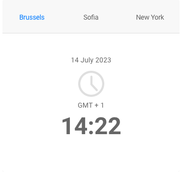
This .NET MAUI TabView is a flexible navigation control that allows you to build tabbed interfaces. Each tabview item has an associated content displayed on selection. The control's API allows you to fully customize the TabView header area containing the tabs, as well as the content.
-
Item Selection
The TabView control for .NET MAUI exposes a selection API, which allows you to extend the navigation depending on the project's needs.
-
Header Customization
The header area (the area, which holds the tabs) of this .NET MAUI TabView control can be fully customized. You can easily change the header position, orientation and spacing between the tabs, or completely modify its look & feel. Additionally, you can enable scrolling in the header, which helps you fit any number of tabs you need no matter the real estate you have at your disposal.
-
Tabs Customization
You can fully customize the appearance of each tab of the .NET MAUI TebView control. Easily add an image in the displayed header, include content and decide whether a given tab will be selected, visible and enabled.
-
Styling Options
The .NET MAUI TabView control comes with a wide range of styling capabilities. You can modify the control's look and feel by changing background and border colors, corner radius and padding, and more. You can style different parts of the TabView - its header, items and content area.
-
Also Available...
The TabView component is also available for Xamarin framework.
Frequently Asked Questions
-
What is .NET MAUI TabView?
Telerik UI for .NET MAUI TabView is a flexible navigation control that allows you to build tabbed interfaces. Each tabview item has an associated content displayed on selection. The control is fully customizable. Using the API you can easily customize the TabView header area that contains the tabs and the TabView content. The TabView is a part of Telerik UI for .NET MAUI, the most comprehensive UI suite for .NET MAUI! To try it out, sign up for a free 30-day trial and kickstart your cross-platform app development today.
-
How do I get started with Telerik UI for .NET MAUI TabView control?
When your .NET MAUI application is set up, you are ready to add a TabView control to your page. To display something in the tab you can easily define TabViewItem elements in its Items collection. To define the header of a TabViewItem you can use its HeaderText property as in the example.
-
Where can I buy the Telerik UI for .NET MAUI TabView control?
The TabView component is one of over 55 in the Telerik UI for .NET MAUI components library which is also a part of the Telerik DevCraft bundle.
The Telerik UI for .NET MAUI library comes with several purchase options, giving you flexibility based on the needs of your project.
Please refer to the Telerik UI for .NET MAUI pricing page for more information.
-
What support options does Telerik UI for .NET MAUI offers?
Depending on your needs, Telerik UI for .NET MAUI offers the following flexible support options:
- Lite support: 72-hour response time, 10 support incidents
- Priority support: 24-hour response time, unlimited support incidents
- Ultimate support: everything in Priority support, plus 4-hour ticket pre-screening and phone assistance
Learn more about flexible support and pricing options.
-
How can I customize tabs with .NET MAUI TabView?
You can fully customize the appearance of each tab. Each tab has a header and content. The TabViewItem class gives you the option to set Tab's header text, add an image which will be displayed in the header, add a content and decide whether the tab will be selected, visible and enabled.
-
How can I try Telerik UI for .NET MAUI TabView control?
You can try all Telerik UI for .NET MAUI components by signing up for a 30-day FREE trial. During your evaluation, you will have access to all the components, technical support, documentation and getting-started resources.
See the .NET MAUI TabView Getting Started article for a quick tutorial and don’t forget to sign up for a trial to get free support.
-
How many components are included in the Telerik UI for .NET MAUI suite?
Telerik UI for .NET MAUI offers a wide range of 70+ controls to enable your cross-platform development of native Windows, macOS, Android and iOS applications. The .NET MAUI UI library is constantly growing. For upcoming releases information, visit our Roadmap.
All UI for .NET MAUI Components
Data Controls
Data Visualization
Navigation & Layout
Charts
Editors
- TimeSpanPicker
- TimePicker
- TemplatedPicker
- Slider
- RichTextEditor
- RangeSlider
- NumericInput
- MaskedEntry
- ListPicker
- ImageEditor
- Entry
- Editor New
- DateTimePicker
- DatePicker
- ComboBox
- AutoComplete Updated
Calendar and Scheduling
Buttons
Interactivity & UX
Pdf Viewer
Document Processing
