
UI for .NET MAUI
.NET MAUI Accordion
- The .NET MAUI Accordion control presents content to users in an accessible way, while saving screen space.
- Part of the Telerik UI for .NET MAUI library along with 70+ professionally-designed UI controls.
- Includes support, documentation, demos, learning resources and more!
-
Save Screen Space with .NET MAUI Accordion
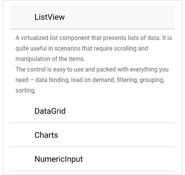
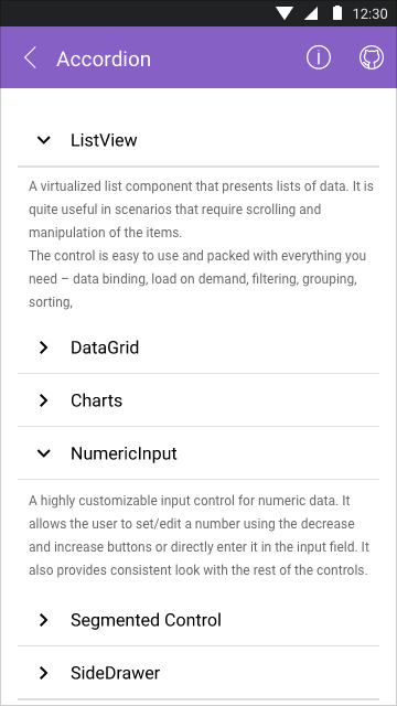
The Telerik UI for .NET MAUI Accordion control is a vertically collapsible content panel that expands one of its items within the available space. It is used to present content to end-users in an easily accessible way, while saving screen space.
-
Customization Options
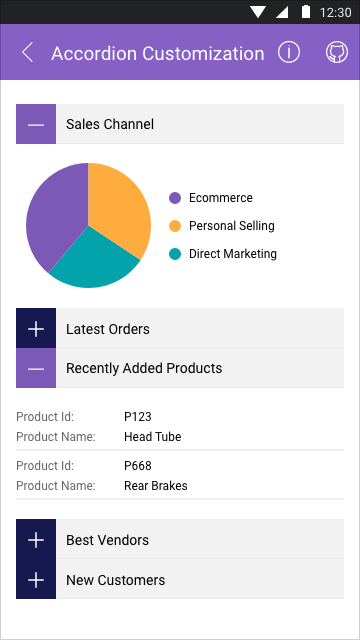
You have full control over the visual appearance of the Accordion items. Customize the item headers, border style, indicator text, font, size, color and order.
-
Collapsed and Expanded States
The Accordion items can contain any type of content, which can clutter your mobile or desktop application’s screen. By interacting with the headers of the control, the user can either show or hide individual items, making it easier to review each item separately or all items at the same time.
See the .NET MAUI Accordion docs: Expand and Collapse States
-
Expand and Collapse Animation
The Telerik UI for .NET MAUI Accordion comes with a customizable animation played when content is expanded or collapsed.
See the .NET MAUI Accordion docs: Expand and Collapse Animation
