.NET MAUI DropDownButton Configuration
The purpose of this help article is to show you the main configuration options of the DropDownButton.
Setting Content
Define the content inside the DropDownButton by setting the Content property (object) or ContentTemplate (DataTemplate) property.
The Content is responsible for the actual content displayed in the button. It can be set to string, View, object, etc.
Here are the scenarios for the visualization of Content or ContentTemplate inside the RadDropDownButton:
-
If
ContentTemplateis set, theViewreturned from theContentTemplate.CreateView()is displayed inside theRadDropDownButton.ControlTemplate, havingContentas itsBindingContext. -
If
ContentTemplateisDataTemplateSelector, first theDataTemplateis selected and then aViewis created from the chosen template usingContentas itsBindingContext. -
If
Contentis set to aViewandContentTemplateisn't set, theViewis displayed inside theRadDropDownButton.ControlTemplate. -
If
Contentis set to astringandContentTemplateisn't set, aLabelis displayed inside theRadDropDownButton.ControlTemplate. -
If
Contentis set to anobjectandContentTemplateisn't set, theToString()of theobjectis used and converted toLabelinside theRadDropDownButton.ControlTemplate.
This is an example of setting Content to a string:
<telerik:RadDropDownButton Content="Save as">
    <telerik:RadDropDownButton.DropDownContent>
        <VerticalStackLayout Padding="12" Spacing="6">
            <Label Text="Select format"
                   FontAttributes="Bold" />
            <telerik:RadTemplatedButton Content=".pdf" />
            <telerik:RadTemplatedButton Content=".txt" />
            <telerik:RadTemplatedButton Content=".docx" />
        </VerticalStackLayout>
    </telerik:RadDropDownButton.DropDownContent>
</telerik:RadDropDownButton>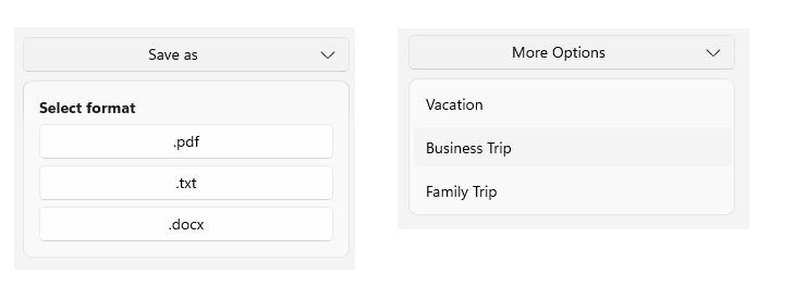
Drop-Down Indicator Configuration
The DropDownButton allows you to configure the indicator position, visibility, and style.
Setting Drop-Down Indicator Position
Use the DropDownIndicatorPosition (enum of type Telerik.Maui.Controls.DropDownButton.DropDownButtonIndicatorPosition) property to set the position of the drop-down indicator, presented inside the RadDropDownButton. The available options are:
- (Default)
Right—The drop-down indicator is positioned to the right of the content. Left—The drop-down indicator is positioned to the left of the content.Top—The drop-down indicator is positioned above the content.Bottom—The drop-down indicator is positioned below the content.
This is an example of setting the DropDownIndicatorPosition to Left:
<telerik:RadDropDownButton Content="Indicator position"
                           DropDownIndicatorPosition="Left"
                           x:Name="indicatorDropDownButton">
    <telerik:RadDropDownButton.DropDownContent>
        <Label Text="The drop-down content" />
    </telerik:RadDropDownButton.DropDownContent>
</telerik:RadDropDownButton>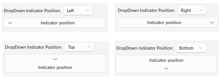
Setting Drop-Down Indicator Visibility
Use the IsDropDownIndicatorVisible (bool) property to show or hide the drop-down indicator, presented inside the RadDropDownButton.
This is an example of setting the IsDropDownIndicatorVisible to False:
<telerik:RadDropDownButton Content="No Indicator"
                           IsDropDownIndicatorVisible="False">
    <telerik:RadDropDownButton.DropDownContent>
        <Label Text="The drop-down content" />
    </telerik:RadDropDownButton.DropDownContent>
</telerik:RadDropDownButton>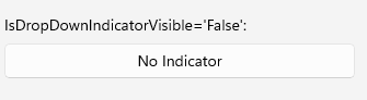
Text Alignment
Use the following properties to align the text in the button when Content is string and ContentTemplate is not set.
HorizontalTextAlignment(Microsoft.Maui.TextAlignment)—Specifies the horizontal alignment of theLabel.Text.VerticalTextAlignment(Microsoft.Maui.TextAlignment)—Specifies the vertical alignment of theLabel.Text.
Text Decoration
Use the TextDecorations (enum of type Microsoft.Maui.TextDecorations) property to specify the text decorations of the Label created when Content is string and ContentTemplate is not set.
Font Options
The following properties specify the font options that apply to the content when Content is string and ContentTemplate is not set.
FontFamily(string)—Specifies the font family of theLabel.Text.FontSize(double)—Specifies the font size in pixels of theLabel.Text.FontAttributes(Microsoft.Maui.Controls.FontAttributes)—Specifies the font attributes of theLabel.Text.
(Desktop-only) Auto-Open Behavior
The DropDownButton allows you to configure the auto-open behavior of the drop-down part of the button on desktop platforms through the AutoOpenDelay (TimeSpan) property. The default value is Zero.
Setting a non-zero value to the AutoOpenDelay property triggers the drop-down to open after the specified time has passed while the mouse pointer is hovering over the button. This behavior is available on Windows and Mac Catalyst.
This is an example of setting the AutoOpenDelay to 1 second:
<telerik:RadDropDownButton Content="Hover"
                           AutoOpenDelay="0:0:1">
    <telerik:RadDropDownButton.DropDownContent>
        <Label Text="Opened after a 1 second delay." />
    </telerik:RadDropDownButton.DropDownContent>
</telerik:RadDropDownButton>