.NET MAUI DropDownButton Overview
Updated on Aug 11, 2026
The Telerik UI for .NET MAUI DropDownButton combines a button surface with a configurable drop-down area that can host custom content. Use it when the primary action needs to expose related commands, options, or contextual UI without navigating away from the current view.
 Start Free Trial
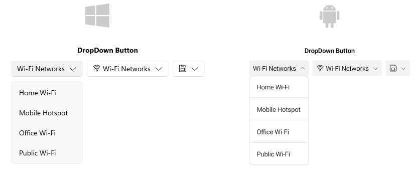
Key Features of the .NET MAUI DropDownButton
- Content and ContentTemplate—The DropDownButton allows you to define the content of the button surface using the
Contentproperty orContentTemplatefor more complex scenarios. - DropDownContent and DropDownContentTemplate—The button allows you to define the content of the drop-down part using the
DropDownContentproperty orDropDownContentTemplatefor more complex scenarios. - Drop-down indicator visibility and position—You can choose to show or hide the drop-down indicator and set its position relative to the button content.
- Drop-down position, size and offset—You can configure the position of the drop-down relative to the button, as well as its size and offset.
- Styling—You can apply different styling options to the button such as changing its background color, border color, border thickness, and styling the drop-down area.
- Animation—The control provides built-in open and close animations for the drop-down part, which you can customize or disable.
- Exhaustive number of events—You can use the events exposed by the DropDownButton to execute various operations on user interactions when the drop-down is opening, opened, and closed.
- Command—The DropDownButton provides a command, that executes when the button is clicked.