.NET MAUI DropDownButton Styling
The DropDownButton provides a set of styling options by exposing properties for customizing its visual appearance.
Styling the DropDownButton
To style the DropDownButton, you can use the following properties:
Background(Brush)—Specifies the background brush of the control.BorderBrush(Brush)—Specifies the border brush of the control.BorderColor(Color)—Specifies the border color of the control.BorderThickness(Thickness)—Specifies the border thickness of the control.CornerRadius(CornerRadius)—Specifies the corner radius of the control.Padding(Thickness)—Specifies the padding of the control.TextColor(Color)—Specifies the color of theLabel.Textcreated whenContentisstringandContentTemplateis not set.- All properties from the Button Configuration article can be applied through style.
Styling the Drop-Down
To style the drop-down part of the DropDownButton, use the following properties:
DropDownBackgroundColor(Color)—Specifies the background color of the drop-down.DropDownBorderColor(Color)—Specifies the border color of the drop-down.DropDownBorderThickness(Thickness)—Specifies the border thickness of the drop-down.DropDownCornerRadius(Thickness)—Specifies the corner radius of the drop-down border.DropDownContentPadding(Thickness)—Specifies the inner padding of the drop-down content area.
Styling the Drop-Down Indicator
Use the DropDownIndicatorStyle (Style with target type Label) property to style the drop-down indicator visual displayed inside the RadDropDownButton.
You can define the TextColor, FontSize, FontFamily, etc. to customize the drop-down indicator.
The DropDownButton uses the .NET MAUI Visual State Manager and defines a visual state group named CommonStates with the following visual states:
NormalOpenedMouseOverFocusedMouseOverPressedFocusedPressedFocusedDisabled
Example of Styling the DropDownButton
The following example demonstrates how to apply styling to the DropDownButton using the visual states.
1. Define the DropDownButton in XAML:
<telerik:RadDropDownButton Content="More Options"
                           Style="{StaticResource DropDownButtonStyle}"
                           DropDownIndicatorStyle="{StaticResource DropDownIndicatorStyle}">
    <telerik:RadDropDownButton.DropDownContent>
        <VerticalStackLayout Padding="12" Spacing="6">
            <Label Text="Actions"
                   FontAttributes="Bold" />
            <telerik:RadTemplatedButton Content="New" />
            <telerik:RadTemplatedButton Content="Open" />
            <telerik:RadTemplatedButton Content="Save" />
        </VerticalStackLayout>
    </telerik:RadDropDownButton.DropDownContent>
</telerik:RadDropDownButton>
2. Define the visual states in the page's resources:
<Style TargetType="Label" x:Key="DropDownIndicatorStyle">
    <Setter Property="FontSize" Value="16" />
    <Setter Property="TextColor" Value="#A30111"/>
</Style>
<Style TargetType="telerik:RadDropDownButton" x:Key="DropDownButtonStyle">
    <Setter Property="TextColor" Value="#00897B" />
    <Setter Property="BorderThickness" Value="1" />
    <Setter Property="BorderBrush" Value="#00897B" />
    <Setter Property="BackgroundColor" Value="#FFFFFF" />
    <Setter Property="VisualStateManager.VisualStateGroups">
        <VisualStateGroupList>
            <VisualStateGroup Name="CommonStates">
                <VisualState Name="Normal" />
                <VisualState Name="Focused" />
                <VisualState Name="Pressed">
                    <VisualState.Setters>
                        <Setter Property="TextColor" Value="#9900897B" />
                        <Setter Property="Background" Value="#E8F5F4" />
                    </VisualState.Setters>
                </VisualState>
                <VisualState Name="FocusedPressed">
                    <VisualState.Setters>
                        <Setter Property="TextColor" Value="#9900897B" />
                        <Setter Property="Background" Value="#E8F5F4" />
                    </VisualState.Setters>
                </VisualState>
                <VisualState Name="Opened">
                    <VisualState.Setters>
                        <Setter Property="telerik:RadDropDownButton.BorderBrush" Value="#00BCA9" />
                        <Setter Property="telerik:RadDropDownButton.BorderThickness" Value="1" />
                    </VisualState.Setters>
                </VisualState>
                <VisualState Name="PointerOver">
                    <VisualState.Setters>
                        <Setter Property="telerik:RadDropDownButton.BackgroundColor" Value="#F9F9F9" />
                    </VisualState.Setters>
                </VisualState>
                <VisualState Name="FocusedMouseOver">
                    <VisualState.Setters>
                        <Setter Property="telerik:RadDropDownButton.BackgroundColor" Value="#F9F9F9" />
                    </VisualState.Setters>
                </VisualState>
                <VisualState Name="Disabled">
                    <VisualState.Setters>
                        <Setter Property="Opacity" Value="0.6" />
                    </VisualState.Setters>
                </VisualState>
            </VisualStateGroup>
        </VisualStateGroupList>
    </Setter>
</Style>
3. Add the telerik namespace:
xmlns:telerik="http://schemas.telerik.com/2022/xaml/maui"This is the result on WinUI:

For a runnable example demonstrating the DropDownButton styling options, see the SDKBrowser Demo Application and go to the DropDownButton > Styling category.
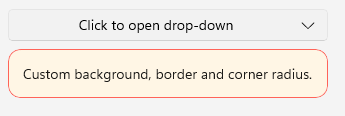
Example of Styling the Drop-Down
The following example demonstrates how to apply styling to the drop-down part of the button.
1. Define the DropDownButton in XAML:
<telerik:RadDropDownButton Content="Click to open drop-down"
                           DropDownBackgroundColor="#FFF6E5"
                           DropDownBorderColor="#FF6358"
                           DropDownBorderThickness="1"
                           DropDownCornerRadius="12">
    <telerik:RadDropDownButton.DropDownContent>
        <Label Text="Custom background, border and corner radius."
                Padding="12" />
    </telerik:RadDropDownButton.DropDownContent>
</telerik:RadDropDownButton>
2. Add the telerik namespace:
xmlns:telerik="http://schemas.telerik.com/2022/xaml/maui"This is the result on WinUI:
For a runnable example demonstrating the DropDownButton styling options, see the SDKBrowser Demo Application and go to the DropDownButton > Styling category.