.NET MAUI DropDownButton Animation
The .NET MAUI DropDownButton animates the drop-down part of the control as it opens and closes. The animation is enabled by default and can be configured by using the following properties:
-
DropDownAnimation(enum of typeTelerik.Maui.Controls.PopupAnimationType)—Defines the animation type when the drop-down part of the control is opened or closed. The available options are:- (Default)
Slide NoneFadeZoom
- (Default)
-
DropDownAnimationDuration(int)—Defines the duration of the drop-down opening and closing animation in milliseconds. The default value is220. -
DropDownAnimationEasing(Microsoft.Maui.Easing)—Defines the easing function for the drop-down opening and closing animation. The default value isEasing.Linear.
Example
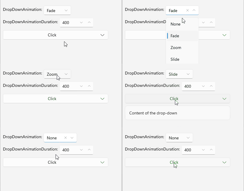
The following example demonstrates how to configure the drop-down animation for the DropDownButton.
1. Define the button in XAML:
<telerik:RadDropDownButton Content="Click"
                           x:Name="animationDropDownButton"
                           DropDownAnimation="Fade"
                           DropDownAnimationDuration="400">
    <telerik:RadDropDownButton.DropDownContent>
        <Label Text="Content of the drop-down"
                     Padding="12" />
    </telerik:RadDropDownButton.DropDownContent>
</telerik:RadDropDownButton>
2. Add the telerik namespace:
xmlns:telerik="http://schemas.telerik.com/2022/xaml/maui"This is the result on WinUI:
For a runnable example demonstrating the DropDownButton animation options, see the SDKBrowser Demo Application and go to the DropDownButton > Features category.