.NET MAUI DropDownButton Drop-Down Configuration
The purpose of this help article is to show you the main configuration options of the control.
Setting Content
Define the content inside the drop-down part of the button by setting the DropDownContent property (View) or DropDownContentTemplate (DataTemplate) property.
Setting DropDownContent
<telerik:RadDropDownButton Content="Save as">
    <telerik:RadDropDownButton.DropDownContent>
        <VerticalStackLayout Padding="12" Spacing="6">
            <Label Text="Select format"
                   FontAttributes="Bold" />
            <telerik:RadTemplatedButton Content=".pdf" />
            <telerik:RadTemplatedButton Content=".txt" />
            <telerik:RadTemplatedButton Content=".docx" />
        </VerticalStackLayout>
    </telerik:RadDropDownButton.DropDownContent>
</telerik:RadDropDownButton>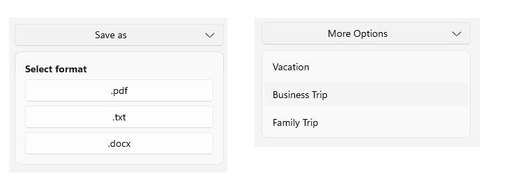
Setting DropDownContentTemplate
<DataTemplate x:Key="DropDownTemplate">
    <telerik:RadCollectionView ItemsSource="{Binding ItemsColors}"
                               SelectionMode="Single"
                               SelectedItem="{Binding PickedColor, Mode=TwoWay}">
        <telerik:RadCollectionView.ItemTemplate>
            <DataTemplate>
                <telerik:RadBorder WidthRequest="25"
                                   HeightRequest="25"
                                   BackgroundColor="{Binding CustomColor}" />
            </DataTemplate>
        </telerik:RadCollectionView.ItemTemplate>
        <telerik:RadCollectionView.ItemsLayout>
            <telerik:CollectionViewGridLayout SpanCount="3"
                                              ItemLength="30"
                                              HorizontalItemSpacing="2"
                                              VerticalItemSpacing="2" />
        </telerik:RadCollectionView.ItemsLayout>
    </telerik:RadCollectionView>
</DataTemplate>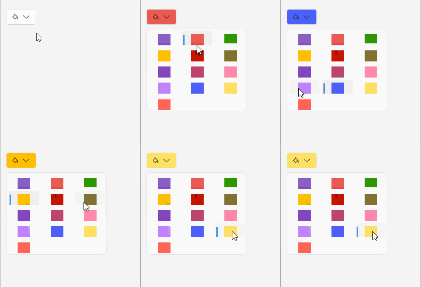
Setting Content Padding
Use the DropDownContentPadding (Thickness) property to define the inner spacing between the drop-down border and the content displayed in the drop-down part of the RadDropDownButton.
This is an example of setting the DropDownContentPadding property.
<telerik:RadDropDownButton Content="Content padding"
                           DropDownContentPadding="16">
    <telerik:RadDropDownButton.DropDownContent>
        <Label Text="Extra padding around the drop-down content." />
    </telerik:RadDropDownButton.DropDownContent>
</telerik:RadDropDownButton>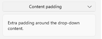
Setting Size
Use the following properties to control the size constraints of the drop-down part of the RadDropDownButton:
DropDownWidth(double)—Defines the width of the drop-down. When the value is not set explicitly, the drop-down width matches the width of theViewdisplayed asDropDownContent.DropDownHeight(double)—Defines the height of the drop-down.DropDownMinWidth(double)—Defines the minimum width of the drop-down.DropDownMinHeight(double)—Defines the minimum height of the drop-down.DropDownMaxWidth(double)—Defines the maximum width of the drop-down.DropDownMaxHeight(double)—Defines the maximum height of the drop-down.
This is an example of defining the size of the drop-down part of the RadDropDownButton using the size-related properties.
<telerik:RadDropDownButton Content="Fixed size"
                           DropDownWidth="240"
                           DropDownHeight="120">
    <telerik:RadDropDownButton.DropDownContent>
        <Label Text="Drop-down with explicit Width and Height." />
    </telerik:RadDropDownButton.DropDownContent>
</telerik:RadDropDownButton>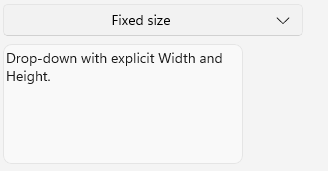
Setting Offset
Use the following properties to offset the drop-down relative to the button:
DropDownHorizontalOffset(double)—Defines the horizontal offset of the drop-down.DropDownVerticalOffset(double)—Defines the vertical offset of the drop-down.
This is an example of setting the horizontal and vertical offset properties.
<telerik:RadDropDownButton Content="Offsets"
                           DropDownVerticalOffset="16"
                           DropDownHorizontalOffset="16">
    <telerik:RadDropDownButton.DropDownContent>
        <Label Text="Positioned with additional vertical and horizontal offsets." />
    </telerik:RadDropDownButton.DropDownContent>
</telerik:RadDropDownButton>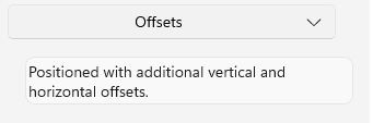
Setting Placement
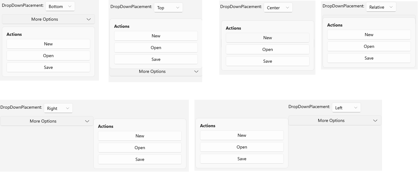
Use the DropDownPlacement (enum of type Telerik.Maui.Controls.PlacementMode) property to define where the drop-down is displayed relative to the button. The available options are:
- (Default)
Bottom—Displays the drop-down below the button. Right—Displays the drop-down to the right of the button.Left—Displays the drop-down to the left of the button.Top—Displays the drop-down above the button.Center—Displays the drop-down centered over the placement target.Relative—Displays the drop-down according to the configured offsets and placement target.
The DropDownPlacement property works together with DropDownHorizontalOffset and DropDownVerticalOffset, allowing you to position the drop-down for different layouts.
This is an example of setting the DropDownPlacement property to Top.
<telerik:RadDropDownButton Content="More Options"
                           WidthRequest="150"
                           x:Name="placementDropDownButton"
                           DropDownPlacement="Top">
    <telerik:RadDropDownButton.DropDownContent>
        <VerticalStackLayout Padding="12" Spacing="6">
            <Label Text="Actions"
                   FontAttributes="Bold" />
            <telerik:RadTemplatedButton Content="New" />
            <telerik:RadTemplatedButton Content="Open" />
            <telerik:RadTemplatedButton Content="Save" />
        </VerticalStackLayout>
    </telerik:RadDropDownButton.DropDownContent>
</telerik:RadDropDownButton>