New to Telerik UI for .NET MAUIStart a free 30-day trial

Quick Start with Telerik UI for .NET MAUI

Updated on May 19, 2026

This guide walks you through the essential steps to get Telerik UI for .NET MAUI up and running in your app.

Prerequisites

To create a .NET MAUI project, you need either of the following:

Step 1: Start Your Free Trial

  • If you already have an active license for Telerik UI for .NET MAUI, skip this step and continue with Step 1.

  • If you don't have an active license, follow the steps below to activate your free trial:

    1. Download the MAUI Installer and start the installation.

    2. Make sure that Telerik UI for .NET MAUI is selected and continue with the setup.

    3. Log in with your Telerik account and complete the installation.

    After the successful installation of .NET MAUI, the MAUI Installer activates your 30 day free trial. The installer also downloads your license key file, so you can skip the next step and continue with Step 2: Create a New MAUI Project.

Step 2: Download Your License Key File

To download and install your Telerik license key file:

  1. Go to the License Keys page in your Telerik account.
  2. Click the Download License Key button.
  3. Save the telerik-license.txt file to the appropriate location for your OS:
    • (on Windows) %AppData%\Telerik\telerik-license.txt
    • (on Mac or Linux) ~/.telerik/telerik-license.txt

This will make the license key available to all Telerik .NET apps that you develop on your local machine.

Step 3: Create a New MAUI Project

Choose your preferred IDE to create a new .NET MAUI project and install the Telerik UI for .NET MAUI controls:

Step 1:

  1. Open Visual Studio and select Create a new project in the start window.

  2. Select the .NET MAUI App template, and click the Next button.

    Telerik UI for .NET MAUI - create new MAUI project in Visual Studio

  3. Name your project and select a location.

  4. Choose the .NET framework for your project.

  5. Wait until Visual Studio restores all dependencies (when done, all exclamation marks in the Dependencies tree view item disappear).

  6. Click the Windows Machine button to build and run the app.

    Telerik UI for .NET MAUI - build and run in Visual Studio

If you encounter any issues creating the basic project, see the complete guide in Microsoft's .NET MAUI documentation.

Step 2: Install the Telerik UI for .NET MAUI Controls

The Telerik.UI.for.Maui package is available on the public NuGet.org registry (recommended) and on the authenticated Telerik NuGet server.

  1. In Visual Studio go to Tools > NuGet Package Manager > Manage NuGet Packages for Solution....

  2. Make sure the Package source is set to nuget.org.

  3. Select the Browse tab, enter Telerik.UI.for.Maui in the search box, and select the package.

  4. Select the checkbox for the target project, and then click Install.

From the Telerik NuGet Server (Alternative)

As the Telerik NuGet server requires authentication, the first step is to obtain an API key that you will use instead of a password. Using an API key instead of a password is a more secure approach, especially when working with .NET CLI or the NuGet.Config file.

  1. Go to the API Keys page in your Telerik account.

  2. Click Generate New Key +.

    Manage API Keys

  3. In the Key Note field, add a note that describes the API key.

  4. Click Generate Key.

  5. Select Copy and Close. Once you close the window, you can no longer copy the generated key. For security reasons, the API Keys page displays only a portion of the key.

  6. Store the generated NuGet API key as you will need it in the next steps. Whenever you need to authenticate your system with the Telerik NuGet server, use api-key as the username and your generated API key as the password.

API keys expire after two years. Telerik will send you an email when a key is about to expire, but we recommend that you set your own calendar reminder with information about where you used that key: file paths, project links, AzDO and GitHub Action variable names, and so on.

Add the Telerik NuGet source to Visual Studio:

  1. In Visual Studio go to Tools > NuGet Package Manager > Package Manager Settings.

  2. Select Package Sources and then click the + button to add a new package source.

  3. Enter a Name for the new package source, for example, telerik.com.

  4. Add the https://nuget.telerik.com/v3/index.json URL as a Source. Click OK.

  5. Whenever Visual Studio displays a dialog to enter credentials for nuget.telerik.com, use api-key as the username and your NuGet API key as the password.

    Add the Telerik NuGet Feed in Visual Studio

Install the Telerik UI for .NET MAUI package:

  1. Select the telerik.com Package source that you added earlier. As this is a private NuGet feed, you must authenticate using api-key as the username and your NuGet API key as the password.

  2. Select the Browse tab, enter maui in the search box, and then select the Telerik.UI.for.Maui package.

  3. Select the checkbox for the target project, and then click Install.

    Add Telerik UI for .NET MAUI package to the project

If your project uses the Telerik.UI.for.Maui.8.0.0 NuGet package and .NET 9, you must also install the Microsoft.Maui.Controls.Compatibility package. This is needed because Telerik UI for .NET MAUI version 8.0.0 depends on Microsoft's compatibility package, which is no longer included in the default .NET MAUI App project template. This dependency has been removed in Telerik UI for .NET MAUI version 9.0.0.

Step 3: Add the Telerik Namespace and Register the Controls

If your .NET MAUI project uses the default project template provided by Microsoft (not the Telerik project template), you must configure the Telerik namespace, register the controls, and call UseTelerik:

To use the controls in the Telerik UI for .NET MAUI library, add the Telerik namespace:

  1. In the MainPage.xaml file, locate the root element at the top.

  2. Paste the Telerik namespace below the last already available namespace:

    XAML
    xmlns:telerik="http://schemas.telerik.com/2022/xaml/maui"

To visualize the Telerik controls, register them in the MauiProgram.cs file of your project:

  1. In the MauiProgram.cs file, add the following using statement:

    C#
    using Telerik.Maui.Controls.Compatibility;
  2. In the CreateMauiApp method, call the UseTelerik extension method:

    C#
    <!-- Code omitted for brevity -->
    .UseMauiApp<App>()
    .UseTelerik()
    <!-- Code omitted for brevity -->

If your project uses the Telerik.UI.for.Maui.8.0.0 NuGet package and .NET 9, you must also install the Microsoft.Maui.Controls.Compatibility package. This is needed because Telerik UI for .NET MAUI version 8.0.0 depends on Microsoft's compatibility package, which is no longer included in the default .NET MAUI App project template. This dependency has been removed in Telerik UI for .NET MAUI version 9.0.0.

Step 4: Add a Telerik UI Component

In this step, you will replace the Button control in Microsoft's project template with a Telerik control. The Telerik UI for .NET MAUI TemplatedButton that you will use gives you full control over the Button's content.

To add the TemplatedButton control to the application:

  1. Delete the existing Button and its event handler:

    1. In the MainPage.xaml file, locate the Button with x:Name="CounterBtn" and delete it.
    2. In the MainPage.xaml.cs code-behind, locate the OnCounterClicked event handler and delete it.
  2. In the MainPage.xaml file, add the Telerik UI for .NET MAUI TemplatedButton and set its content to a string:

    XAML
    <telerik:RadTemplatedButton x:Name="templatedButton"
    	                        Content="My TemplatedButton Content" />

After adding the basic TemplatedButton and setting the initial content, you can hit F5 to confirm that the app is running. In the next steps, you will configure the control by adding some interactivity.

Step 5: Add Custom Content to the TemplatedButton

In this step, you will edit the code-behind file by adding logic that makes the TemplatedButton interactive: clicking the button will change its content and show a loading indicator for two seconds.

  1. In the MainPage.xaml file, set the new content of the TemplatedButton:

    • Change the content inside the button by removing the string and defining a Grid, which lets you organize the content in a structured layout.

    • In the Grid, add a BusyIndicator control and adjust its styling options.

    • In the Grid, add a label control for the loading indicator.

      XAML
      <telerik:RadTemplatedButton x:Name="templatedButton">
      	<telerik:RadTemplatedButton.Content>
      		<Grid ColumnDefinitions="Auto, *" HorizontalOptions="Center">
      			<telerik:RadBusyIndicator x:Name="busy"
      							AnimationContentHeightRequest="16"
      							AnimationContentColor="#80CBC4"
      							AnimationContentWidthRequest="16"
      							AnimationType="Animation4"
      							IsVisible="{Binding IsBusy,Source={x:Reference busy}}"
      							Margin="0, 0, 10, 0" />
      			<Label x:Name="loadingLabel" 
      		Grid.Column="1"
      		TextColor="{Binding Source={RelativeSource AncestorType={x:Type telerik:RadTemplatedButton}}, Path=TextColor}" 
      		Text="Load Content" />
      		</Grid>
      	</telerik:RadTemplatedButton.Content>
      </telerik:RadTemplatedButton>
  2. In the MainPage.xaml.cs file, add a new member method within the MainPage class. This new method adds the logic that controls the content of the button:

    C#
    private async void OnTemplatedButtonClicked(object sender, EventArgs e)
    {
    	this.busy.IsBusy = true;
    	this.loadingLabel.Text = "Loading Data";
    	await Task.Delay(TimeSpan.FromSeconds(2));
    	this.busy.IsBusy = false;
    	this.loadingLabel.Text = "Data is Loaded";
    }
  3. Finally, set the Clicked event and add some styles to the TemplatedButton. Use the various appearance options provided by the component, for example, TextColor, Background, BorderBrush, and so on:

    XAML
    <telerik:RadTemplatedButton x:Name="templatedButton"
    							TextColor="Black"
    							Background="#FAFAFA"
    							BorderBrush="LightGray"
    							BorderThickness="1"
    							Clicked="OnTemplatedButtonClicked"
    							HorizontalOptions="Center">
    	<telerik:RadTemplatedButton.Content>
    		<Grid ColumnDefinitions="Auto, *" HorizontalOptions="Center">
    			<telerik:RadBusyIndicator x:Name="busy"
    										AnimationContentHeightRequest="16"
    										AnimationContentColor="#80CBC4"
    										AnimationContentWidthRequest="16"
    										AnimationType="Animation4"
    										IsVisible="{Binding IsBusy,Source={x:Reference busy}}"
    										Margin="0, 0, 10, 0" />
    			<Label x:Name="loadingLabel" 
    					Grid.Column="1"
    					TextColor="{Binding Source={RelativeSource AncestorType={x:Type telerik:RadTemplatedButton}}, Path=TextColor}" 
    					Text="Load Content" />
    		</Grid>
    	</telerik:RadTemplatedButton.Content>
    </telerik:RadTemplatedButton>

To run the application, press F5. Congratulations, you created your first app with Telerik UI for .NET MAUI controls!

Step 1: Create a New MAUI Project

  1. Open Visual Studio Code and press Cmd/Ctrl+Shift+P. Enter .NET: New Project... in the input field.

  2. Select the .NET MAUI App option.

  3. Enter a name for your app.

  4. Select an empty folder for your project. If the folder is not empty, the file explorer opens again.

  5. Wait for Visual Studio Code to create the project and complete its configuration.

  6. Choose the Debug Target:

    1. Open a C# or XAML file, for example, App.xaml.

    2. Click the curly brackets symbol { } in the bottom right corner of Visual Studio Code.

      • If you are working on a Mac, select My Mac.
      • If you are working on Windows, select Local Machine.

      Telerik UI for .NET MAUI - select debug target in Visual Studio Code

  7. Press F5 to start a debug session. If Visual Studio Code prompts you to select a debugger, select C#.

If you encounter any issues creating the basic project, see the complete guide in Microsoft's .NET MAUI documentation.

Step 2: Install the Telerik UI for .NET MAUI Controls

The Telerik.UI.for.Maui package is available on the public NuGet.org registry (recommended) and on the authenticated Telerik NuGet server.

Navigate to your project's root directory in the terminal and run:

bash
dotnet add package Telerik.UI.for.Maui

From the Telerik NuGet Server (Alternative)

As the Telerik NuGet server requires authentication, the first step is to obtain an API key that you will use instead of a password. Using an API key instead of a password is a more secure approach, especially when working with .NET CLI or the NuGet.Config file.

  1. Go to the API Keys page in your Telerik account.

  2. Click Generate New Key +.

    Manage API Keys

  3. In the Key Note field, add a note that describes the API key.

  4. Click Generate Key.

  5. Select Copy and Close. Once you close the window, you can no longer copy the generated key. For security reasons, the API Keys page displays only a portion of the key.

  6. Store the generated NuGet API key as you will need it in the next steps. Whenever you need to authenticate your system with the Telerik NuGet server, use api-key as the username and your generated API key as the password.

API keys expire after two years. Telerik will send you an email when a key is about to expire, but we recommend that you set your own calendar reminder with information about where you used that key: file paths, project links, AzDO and GitHub Action variable names, and so on.

Use the command below to add the Telerik NuGet source. Replace the placeholder with the API key that you generated.

bash
dotnet nuget add source https://nuget.telerik.com/v3/index.json --name TelerikNuGetFeed --username api-key --password <YOUR-NUGET-API-KEY> --store-password-in-clear-text

See Microsoft's security best practices for more information on how to securely store your NuGet source credentials.

Then install the package:

bash
dotnet add package Telerik.UI.for.Maui --source TelerikNuGetFeed

Step 3: Add the Telerik Namespace and Register the Controls

If your .NET MAUI project uses the default project template provided by Microsoft (not the Telerik project template), you must configure the Telerik namespace, register the controls, and call UseTelerik:

To use the controls in the Telerik UI for .NET MAUI library, add the Telerik namespace:

  1. In the MainPage.xaml file, locate the root element at the top.

  2. Paste the Telerik namespace below the last already available namespace:

    XAML
    xmlns:telerik="http://schemas.telerik.com/2022/xaml/maui"

To visualize the Telerik controls, register them in the MauiProgram.cs file of your project:

  1. In the MauiProgram.cs file, add the following using statement:

    C#
    using Telerik.Maui.Controls.Compatibility;
  2. In the CreateMauiApp method, call the UseTelerik extension method:

    C#
    <!-- Code omitted for brevity -->
    .UseMauiApp<App>()
    .UseTelerik()
    <!-- Code omitted for brevity -->

If your project uses the Telerik.UI.for.Maui.8.0.0 NuGet package and .NET 9, you must also install the Microsoft.Maui.Controls.Compatibility package. This is needed because Telerik UI for .NET MAUI version 8.0.0 depends on Microsoft's compatibility package, which is no longer included in the default .NET MAUI App project template. This dependency has been removed in Telerik UI for .NET MAUI version 9.0.0.

Step 4: Add a Telerik UI Component

In this step, you will replace the Button control in Microsoft's project template with a Telerik control. The Telerik UI for .NET MAUI TemplatedButton that you will use gives you full control over the Button's content.

To add the TemplatedButton control to the application:

  1. Delete the existing Button and its event handler:

    1. In the MainPage.xaml file, locate the Button with x:Name="CounterBtn" and delete it.
    2. In the MainPage.xaml.cs code-behind, locate the OnCounterClicked event handler and delete it.
  2. In the MainPage.xaml file, add the Telerik UI for .NET MAUI TemplatedButton and set its content to a string:

    XAML
    <telerik:RadTemplatedButton x:Name="templatedButton"
    	                        Content="My TemplatedButton Content" />

After adding the basic TemplatedButton and setting the initial content, you can hit F5 to confirm that the app is running. In the next steps, you will configure the control by adding some interactivity.

Step 5: Add Custom Content to the TemplatedButton

In this step, you will edit the code-behind file by adding logic that makes the TemplatedButton interactive: clicking the button will change its content and show a loading indicator for two seconds.

  1. In the MainPage.xaml file, set the new content of the TemplatedButton:

    • Change the content inside the button by removing the string and defining a Grid, which lets you organize the content in a structured layout.

    • In the Grid, add a BusyIndicator control and adjust its styling options.

    • In the Grid, add a label control for the loading indicator.

      XAML
      <telerik:RadTemplatedButton x:Name="templatedButton">
      	<telerik:RadTemplatedButton.Content>
      		<Grid ColumnDefinitions="Auto, *" HorizontalOptions="Center">
      			<telerik:RadBusyIndicator x:Name="busy"
      							AnimationContentHeightRequest="16"
      							AnimationContentColor="#80CBC4"
      							AnimationContentWidthRequest="16"
      							AnimationType="Animation4"
      							IsVisible="{Binding IsBusy,Source={x:Reference busy}}"
      							Margin="0, 0, 10, 0" />
      			<Label x:Name="loadingLabel" 
      		Grid.Column="1"
      		TextColor="{Binding Source={RelativeSource AncestorType={x:Type telerik:RadTemplatedButton}}, Path=TextColor}" 
      		Text="Load Content" />
      		</Grid>
      	</telerik:RadTemplatedButton.Content>
      </telerik:RadTemplatedButton>
  2. In the MainPage.xaml.cs file, add a new member method within the MainPage class. This new method adds the logic that controls the content of the button:

    C#
    private async void OnTemplatedButtonClicked(object sender, EventArgs e)
    {
    	this.busy.IsBusy = true;
    	this.loadingLabel.Text = "Loading Data";
    	await Task.Delay(TimeSpan.FromSeconds(2));
    	this.busy.IsBusy = false;
    	this.loadingLabel.Text = "Data is Loaded";
    }
  3. Finally, set the Clicked event and add some styles to the TemplatedButton. Use the various appearance options provided by the component, for example, TextColor, Background, BorderBrush, and so on:

    XAML
    <telerik:RadTemplatedButton x:Name="templatedButton"
    							TextColor="Black"
    							Background="#FAFAFA"
    							BorderBrush="LightGray"
    							BorderThickness="1"
    							Clicked="OnTemplatedButtonClicked"
    							HorizontalOptions="Center">
    	<telerik:RadTemplatedButton.Content>
    		<Grid ColumnDefinitions="Auto, *" HorizontalOptions="Center">
    			<telerik:RadBusyIndicator x:Name="busy"
    										AnimationContentHeightRequest="16"
    										AnimationContentColor="#80CBC4"
    										AnimationContentWidthRequest="16"
    										AnimationType="Animation4"
    										IsVisible="{Binding IsBusy,Source={x:Reference busy}}"
    										Margin="0, 0, 10, 0" />
    			<Label x:Name="loadingLabel" 
    					Grid.Column="1"
    					TextColor="{Binding Source={RelativeSource AncestorType={x:Type telerik:RadTemplatedButton}}, Path=TextColor}" 
    					Text="Load Content" />
    		</Grid>
    	</telerik:RadTemplatedButton.Content>
    </telerik:RadTemplatedButton>

To run the application, press F5. Congratulations, you created your first app with Telerik UI for .NET MAUI controls!

Next Steps

AI Components
AI Controls & Features
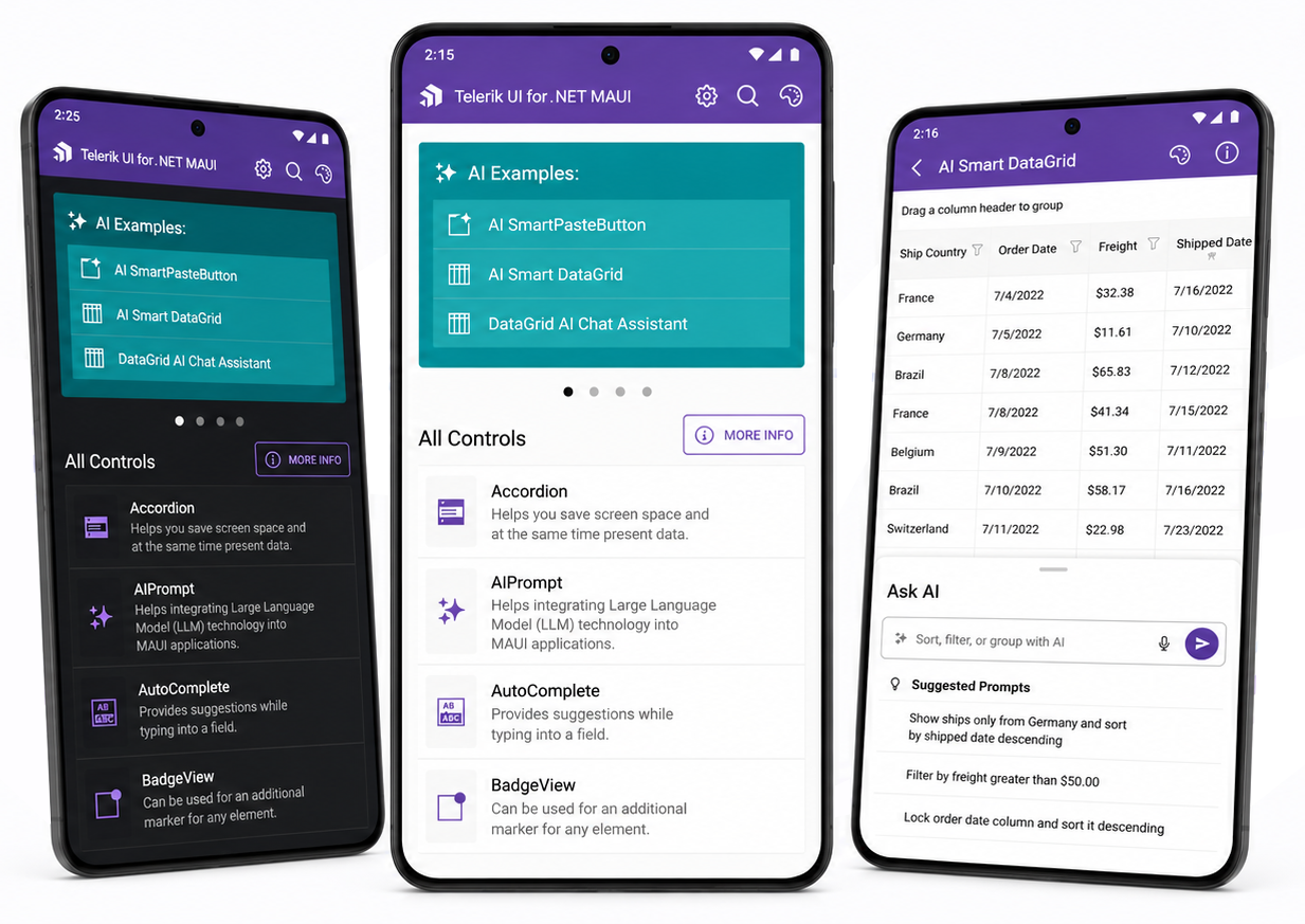
Explore the AI-powered controls and features available in Telerik UI for .NET MAUI.
AI Coding Assistant
MCP Server
Use the Telerik MCP server to get AI-assisted coding support for .NET MAUI development.
Use Controls
All Controls
Browse the full list of Telerik UI for .NET MAUI controls available for your application.
Sample Applications
Sample Apps
Explore sample applications built with Telerik UI for .NET MAUI to see the controls in action.
Theming and Styles
Styling
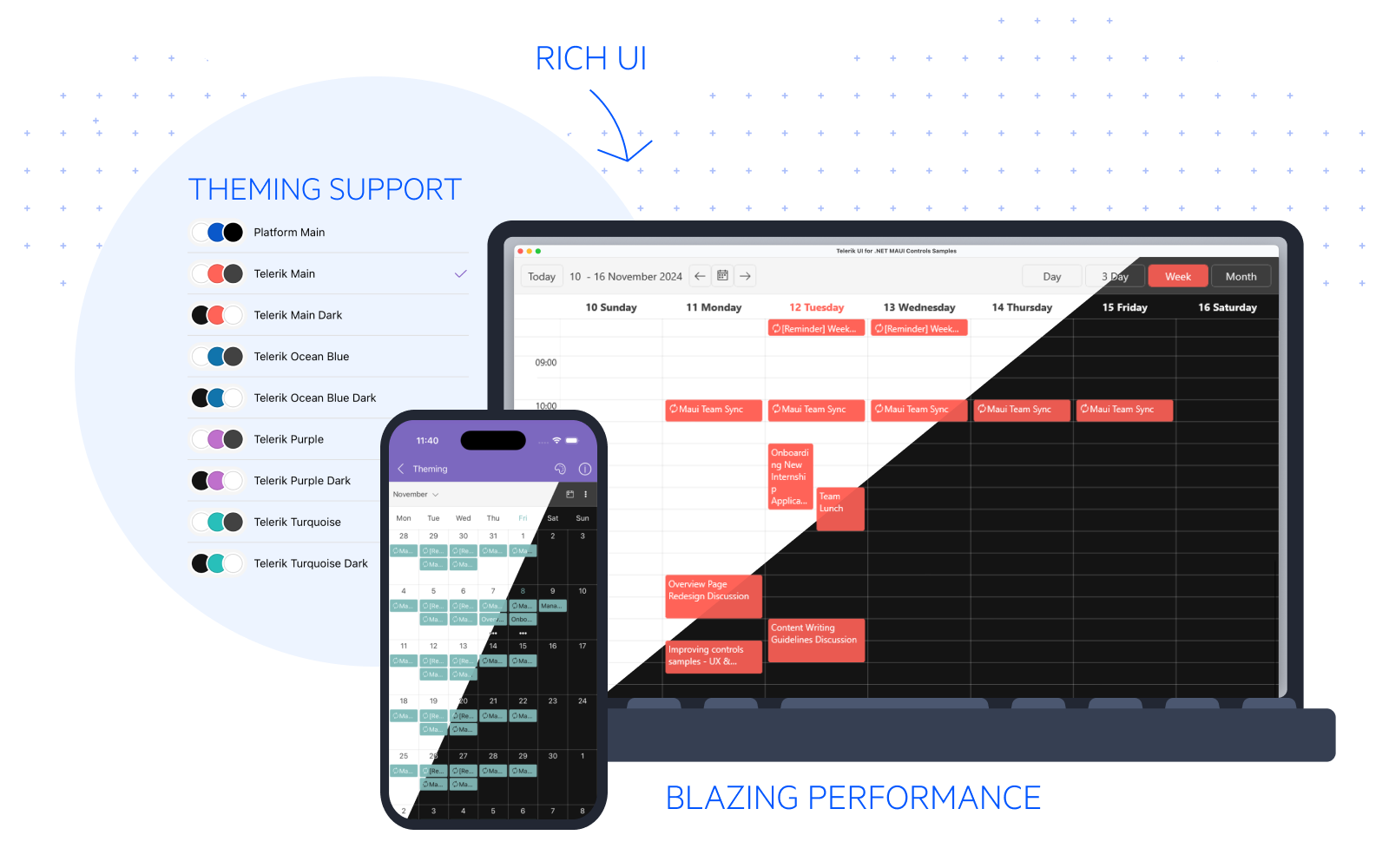
Learn how to apply and customize themes across your Telerik UI for .NET MAUI application.
Font Icons
Icons
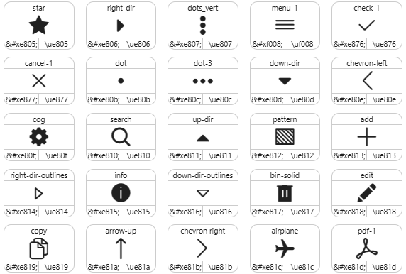
Use the built-in Telerik font icons to enhance your .NET MAUI application UI.

See Also