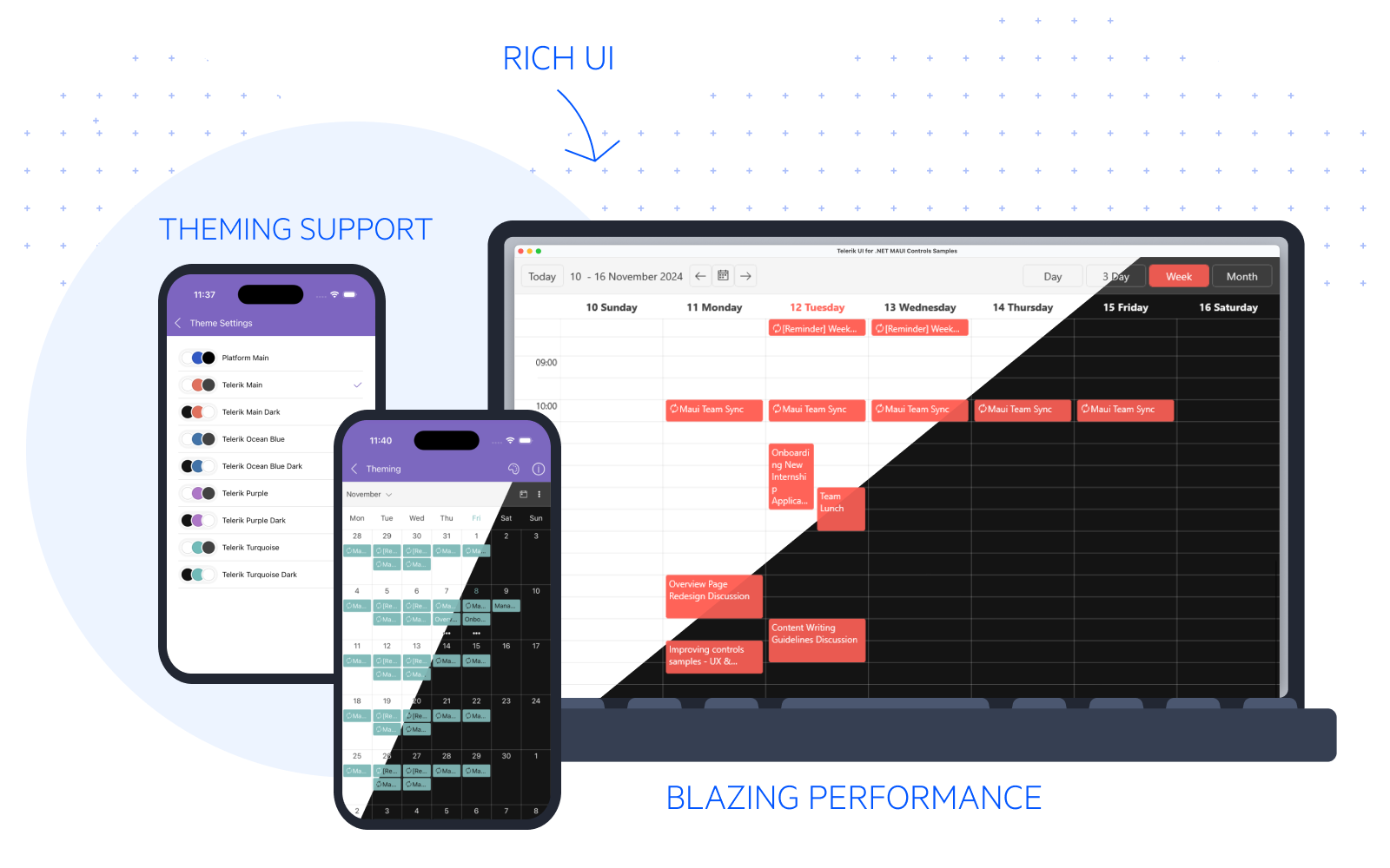
Theming Overview
Telerik UI for .NET MAUI comes with a built-in theme that controls the visual appearance of the components, including colors, borders, backgrounds, size, layout, position, and font size. The theme also offers multiple color variations to choose from.
In addition to the Telerik theme, Telerik UI for .NET MAUI also provides a Platform theme with light and dark variants. The platform theme closely resembles the light and dark modes of the device that runs your MAUI application.
The built-in Telerik UI for .NET MAUI theme and its swatches were introduced in version 8.0.0 (2024 Q4) as a preview. With Telerik UI for MAUI 11.0.0 (2025 Q2) the Telerik theme and its swatches are generally available.
Theme
A theme is a collection of styles and templates in XAML files, which determine the appearance of the Telerik .NET MAUI components, including fonts, colors, sizes, and layouts. Furthermore, you can apply the theme's styles to other parts of your app and achieve visual consistency.
Swatch
A theme swatch is a color variation of a theme. All swatches of a given theme use the same fonts, sizes, and layouts. On the other hand, the text colors, background colors, and border colors are different.
The Telerik .NET MAUI theme comes with a set of eight predefined swatches for both dark and light modes while the Platform theme offers a light and dark swatch.
| Theme | Swatch | Color | TelerikTheme enum |
|---|---|---|---|
| Platform | Light |  | PlatformLight |
| Platform | Dark |  | PlatformDark |
| Telerik | Main |  | TelerikMain |
| Telerik | Main Dark |  | TelerikMainDark |
| Telerik | Ocean Blue |  | TelerikOceanBlue |
| Telerik | Ocean Blue Dark |  | TelerikOceanBlueDark |
| Telerik | Purple |  | TelerikPurple |
| Telerik | Purple Dark |  | TelerikPurpleDark |
| Telerik | Turquoise |  | TelerikTurquoise |
| Telerik | Turquoise Dark |  | TelerikTurquoiseDark |
The TelerikTheme enum has a Default value which indicates the default look of the controls (without theming).
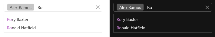
The next image shows the differences and similarities between the Purple and Purple Dark swatches when applied to the AutoComplete control.
You can explore and compare the built-in theme swatches in the Telerik .NET MAUI ControlsSamples App. Go to the Theming example of each component and use the Change Theme button to switch between the theme swatches.
Using the MAUI Theming
Before you can add Telerik Theming to your app, make sure that it is configured to use the Telerik UI for .NET MAUI components. For more details, see the Getting Started with Telerik UI for .NET MAUI in Visual Studio or Visual Studio Code articles.
1. Go to the .csproj file of your MAUI project and set UseTelerikTheming property to true in a separate PropertyGroup:
<PropertyGroup>
<UseTelerikTheming>true</UseTelerikTheming>
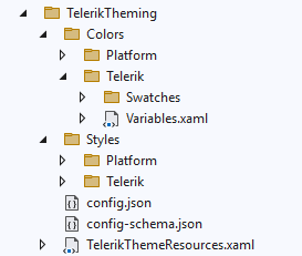
</PropertyGroup>2. Rebuild the solution—this will generate a new TelerikTheming folder containing all styles and resources needed for the Telerik .NET MAUI controls.
-
The
Colorsfolder contains thePlatformandTeleriksubfolders, each holding the resource dictionaries required for the theme swatches. Note that the colors are referenced through dynamic resources, so you can update them at runtime.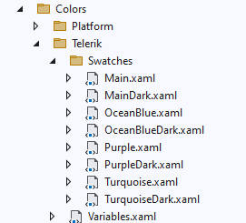
-
The
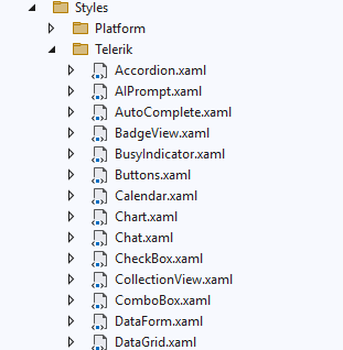
Stylesfolder contains thePlatformandTeleriksubfolders, each holding the styles and templates of the Telerik UI for .NET MAUI controls for the corresponding theme.- The styles are implemented through control-specific XAML files (see the next image).
- The styles for all base controls that are used to build complex controls like the DataGrid are in the
Core.xamlfile. - The control templates in the XAML files are specific to the Telerik theme and the Platform theme. They differ from the default control templates of the Telerik UI for .NET MAUI controls.
- The number of files in the
PlatformandTeleriksubfolders is different because both themes support a different number of controls.
The files in the
TelerikThemingfolder are auto-generated. Use them only as a reference and do not modify them. See Customizing the Telerik Theme for information on how to use these files to apply your own styles.
3. Go to the App.xaml file of your app and add the TelerikTheming resource dictionary to the application resources:
<Application.Resources>
    <ResourceDictionary>
        <ResourceDictionary.MergedDictionaries>
            <ResourceDictionary Source="Resources/Styles/Colors.xaml" />
            <ResourceDictionary Source="Resources/Styles/Styles.xaml" />
            <local:TelerikThemeResources />
        </ResourceDictionary.MergedDictionaries>
    </ResourceDictionary>
</Application.Resources>
4. Choose a theme by setting the Theme (enum of type TelerikTheme) property to the desired theme in the App.xaml:
<local:TelerikThemeResources Theme="TelerikPurple" />or AppTheme (enum of type TelerikTheme) property to the App.xaml.cs file.
TelerikThemeResources.AppTheme = TelerikTheme.TelerikPurple;The steps above apply the Telerik theme with its Purple swatch to the Telerik .NET MAUI components used across the app.
Example for ToggleButton and Telerik Theme with Purple Swatch
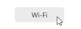
If you have the following RadToggleButton control:
<telerik:RadToggleButton x:Name="toggleButton"
                         Content="Wi-Fi" />
After applying the Purple swatch, the ToggleButton looks like this:
Some of the Telerik UI for .NET MAUI controls do not fully support the Telerik theming yet. These are Barcode, Chart, Gauge, Map.
Applying Theme Colors throughout the App
You can use the colors provided by the Telerik theme and its swatches. Each theme swatch provides a set of colors that you can use in parts of your app that aren't Telerik components. This allows you to achieve a consistent look & feel.
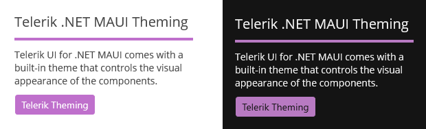
For example, you can use the RadAppSurfaceColor and RadOnAppSurfaceColor colors for background/text color respectively, and RadPrimaryColor for the accent color to match the appearance of the Telerik controls:
<VerticalStackLayout Spacing="10"
                     Padding="20"
                     BackgroundColor="{DynamicResource RadAppSurfaceColor}">
    <Label Text="Telerik .NET MAUI Theming"
           FontSize="20"
           TextColor="{DynamicResource RadOnAppSurfaceColor}" />
    <BoxView Color="{DynamicResource RadPrimaryColor}"
            HeightRequest="4" />
    <Label Text="Telerik UI for .NET MAUI comes with a built-in theme that controls the visual appearance of the components."
           FontSize="14"
           TextColor="{DynamicResource RadOnAppSurfaceColor}" />
    <telerik:RadToggleButton Content="Telerik Theming"
                             HorizontalOptions="Start" />
</VerticalStackLayout>
Here is the result with the Purple and Purple Dark swatches applied:
Changing the Initially Loaded Themes and Control's XAML Files
Once you enable the theming mechanism by setting UseTelerikTheming to True and then rebuild the app, the task generates a config.json file inside the TelerikTheming folder.
By editing the generated config.json file, you can:
- Control which theme-specific files are generated in the
TelerikThemingfolder. - Control which controls-specific XAML files are generated in the
TelerikThemingfolder.
You can remove themes and controls from the config.json file that won't be used in the application. In this way, the Telerik Theming task generates only the swatch and control XAML files listed in the config.json file.
Changing the Theme Swatch Dynamically
You can take advantage of the available theme swatches and change them at runtime based on the device theme. This allows the application to respond to changes in the device theme from light to dark and the other way around. For more details on the suggested implementation, see the Changing the Theme at Runtime KB article.