UI for .NET MAUI
.NET MAUI SegmentedControl
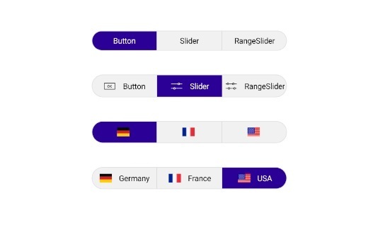
- .NET MAUI SegmentedControl displays a row of horizontally aligned, mutually exclusive option buttons that support data binding, custom item templates, flexible sizing, selection modes, per-segment enable/disable, keyboard navigation, and full styling — all configurable in pure XAML. The result — developers get a production-ready option-picker for any scenario, from a simple tab switcher to a fully themed and accessible segmented UI.
- Part of the Telerik UI for .NET MAUI library along with 70+ professionally-designed UI controls.
- Includes support, documentation, demos, learning resources and more!
-
.NET MAUI SegmentedControl — A Native Option-Picker for .NET MAUI
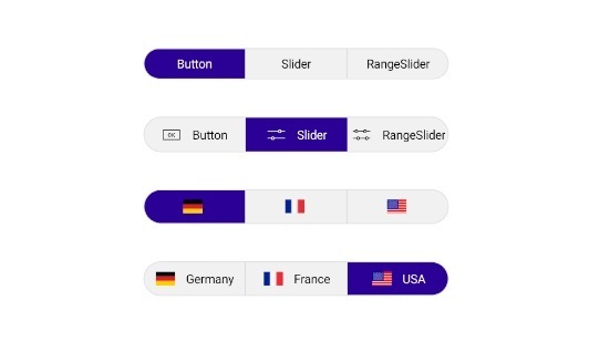
.NET MAUI SegmentedControl displays a row of horizontally aligned, mutually exclusive option buttons that support data binding, custom item templates, flexible sizing, selection modes, per-segment enable/disable, keyboard navigation, and full styling — all configurable in pure XAML. The result — developers get a production-ready option-picker for any scenario, from a simple tab switcher to a fully themed and accessible segmented UI.
-
Data Binding
The .NET MAUI SegmentedControl populates its segments from any `IEnumerable` collection through `ItemsSource`, with `DisplayMemberPath` for quick property-to-label binding and `ItemTemplate` / `DataTemplateSelector` for fully custom segment content. The result — developers can drive the control directly from view-model collections without any manual segment construction or code-behind.
-
Size Mode
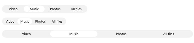
Each segment in the .NET MAUI SegmentedControl independently controls its width through the `SizeMode` property — `Star` for equal share of remaining space, `Auto` for content-driven sizing, and `Fixed` for an explicit `WidthRequest` — applied uniformly or per-segment through `ItemViewStyle`. The result — developers can mix and match sizing strategies to build everything from evenly spaced tab bars to compact fixed-width segment groups without custom layout wrappers.
-
Selection
The .NET MAUI SegmentedControl exposes `SelectedIndex` and `SelectedItem` for two-way data binding, a `SelectionChanged` event with added/removed item details, and three `SelectionMode` options — `Single`, `SingleDeselect`, and `None` — for precise control over how user interaction affects the current selection. The result — developers can wire the control into any MVVM architecture and handle selection state changes with a single binding, no code-behind required.
-
Item Tapped
The .NET MAUI SegmentedControl fires `ItemTapped` and executes `ItemTappedCommand` on every segment tap, regardless of whether the tapped segment is already selected or whether `SelectionMode` is set to `None`. The result — developers can handle repeat taps on the active segment or respond to any interaction independently of selection state, without custom gesture recognizers.
See the .NET MAUI SegmentedControl Item Tapped Documentation
-
Disabled Segments
The .NET MAUI SegmentedControl allows individual segments to be enabled or disabled at any time via `SetSegmentEnabled(index, bool)`, with `IsSegmentEnabled(index)` for state inspection — disabled segments ignore user interaction and are excluded from selection. The result — developers can reflect dynamic application state such as feature gating or permission-based UI directly in the control without rebuilding the item source.
See the .NET MAUI SegmentedControl Disabled Segments Documentation

-
Keyboard Navigation
The .NET MAUI SegmentedControl supports keyboard navigation on WinUI and MacCatalyst — `Tab` / `Shift+Tab` to enter and exit the control, `Left` / `Right Arrow` to move between segments, and `Enter` to select the focused segment. The result — desktop users can navigate and operate the SegmentedControl entirely without a pointer, meeting accessibility requirements for keyboard-driven interfaces.
See the .NET MAUI SegmentedControl Keyboard Navigation Documentation
-
Visual States
The .NET MAUI SegmentedControl integrates with the .NET MAUI Visual State Manager through a `CommonStates` group covering Normal, Selected, Pressed, SelectedPressed, Disabled, DisabledSelected, and the desktop-only states MouseOver, SelectedMouseOver, Focused, FocusedMouseOver, and FocusedSelected. The result — developers can define precise state-specific appearances in pure XAML, delivering consistent interaction feedback across both touch and desktop input models.
See the .NET MAUI SegmenetedControl Visual States Documentation
-
Styling
The .NET MAUI SegmentedControl offers granular styling through `ItemViewStyle` and `ItemViewStyleSelector` for per-segment appearance, `SelectionIndicatorStyle` for the active selection highlight, and `SeparatorStyle` for the dividers between segments — with `BorderColor`, `CornerRadius`, `BackgroundColor`, and `Padding` available directly on the control via `RadBorder` inheritance. The result — developers can fully theme every visual layer of the SegmentedControl in pure XAML, from individual segment typography to the overall control frame.

-
Migrating the SegmentedControl after 14.0.0 Version
The `RadSegmentedControl` was rebuilt from the ground up in Telerik UI for .NET MAUI 14.0.0, introducing full data binding, selection modes, item templates, size modes, a redesigned styling pipeline, and new item tap events — this guide maps every changed and removed API from the pre-14.0.0 version to its replacement in the new control. The result — development teams can migrate existing SegmentedControl implementations systematically, with side-by-side XAML and C# examples covering every breaking change from data binding and selection through to styling.
See the .NET MAU SegmentedControl Migrating the SegmentedControl after 14.0.0 Version Documentation