.NET MAUI SegmentedControl Overview
Updated on May 18, 2026
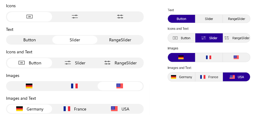
The Telerik UI for .NET MAUI SegmentedControl allows you to display a list of horizontally aligned, mutually exclusive options, which can be selected by the user. Each option is rendered as a button that can display text, an image, or custom content.
 Start Free Trial
Key Features of the .NET MAUI SegmentedControl
- Data binding—Populate the control with a collection of business objects by using the
ItemsSourceproperty and visualize the data throughDisplayMemberPath, a customItemTemplate, or aDataTemplateSelector. - Size mode—Configure how each segment sizes itself within the control through the
SizeModeproperty of the item view, which supportsStar,Auto, andFixedsizing. - Selection—Select segments programmatically or through user interaction by using the
SelectedIndexandSelectedItemproperties. The control supportsSingle,SingleDeselect, andNoneselection modes and raises aSelectionChangedevent. - Item tapped—Respond to tap interactions on the segments through the
ItemTappedevent and theItemTappedCommandcommand, regardless of the current selection. - Disabling segments—Disable the interactions with a specific segment by using the
SetSegmentEnabledmethod and check the current state through theIsSegmentEnabledmethod. - Right-to-left support—The SegmentedControl mirrors its layout when the
FlowDirectionis set toRightToLeft, providing full support for right-to-left languages and locales. - Keyboard navigation—Users can navigate between segments and change the selection through the keyboard on platforms that support it, improving the accessibility of the control.
- Styling—Customize the appearance of the segments, the selection indicator, and the separators between segments through the
ItemViewStyle,ItemViewStyleSelector,SelectionIndicatorStyle, andSeparatorStyleproperties.