.NET MAUI SegmentedControl Styling
The SegmentedControl provides a set of styling properties that allow you to customize the appearance of the segments, the selection indicator, and the separators between segments. The actual style that is applied to each visual element is a merger between the custom style and the default style.
Styling Properties
The SegmentedControl exposes the following styling properties:
ItemViewStyle(Stylewith target type ofRadSegmentedControlItemView)—Defines the style applied uniformly to each segment item view.ItemViewStyleSelector(IStyleSelector)—Provides per-item style logic forRadSegmentedControlItemViewinstances. When set, the selector is invoked with the business item and the container view to determine the applied style.SelectionIndicatorStyle(Stylewith target type ofRadBorder)—Defines the style applied to the visual selection indicator.SeparatorStyle(Stylewith target type ofRadBorder)—Defines the style applied to the separator rectangle rendered between adjacent segments.
In addition to the styling properties above, the SegmentedControl inherits from RadBorder, so you can customize the surrounding frame by setting the BorderColor, BackgroundColor, BorderThickness, CornerRadius, and Padding properties directly on the control.
Style the Segment Item
The RadSegmentedControlItemView exposes a number of bindable properties that can be set through the ItemViewStyle property of the SegmentedControl:
TextColor(Color)—Defines the color of the text in the unselected state.SelectedTextColor(Color)—Defines the color of the text in the selected state.BackgroundColor(Color)—Defines the background color of the segment in the unselected state.BorderColor(Color)—Defines the border color of the segment in the unselected state.BorderThickness(Thickness)—Defines the border thickness of the segment.CornerRadius(CornerRadius)—Defines the corner radius of the segment.Padding(Thickness)—Defines the padding inside the segment.FontSize(double)—Defines the font size of the segment text.FontFamily(string)—Defines the font family of the segment text.FontAttributes(FontAttributes)—Defines the font attributes of the segment text.HorizontalTextAlignment(TextAlignment)—Defines the horizontal alignment of the text.VerticalTextAlignment(TextAlignment)—Defines the vertical alignment of the text.SizeMode(SegmentedControlSizeMode)—Defines how the segment sizes itself. For more information, see the Size Mode article.
The following example demonstrates how to apply a style to the segments:
<Style x:Key="SegmentItemView" TargetType="telerik:RadSegmentedControlItemView">
    <Setter Property="CornerRadius" Value="4" />
    <Setter Property="TextColor" Value="#8660C5" />
    <Setter Property="SelectedTextColor" Value="White" />
    <Setter Property="FontAttributes" Value="Bold" />
    <Setter Property="Margin" Value="1, 0" />
</Style>
Style the Selection Indicator
Customize the selection indicator by providing a Style targeting RadBorder:
<Style x:Key="SelectedSegmentIndicatorStyle" TargetType="telerik:RadBorder">
    <Setter Property="BackgroundColor" Value="#8660C5" />
    <Setter Property="CornerRadius" Value="4" />
    <Setter Property="Padding" Value="2" />
</Style>
Style the Separator
Customize the separator between segments by providing a Style targeting RadBorder:
<Style x:Key="SegmentSeparatorStyle" TargetType="telerik:RadBorder">
    <Setter Property="WidthRequest" Value="2" />
    <Setter Property="BackgroundColor" Value="#C4B5FD" />
    <Setter Property="Margin" Value="0, 4" />
</Style>
Apply Styles to Segments, Selection Indicator, and Separator
Apply the defined styles to the SegmentedControl through its ItemViewStyle, SelectionIndicatorStyle, and SeparatorStyle properties:
<telerik:RadSegmentedControl x:Name="segmentControl"
                             ItemViewStyle="{StaticResource SegmentItemView}"
                             SelectionIndicatorStyle="{StaticResource SelectedSegmentIndicatorStyle}"
                             SeparatorStyle="{StaticResource SegmentSeparatorStyle}"
                             BorderColor="#7C3AED"
                             BackgroundColor="#1A7C3AED"
                             BorderThickness="1"
                             CornerRadius="8"
                             VerticalOptions="Start">
    <telerik:RadSegmentedControl.ItemsSource>
        <x:Array Type="{x:Type x:String}">
            <x:String>Popular</x:String>
            <x:String>Library</x:String>
            <x:String>Playlists</x:String>
            <x:String>Friends</x:String>
        </x:Array>
    </telerik:RadSegmentedControl.ItemsSource>
</telerik:RadSegmentedControl>
The following image shows the end result:

Example with Style Selector
When segments need to be styled differently based on their data, use the ItemViewStyleSelector property to assign a style on a per-item basis.
1. Define the styles and the style selector in the resources:
<Style TargetType="Label">
    <Setter Property="VerticalTextAlignment" Value="Center" />
    <Setter Property="HorizontalTextAlignment" Value="Center" />
</Style>
<Style x:Key="AllStyle" TargetType="telerik:RadSegmentedControlItemView">
    <Setter Property="SelectedTextColor" Value="#000000" />
    <Setter Property="TextColor" Value="#00897B" />
    <Setter Property="BorderColor" Value="#80CBC4" />
    <Setter Property="BorderThickness" Value="1" />
    <Setter Property="CornerRadius" Value="0" />
    <Setter Property="Padding" Value="8" />
    <Setter Property="Margin" Value="2, 0" />
</Style>
<Style x:Key="BookingStyle" TargetType="telerik:RadSegmentedControlItemView">
    <Setter Property="SelectedTextColor" Value="#7350B0" />
    <Setter Property="TextColor" Value="#8660C5" />
    <Setter Property="BorderColor" Value="#908660C5" />
    <Setter Property="BorderThickness" Value="2" />
    <Setter Property="CornerRadius" Value="1" />
    <Setter Property="Padding" Value="8" />
    <Setter Property="Margin" Value="2, 0" />
</Style>
<Style x:Key="RadSegmentedControlSelectionIndicatorStyle" TargetType="telerik:RadBorder">
    <Setter Property="BackgroundColor" Value="#BFE5E1" />
    <Setter Property="CornerRadius" Value="1" />
    <Setter Property="Padding" Value="5" />
    <Setter Property="Margin" Value="4, 2" />
</Style>
<Style x:Key="RadSegmentedControlSeparatorStyle" TargetType="telerik:RadBorder">
    <Setter Property="WidthRequest" Value="0" />
    <Setter Property="BackgroundColor" Value="Transparent" />
</Style>
<local:BookingStyleSelector x:Key="FileCategoryStyleSelector"
                            AllStyle="{StaticResource AllStyle}"
                            BookingStyle="{StaticResource BookingStyle}" />
2. Implement the IStyleSelector:
public class BookingStyleSelector : IStyleSelector
{
public Style BookingStyle { get; set; }
public Style AllStyle { get; set; }
public Style SelectStyle(object item, BindableObject bindable)
{
var data = item as SegmentItem;
if (data == null)
{
return null;
}
return data.Category == "Calendar" ? this.BookingStyle : this.AllStyle;
}
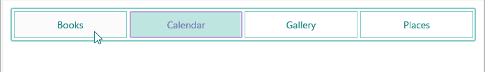
}3. Apply the selector to the SegmentedControl:
<telerik:RadSegmentedControl ItemsSource="{Binding FileCategories}"
                             DisplayMemberPath="Category"
                             ItemViewStyleSelector="{StaticResource FileCategoryStyleSelector}"
                             SelectionIndicatorStyle="{StaticResource RadSegmentedControlSelectionIndicatorStyle}"
                             SeparatorStyle="{StaticResource RadSegmentedControlSeparatorStyle}"
                             BorderBrush="#80CBC4"
                             BackgroundColor="#FFF"
                             CornerRadius="2"
                             BorderThickness="2" Padding="1, 3" />
This is the result:
For runnable examples demonstrating the SegmentedControl Styling options, see the SDKBrowser Demo Application and go to the SegmentedControl > Styling category.