.NET MAUI SegmentedControl Data Binding
When the segments of the SegmentedControl are populated from a collection of business objects rather than plain strings, data binding is necessary to correctly visualize the data. The SegmentedControl supports data binding through the DisplayMemberPath property and the ItemTemplate property.
Populate with Data
To populate the SegmentedControl with data, use the following properties:
ItemsSource(IEnumerable)—Defines the collection of the items that will populate the control with data. The control supports both observable and static collections.DisplayMemberPath(string)—Defines the name of the property which will be visualized inside each segment.
If DisplayMemberPath is not set, the ToString implementation of the business object will be visualized. Use DisplayMemberPath to visualize a specific property from the bound business object.
The following example demonstrates how to bind the ItemsSource of the control and specify the property used for display:
1. Define a model class:
public class SegmentItem
{
    public string Icon { get; set; }

    public string Category { get; set; }

    public string Description { get; set; }
}
2. Define a ViewModel that exposes a collection of items:
public class ViewModel : NotifyPropertyChangedBase
{
public ViewModel()
{
this.FileCategories = new ObservableCollection<SegmentItem>
{
new SegmentItem { Icon = "\ue847", Category = "Books", Description = "Browse and manage your book collection, reading lists, and bookmarks." },
new SegmentItem { Icon = "\ue866", Category = "Calendar", Description = "View and manage your upcoming events, appointments, and reminders." },
new SegmentItem { Icon = "\ue869", Category = "Gallery", Description = "Explore and organize your photos, albums, and media files." },
new SegmentItem { Icon = "\ue83d", Category = "Places", Description = "Discover and save your favorite locations, venues, and points of interest." },
};
}
public ObservableCollection<SegmentItem> FileCategories { get; }
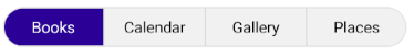
}3. Bind the ItemsSource of the control and specify the property used for display:
<telerik:RadSegmentedControl ItemsSource="{Binding FileCategories}"
                             DisplayMemberPath="Category"/>
This is the result:
Define Item Appearance
To customize the appearance of each segment, set the ItemTemplate property to a DataTemplate.
Here is an example with ItemTemplate:
1. Create a sample model:
public class SegmentItem
{
    public string Icon { get; set; }

    public string Category { get; set; }

    public string Description { get; set; }
}
2. Create a ViewModel:
public class ViewModel : NotifyPropertyChangedBase
{
public ViewModel()
{
this.FileCategories = new ObservableCollection<SegmentItem>
{
new SegmentItem { Icon = "\ue847", Category = "Books", Description = "Browse and manage your book collection, reading lists, and bookmarks." },
new SegmentItem { Icon = "\ue866", Category = "Calendar", Description = "View and manage your upcoming events, appointments, and reminders." },
new SegmentItem { Icon = "\ue869", Category = "Gallery", Description = "Explore and organize your photos, albums, and media files." },
new SegmentItem { Icon = "\ue83d", Category = "Places", Description = "Discover and save your favorite locations, venues, and points of interest." },
};
}
public ObservableCollection<SegmentItem> FileCategories { get; }
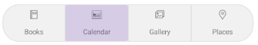
}3. Define the SegmentedControl with a sample ItemTemplate:
<telerik:RadSegmentedControl ItemsSource="{Binding FileCategories}"
                             SelectionIndicatorStyle="{StaticResource SelectedSegmentIndicatorStyle}">
    <telerik:RadSegmentedControl.ItemTemplate>
        <DataTemplate>
            <VerticalStackLayout Spacing="10">
                <Label Text="{Binding Icon}"
                       VerticalTextAlignment="Center"
                       FontFamily="TelerikFontExamples" />
                <Label Text="{Binding Category}"
                       FontSize="10"/>
            </VerticalStackLayout>
        </DataTemplate>
    </telerik:RadSegmentedControl.ItemTemplate>
</telerik:RadSegmentedControl>
4. Add a style for the selected segment:
<Style x:Key="SelectedSegmentIndicatorStyle" TargetType="telerik:RadBorder">
    <Setter Property="BackgroundColor" Value="#408660C5" />
    <Setter Property="CornerRadius" Value="4" />
    <Setter Property="Padding" Value="2" />
</Style>
5. Add the telerik namespace:
xmlns:telerik="http://schemas.telerik.com/2022/xaml/maui"This is the result:
Item Appearance at Runtime
When the SegmentedControl is bound to a collection of multiple data item objects and the appearance of each segment depends on a specific property of the business object, then you can define an item appearance at runtime by setting the ItemTemplate property to a DataTemplateSelector object.
1. Define the data templates and the selector:
<DataTemplate x:Key="CommonTemplate">
    <VerticalStackLayout Spacing="10">
        <Label Text="{Binding Icon}"
               FontFamily="TelerikFontExamples" />
        <Label Text="{Binding Category}"
               FontSize="10"/>
    </VerticalStackLayout>
</DataTemplate>
<DataTemplate x:Key="CalendarTemplate">
    <Label Text="{Binding Icon}"
           FontFamily="TelerikFontExamples"
           FontSize="20" />
</DataTemplate>
<local:EvenOddDataTemplateSelector x:Key="FileCategoriesTemplateSelector"
                                   CommonTemplate="{StaticResource CommonTemplate}"
                                   CalendarTemplate="{StaticResource CalendarTemplate}" />
2. Implement the DataTemplateSelector:
public class EvenOddDataTemplateSelector : DataTemplateSelector
{
public DataTemplate CalendarTemplate { get; set; }
public DataTemplate CommonTemplate { get; set; }
protected override DataTemplate OnSelectTemplate(object item, BindableObject container)
{
var data = item as SegmentItem;
if(data == null)
{
return null;
}
return data.Category == "Calendar" ? this.CalendarTemplate : this.CommonTemplate;
}
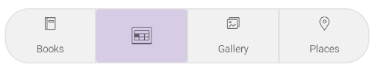
}3. Apply the selector to the ItemTemplate of the control:
<telerik:RadSegmentedControl ItemsSource="{Binding FileCategories}"
                             ItemTemplate="{StaticResource FileCategoriesTemplateSelector}"
                             SelectionIndicatorStyle="{StaticResource SelectedSegmentIndicatorStyle}" />
4. Add a sample model:
public class SegmentItem
{
    public string Icon { get; set; }

    public string Category { get; set; }

    public string Description { get; set; }
}
5. Create a ViewModel:
public class ViewModel : NotifyPropertyChangedBase
{
    public ViewModel()
    {
        this.FileCategories = new ObservableCollection<SegmentItem>
        {
            new SegmentItem { Icon = "\ue847", Category = "Books", Description = "Browse and manage your book collection, reading lists, and bookmarks." },
            new SegmentItem { Icon = "\ue866", Category = "Calendar", Description = "View and manage your upcoming events, appointments, and reminders." },
            new SegmentItem { Icon = "\ue869", Category = "Gallery", Description = "Explore and organize your photos, albums, and media files." },
            new SegmentItem { Icon = "\ue83d", Category = "Places", Description = "Discover and save your favorite locations, venues, and points of interest." },
        };
    }

    public ObservableCollection<SegmentItem> FileCategories { get; }
}
6. Add the telerik namespace:
xmlns:telerik="http://schemas.telerik.com/2022/xaml/maui"This is the result:
For a runnable example demonstrating the SegmentedControl data-binding scenarios, see the SDKBrowser Demo Application and go to the SegmentedControl > Data Binding category.