.NET MAUI SegmentedControl Size Mode
The SegmentedControl allows you to control how each segment sizes itself within the control through the SizeMode property of the RadSegmentedControlItemView.
The SizeMode property is of type Telerik.Maui.Controls.SegmentedControl.SegmentedControlSizeMode and supports the following values:
- (Default)
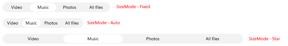
Star—The segment takes an equal share of the remaining width afterFixedandAutosegments are sized. Auto—The segment sizes itself to its desired (content-driven) width.Fixed—The segment uses itsWidthRequest, optionally clamped byMinimumWidthRequestandMaximumWidthRequestwhen those are explicitly set.
The SizeMode can be applied to all segments through an ItemViewStyle that targets RadSegmentedControlItemView.
The following example demonstrates how to apply the Star size mode to all segments:
<telerik:RadSegmentedControl SelectedIndex="1">
    <telerik:RadSegmentedControl.ItemViewStyle>
        <Style TargetType="telerik:RadSegmentedControlItemView">
            <Setter Property="SizeMode" Value="Star" />
        </Style>
    </telerik:RadSegmentedControl.ItemViewStyle>
    <telerik:RadSegmentedControl.ItemsSource>
        <x:Array Type="{x:Type x:String}">
            <x:String>Video</x:String>
            <x:String>Music</x:String>
            <x:String>Photos</x:String>
            <x:String>All files</x:String>
        </x:Array>
    </telerik:RadSegmentedControl.ItemsSource>
</telerik:RadSegmentedControl>
The following example demonstrates how to apply the Fixed size mode to all segments:
<telerik:RadSegmentedControl SelectedIndex="1"
                             HorizontalOptions="Start">
    <telerik:RadSegmentedControl.ItemViewStyle>
        <Style TargetType="telerik:RadSegmentedControlItemView">
            <Setter Property="SizeMode" Value="Fixed" />
            <Setter Property="WidthRequest" Value="86" />
        </Style>
    </telerik:RadSegmentedControl.ItemViewStyle>
    <telerik:RadSegmentedControl.ItemsSource>
        <x:Array Type="{x:Type x:String}">
            <x:String>Video</x:String>
            <x:String>Music</x:String>
            <x:String>Photos</x:String>
            <x:String>All files</x:String>
        </x:Array>
    </telerik:RadSegmentedControl.ItemsSource>
</telerik:RadSegmentedControl>
The following example demonstrates how to apply the Auto size mode to all segments:
<telerik:RadSegmentedControl SelectedIndex="1"
                             HorizontalOptions="Start">
    <telerik:RadSegmentedControl.ItemViewStyle>
        <Style TargetType="telerik:RadSegmentedControlItemView">
            <Setter Property="SizeMode" Value="Auto" />
        </Style>
    </telerik:RadSegmentedControl.ItemViewStyle>
    <telerik:RadSegmentedControl.ItemsSource>
        <x:Array Type="{x:Type x:String}">
            <x:String>Video</x:String>
            <x:String>Music</x:String>
            <x:String>Photos</x:String>
            <x:String>All files</x:String>
        </x:Array>
    </telerik:RadSegmentedControl.ItemsSource>
</telerik:RadSegmentedControl>
For a runnable example demonstrating the SegmentedControl Size Mode options, see the SDKBrowser Demo Application and go to the SegmentedControl > Size Mode category.