
UI for .NET MAUI
.NET MAUI BottomSheet
- Easily bring gesture-driven, themed, programmable bottom overlays to your mobile and desktop apps.
- Part of the Telerik UI for .NET MAUI library along with 70+ professionally-designed UI controls.
- Includes support, documentation, demos, learning resources and more!
-
Surface What Matters with the Telerik UI for .NET MAUI BottomSheet
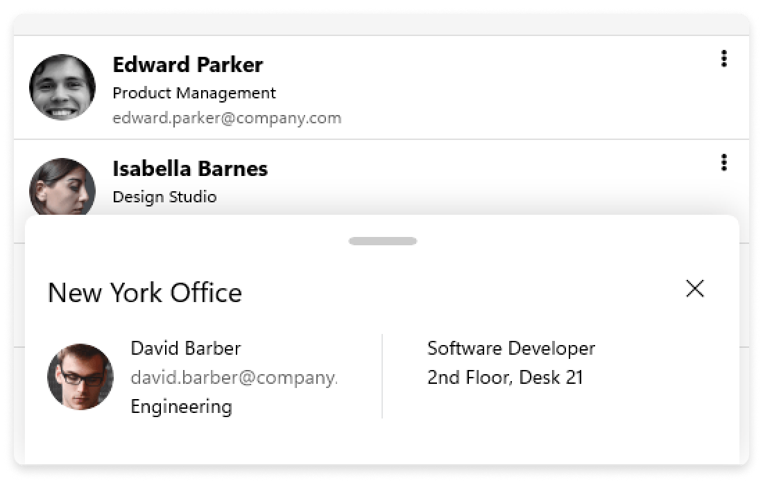
Give users quick access to contextual actions and content with the BottomSheet component - a flexible surface that slides up from the bottom of the screen. Perfect for filters, sharing menus, product details or supplementary workflows, it keeps people focused while revealing exactly what they need, when they need it.
-
BottomSheet Content
Render anything from simple menus to rich layouts. Drop in lists, forms, images or custom views and control sizing, peek height and layout to fit your scenario.
See the .NET MAUI BottomSheet Documentation: Content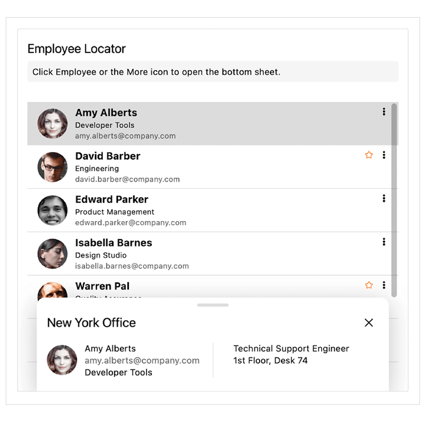
-
States
Guide the experience with built-in states such as Hidden, Collapsed, Half and Expanded. Configure default state, allowed transitions and snapping to keep interactions predictable.
See the .NET MAUI BottomSheet Documentation: States
-
Swipe
Allow better experience with intuitive gestures. Users can drag or swipe to expand, collapse or dismiss the BottomSheet. Fine-tune thresholds and velocity to match your app’s feel.
See the .NET MAUI BottomSheet Documentation: Swipe
-
Show/ Close API
Open and close the BottomSheet programmatically from any event - button taps, list selections or page load. Subscribe to open/close events for analytics, validation or dynamic content updates.
See the .NET MAUI BottomSheet Documentation: Show/ Close -
Theming
Match your brand out of the box. The BottomSheet supports the Telerik for .NET MAUI’s built-in themes and respects light/dark mode, typography and color tokens for a seamless fit.
See the .NET MAUI BottomSheet Documentation: Overview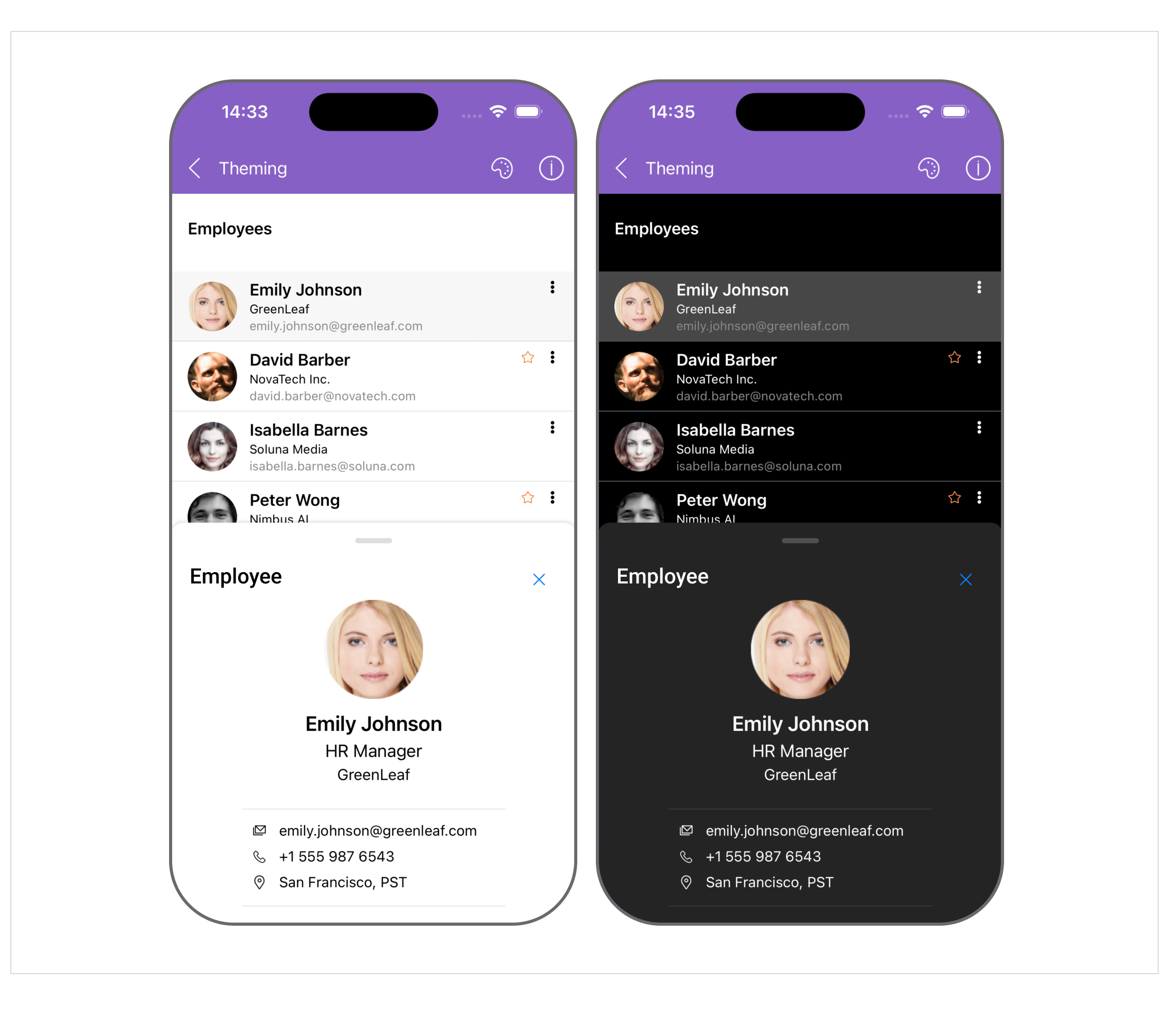
-
Animation
Smooth, performant animations make state changes feel natural. Customize duration to align with your motion design.
See the .NET MAUI BottomSheet Documentation: Animation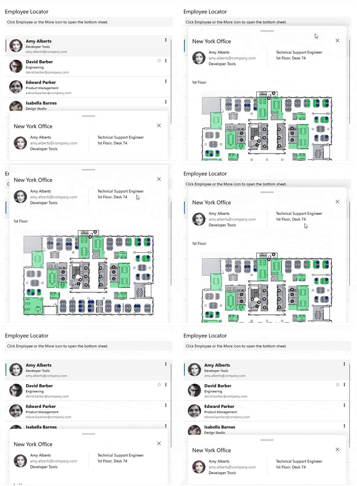
All UI for .NET MAUI Components
Data Controls
Data Visualization
Navigation & Layout
Charts
Editors
- TimeSpanPicker
- TimePicker
- TemplatedPicker
- Slider
- RichTextEditor
- RangeSlider
- NumericInput
- MaskedEntry
- ListPicker
- ImageEditor
- Entry
- Editor New
- DateTimePicker
- DatePicker
- ComboBox
- AutoComplete Updated
Calendar and Scheduling
Buttons
Interactivity & UX
Pdf Viewer
Document Processing
