
UI for ASP.NET Core
ASP.NET Core TreeList
- Visualize hierarchical data leveraging the powerful ASP.NET Core TreeList component.
- Part of the Telerik UI for ASP.NET Core library along with 120+ professionally designed UI components.
- Includes support, documentation, demos, virtual classrooms, Visual Studio Code Extensions and more!

-
Overview
The Telerik UI for ASP.NET Core TreeList is a data management component, in many aspects similar to the Grid, but providing the option to visualize and manage hierarchical data. It comes with many valuable built-in features, including paging, sorting, filtering, data editing, drag and drop, various export options and more. The component can be used in many scenarios, for example to list all employees of a company and group them under their managers, representing the organizational hierarchy.
See the ASP.NET Core TreeList demo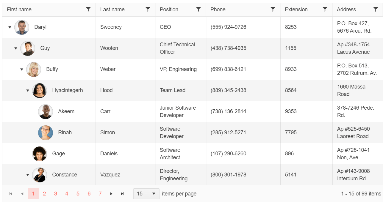
-
Data Binding
The ASP.NET Core TreeList component supports binding to various endpoints. You can configure it for lazy loading to make AJAX requests upon loading child nodes, sorting or filtering. You could also use the DataSource component to bind the control to static arrays, dynamic objects, local or remote data, OData or even SignalR.
Learn more about data binding the TreeList

-
Selection
The TreeList component comes with 20+ built-in themes, such as Default (our own styling), Material (based on the Material Design guidelines) and Bootstrap (which resembles the Bootstrap styling for better integration). You can easily customize any of the available themes with a few lines of CSS or create a new theme to match your colors and branding with the Telerik SASS ThemeBuilder application.
-
Filtering
Users can also apply multiple filter operands per column using the column filter option. Alternatively, users can take advantage of the filter row functionality by setting the Filterable->Mode property to Row. Based on the data type, a filtering row will be rendered in the underlying columns with corresponding editors such as TextBoxes for string values, NumericTextBoxes for numeric values, DatePickers for date values or templates defined by users.
See the TreeList Filter Row demo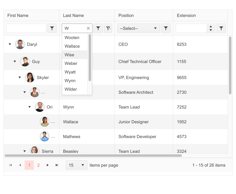
-
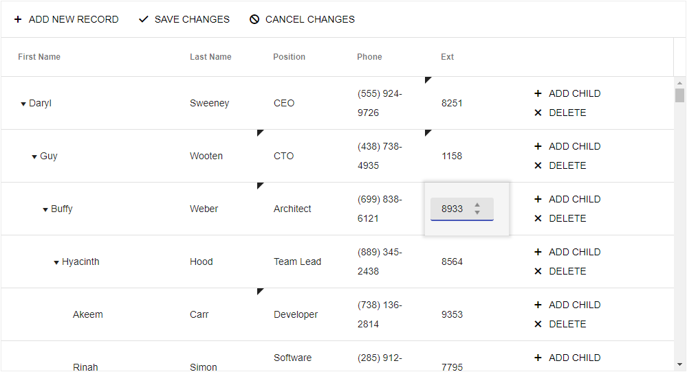
Editing
The Telerik UI for ASP.NET Core TreeList comes with built-in editing functionality that can be implemented by setting the model and configuring the transport. Users can edit data in the TreeList in three different ways:
- Inline editing puts the whole row in edit mode and lets you modify the content of any cell from it
- InCell editing puts only the selected cell in edit mode
- Popup editing has the component display a popup form, containing all values of the current record
-
Columns
For an ultimate user experience, there are several options available to manipulate Columns:
- Reorder columns: drag and drop a column to the position you want it to be
- Resize columns: to fit and display the data the way you want it
- Freeze columns: to always keep important information in sight
- Command columns: to show commands instead of data (e.g., buttons to initiate editing, saving or other custom data operations)
-
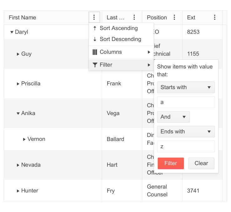
Column Menu
The Column Menu of the TreeList provides a built-in option to display a menu with column operations, such as:- Sort data in an ascending or descending order
- Choose which columns to display and which to hide
- Apply multiple filters to one or many columns to extract the information you need from the displayed data
-
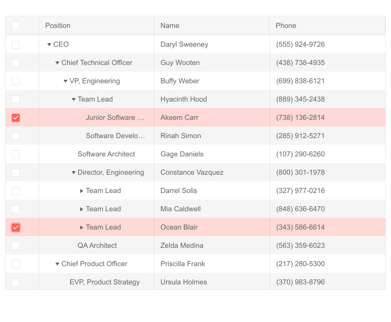
Drag and Drop
Users can drag and drop tree list items when the Editable.Move property is set to true. They can rearrange the order of the rows across all hierarchy levels of the TreeList, as the component would internally update the parentId field when such change is registered.
See the ASP.NET Core TreeList Drag and Drop demo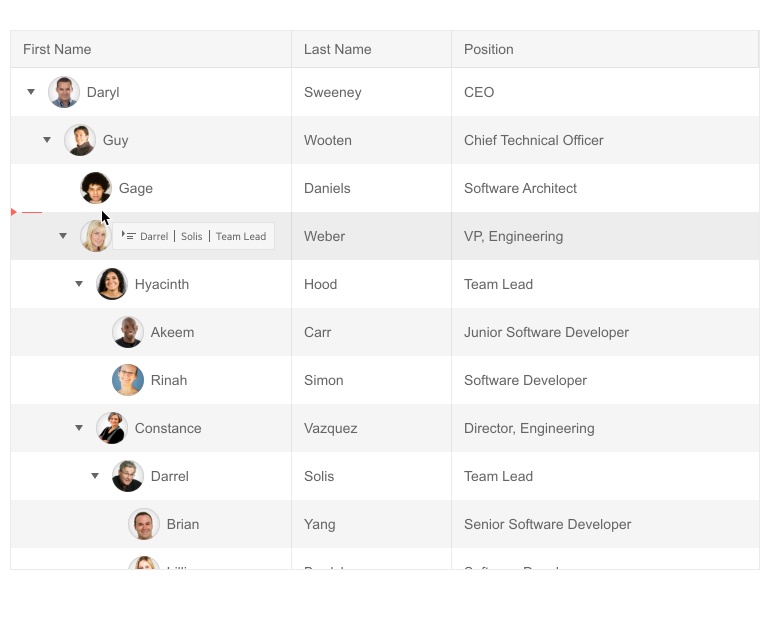
-
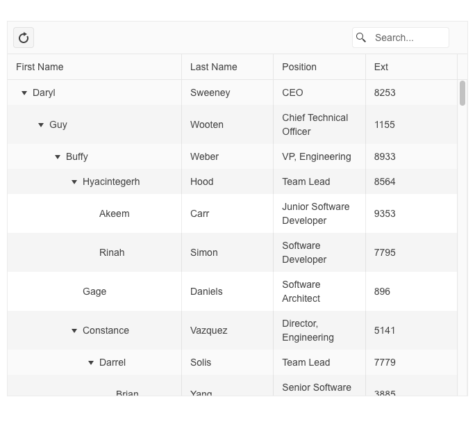
Search Panel
Sometimes the data in the TreeList component can be large and users would need an easy way to locate what they are looking for. That is why we have added a search box above the table.
The Search Panel feature allows easy location of specific records within the TreeList. Typing what you are looking for would filter the records in the TreeList and display the desired information along with the related items in the hierarchy. The feature allows configuration of the tree list fields that should be included in the search command.
See the Telerik UI for ASP.NET Core TreeList Search Panel demo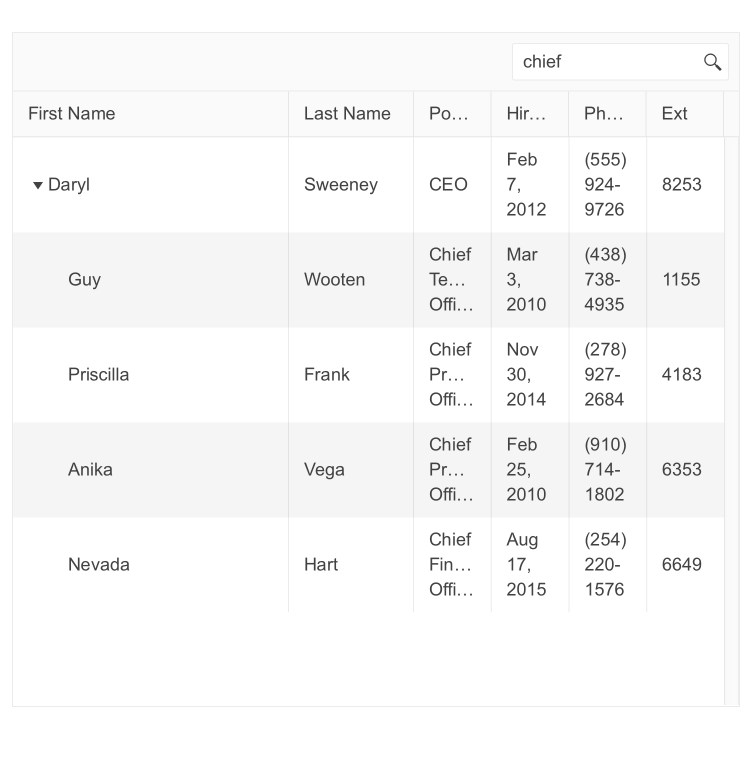
-
Multi-Column Headers
The multi-column headers feature of the TreeList allows you to stack several column headers under a common parent header to visually group relevant fields for your end users. The common header in turn can be a child of another upper MultiColumn header that can also span both columns and other headers. For example, you can set a top-level common header named “Personal Info,” under which you can define columns for LastName, Phone and another common header named “Location” which groups multiple related columns, such as Country, City, etc.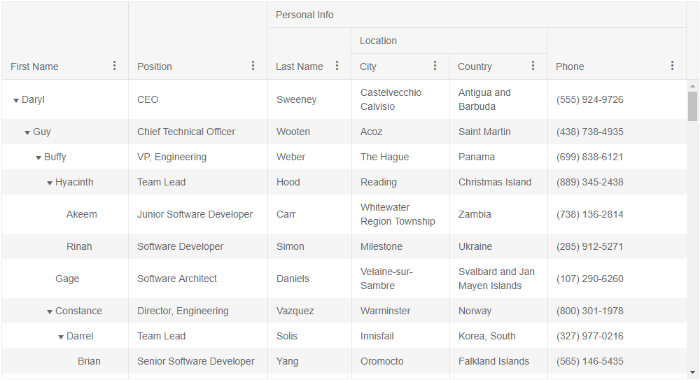
-
Toolbar Template
Further customization of the Telerik UI for ASP.NET Core TreeList is available through the Toolbar template. It gives you full control over the toolbar appearance, enabling you to specify your own layout with ease.
See Telerik UI for ASP.NET Core TreeList toolbar template demo
-
Row Template
The TreeList row template offers flexible customization for styling row appearance. In addition to text and numbers, you are also able to add images, icons and other elements for full control and a customized data look. The TreeList includes RowTemplate and AltRowTemplate so that you can render different content for the tree list alternating rows.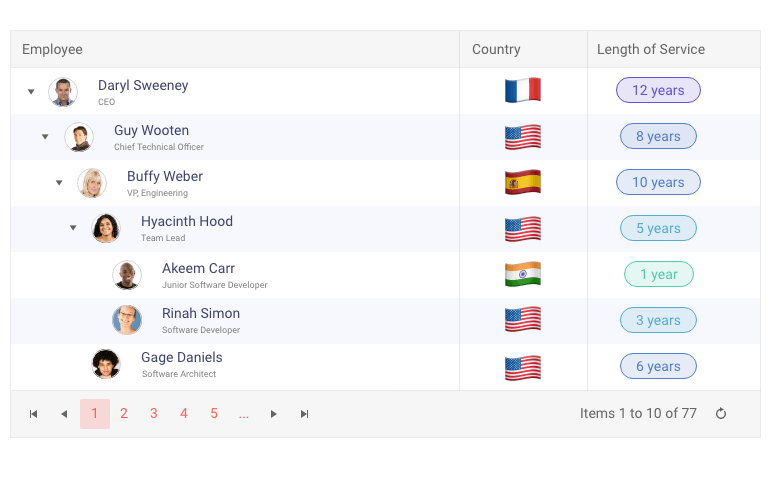
-
Aggregates
The TreeList component enables you to visualize aggregated results for each level of the hierarchical data. The built-in aggregate functions include Count, Sum, Average, etc. and can be displayed in each group footer.

-
Client-Side Paging
Working with large datasets can be overwhelming. That is why the TreeList component allows client-side pagination. You can enable paging by configuring the Pageable settings and predefining the displayed items per page, however users can still alter this for their convenience.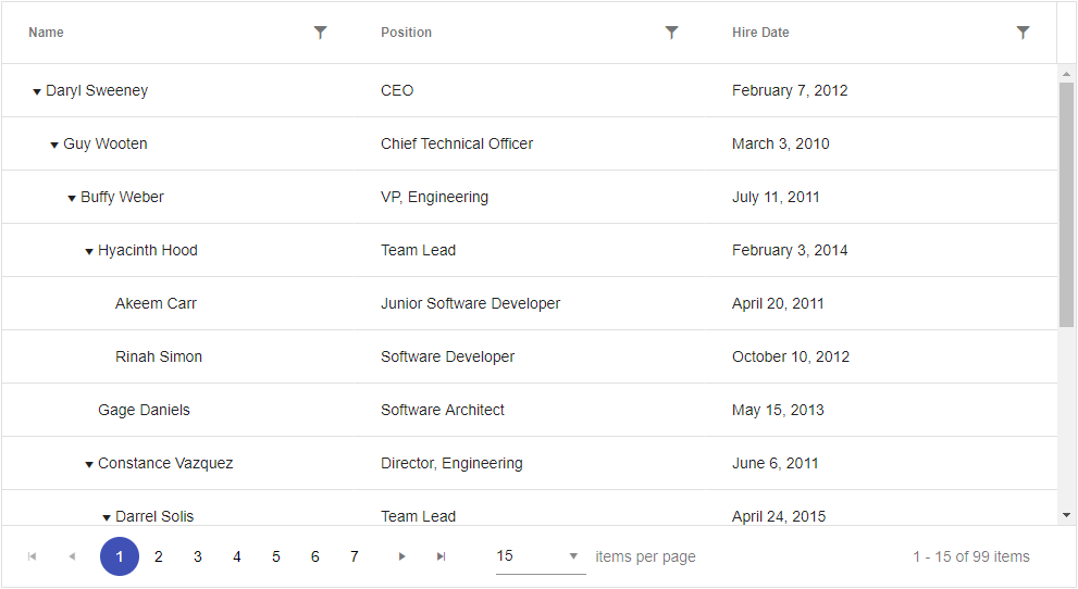
-
Persist State
Using the TreeList state management feature, you can easily save the user’s preferences and settings when they interact with the component and restore them when they log back in. Saving user preferences is achieved with the getOptions method and restoring them with the setOptions one.
-
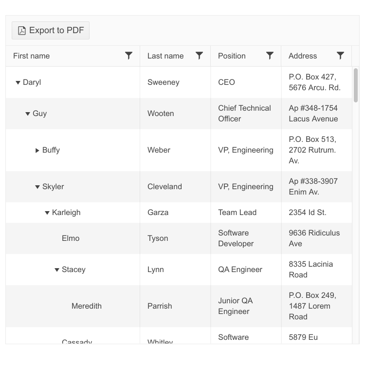
Export to PDF or Excel
You can enable the TreeList built-in PDF and Excel export functionality with a single line of code. Easily customize the exported file to include the exact content you need.
-
Events
The ASP.NET Core TreeList fires different events, depending on how the user has interacted with the component. Some events are related to data management, such as OnEdit, OnUpdate and OnDeleteand others to visibility, such as OnExapnd and OnCollapse. The full list of events supported by the TreeList component is available in the API.
-
Globalization and Localization
The ASP.NET Core TreeList supports globalization and localization and is designed to work in different cultures and respond to their requirements for number, date and time, currency, week and month formats.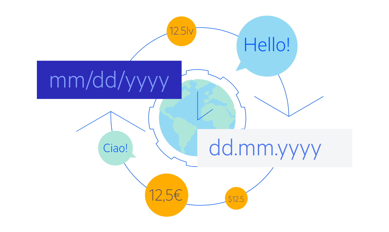
-
Accessibility
Accessibility can be a large concern in any application. The Telerik UI for ASP.NET Core TreeList component complies with Section 508 and WCAG guidelines out of the box, ensuring anyone can navigate the component’s UI.

-
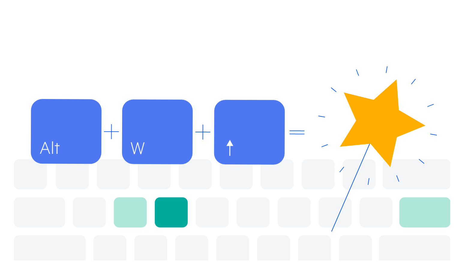
Keyboard Navigation
The TreeList supports keyboard navigation out of the box. Refer to the demo page for detailed information about how to navigate the component with the intuitive keyboard shortcuts.
-
TreeList Theming
The TreeList component comes with 20+ built-in themes, such as Default (our own styling), Material (based on the Material Design guidelines), Bootstrap (which resembles the Bootstrap styling for better integration) and Fluent (based on Microsoft Fluent UI). You can easily customize any of the available themes with a few lines of CSS or create a new theme to match your colors and branding with the Telerik SASS ThemeBuilder application.
-
TreeList in Razor Pages
The TreeList is one of the many Telerik UI for ASP.NET Core controls that are supported in both MVC and Razor Pages applications. In the Razor Page scenario, you can set up the TreeList component bindings through configuring the CRUD (Create, Read, Update, Delete) methods of its DataSource instance. To learn more about plugging ASP.NET Core components in Razor Pages, check out the documentation article or visit the Razor Pages examples in our GitHub project repository.
