
UI for WPF
WPF Gauge
- The WPF Gauge allows building business dashboards with rich assortment of circular, linear and numeric gauge types.
- Part of the Telerik UI for WPF library along with 165+ professionally-designed UI controls.
- Includes support, documentation, demos, virtual classrooms, Visual Studio Extensions and more!
-
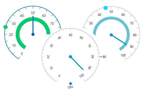
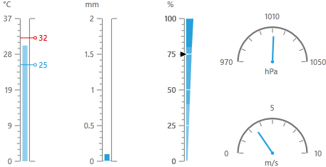
A Variety of Gauges for All of Your Needs
Use radial, linear and numeric gauge types, making sure you display your data in an appropriate manner. You also get semi-circle and quadrant styles for the radial gauges provided out of the box.
-
Fully Customizable Elements
With fully customizable gauge elements, ensure that RadGauge can fit easily into any scenario or style, complete with rich interactivity and fluid animations.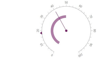
-
Opt-In Model for Building
The opt-in model for building RadGauges enables developers to add as much or as little detail to their gauges as they choose, including multiple scales and indicators that can all animate independently. -
Also Available...
The Gauge control is also available for these popular frameworks:
