UI for WPF
WPF DataGrid
- WPF DataGrid is a feature-rich control that provides outstanding performance and a flexible hierarchy model.
- Part of the Telerik UI for WPF library along with 165+ professionally-designed UI controls.
- Includes support, documentation, demos, virtual classrooms, Visual Studio Extensions and more!
-
Display and Manage Large Data Collections
The Telerik GridView for WPF is the ultimate grid that provides outstanding performance and a remarkably flexible hierarchy model. The component enables you to create fully customizable and highly interactive interfaces for display and management of large sets of data.
Documentation on Getting Started with the Telerik GridView for WPF -
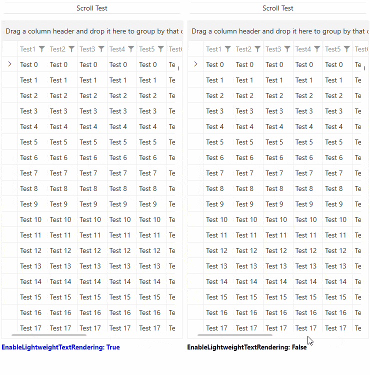
GridView - Up to 40% Faster
Your favorite grid just got significantly quicker. Telerik WPF GridView delivers up to 40% performance improvement across common scenarios.*
What’s faster:- Scrolling & virtualization: Smoother large-data navigation.
- Grouping, sorting, filtering: Snappier interactions under heavy loads.
- Rendering pipeline: Reduced layouts and allocations for a more responsive feel.
*Actual results vary by data shape, templates and machine.
- Scrolling & virtualization: Smoother large-data navigation.
-
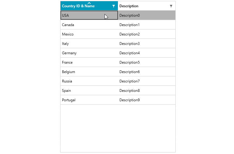
Filtering
Data Grid provides a built-in filtering functionality, which allows the user to easily filter data by one or more columns. Filtering is enabled out-of-the-box for most .NET types such as strings, numeric types, DateTimes and more.
Documentation on Filtering with the Telerik Grid for WPF -
MultiColumnComboBox Column Support
You can add the MultiColumnComboBox control through the editors into a new column in the grid, enabling all its powerful features straight through the Grid component.
-
Quick and Seamless Data Operations
Get quicker operations with your data and a seamless display, whether you have ten or ten thousand items loaded, thanks to the unique LINQ-based data engine and built-in UI virtualization.
Documentation on UI Virtualization Support for the Telerik Grid for WPF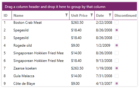
-
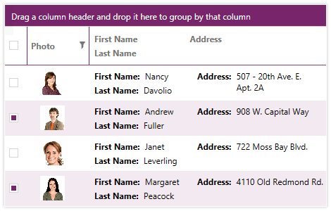
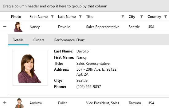
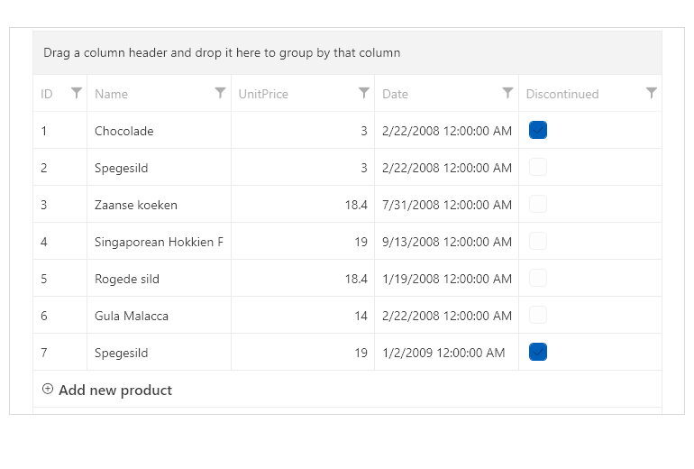
Grouping
Make use of support for grouping, complete with aggregated results as well as total rows with aggregate functions - all fully customizable to suit your business requirements.
Documentation on Grouping with Telerik Grid for WPF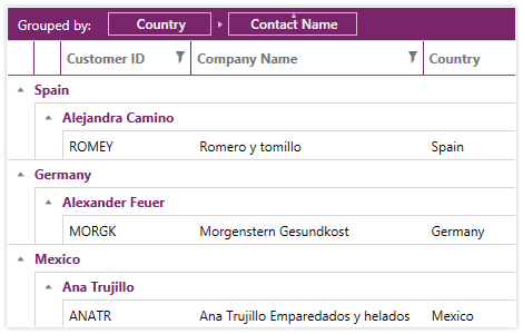
-
Support for Sticky Group Headers
By utilizing this functionality users areable to “freeze” the group header to remain visible while scrolling through the data in the grid. The functionality is especially useful, when you have multiple groups in a large table and require you to view the group headers, while browsing the dataset.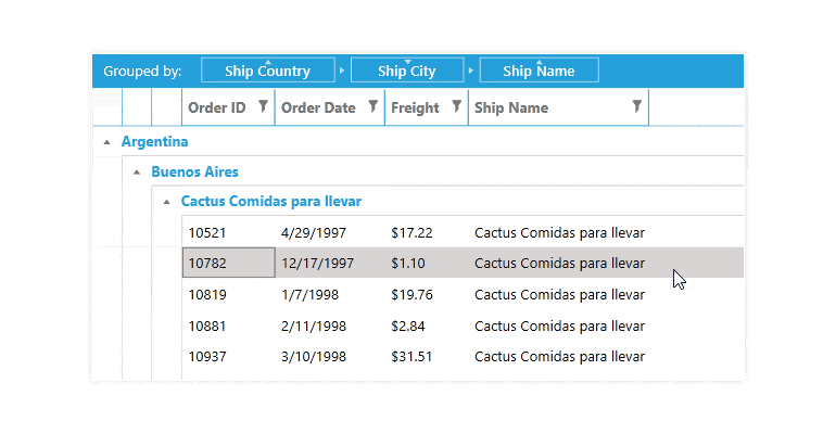
-
Search as You Type
This functionality offers an intuitive approach for end-users to find their desired matches. Upon entering a symbol in the search box, the control instantly performs a search operation, providing real-time results even before you’ve finished typing.
-
Built-In Data Validation Support
The built-in support for data validation ensures data is entered accurately, while providing UI prompts to guide the user with your custom error messages.
Documentation on Data Validation Support in Telerik Data Grid for WPF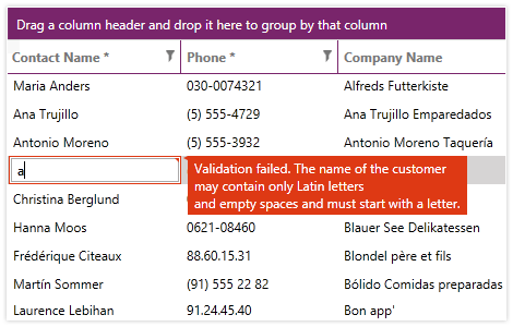
-
Copy and Paste To and From Excel
With bi-directional copy and paste to and from Microsoft Excel, you can easily move data for bulk operations and seamlessly place it back into GridView.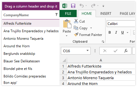
-
Merged Cells
You can easily observe attribute value trends and ensure a consistent view of sorted data by employing the merged cells feature. RadGridView will automatically merge adjacent cells that have the same value.
Documentation on merging cells with the Telerik Grid View for WPF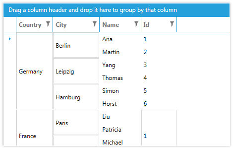
-
Integrate With Data-Centric Controls
Rapidly develop applications with a powerful array of features, thanks to easy integration with DataPager, DataFilter, ExpressionEditor and other data-centric controls that use the built-in data engine.
Check out the Sample Applications built with the Telerik Data Grid for WPF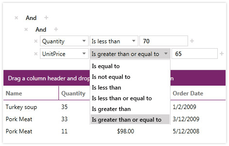
-
Fully Customizable Look and Feel
Fully customizable, you can change the look and feel of individual grid elements, replace our Excel-like filters with custom implementations and modify the look and feel of cells and rows.
Documentation on the Telerik Grid View for WPF's styling capabilities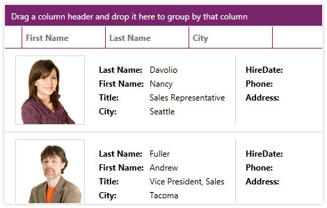
-
GridViewNewRow Customization
The RadGridView now includes a new property that allows developers to customize the GridViewNewRow text, providing greater flexibility in defining user-friendly prompts for adding new rows. This enhancement improves clarity and usability in data entry scenarios, whether guiding users with specific instructions or localizing text for different languages. Additionally, a new Template option enables users to place not just text but any content they want, allowing for even greater customization and adaptability.
-
Pinned (Frozen) Columns and Rows
The GridView control in the suite enables you to keep a part of your data always visible while putting the rest of the data in context. To freeze columns the user can simply drag the left or the right frozen columns splitters of the control. As for the rows the user can just click the pin button of the row, located on the left-hand side of it. GridView API allows for programmatically freezing columns or rows.
-
Filter Editor
Filter Editor is one of the filtering modes of RadGridView, which allows you to create complex filter expressions. The visualization of the editor consists of a panel displaying an overview of the filtering criteria and a dialog with an embedded RadDataFilter control that is used to add, remove and modify the filters.
- Data Filter View — The panel displaying the applied filters and the related options.- Apply Filters CheckBox — A CheckBox that enables/disables the selected filters in the associated RadGridView instances.
- Toggle Wrapping Button — A toggle button that enables/disables the wrapping of the filtering criteria.
- Edit Filters Button — A button that opens a dialog that allows editing of the filters using a RadDataFilter control.
- Close Button — A button that hides the Data Filter View panel.
- Filter Part — The parts of the field criteria, the associated operators and parenting.
- RadDataFilter — A data filter editor.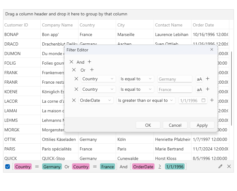
-
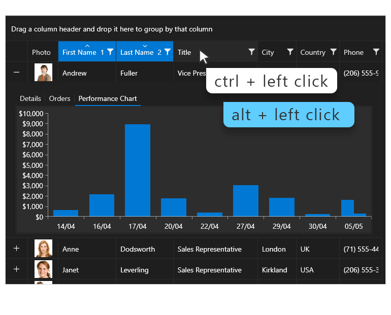
Support for Specifying the Modifier Key Used for Multi-Column Sorting
The GridView now provides support for specifying the modifier key used for multi-column sorting. This enhancement allows you to seamlessly plug any valid keys combination as an action accelerator.
See the WPF GridView Documenation
-
Support for asynchronous exporting
The DataGrid control provides support for asynchronous exporting.
Documentation on Asynchronous Exporting with the Telerik Grid View for WPF -
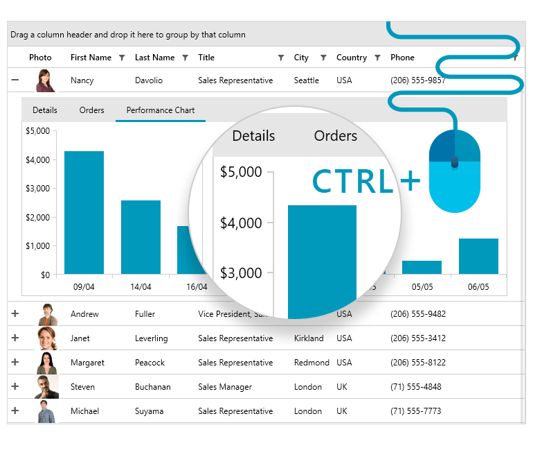
CTRL + Mouse Wheel (Excel-Like) Zooming Support
Excel-like zooming is a convenient functionality that allows users to zoom in and out the GridView via the CTRL + mouse wheel combination.
-
Also Available...
The DataGrid component is also available for these popular frameworks:
-
Complete Data Grid Experience
Enjoy out-of-the-box support for multi-column sorting, grouping, Excel-like filtering and multiple row and cell selection for a complete datagrid experience, all without writing a line of code.
Check out the Telerik UI for WPF demos to see the grid in action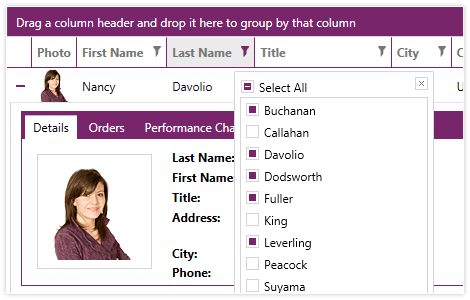
-
Multiple Column Types
Enjoy multiple column types, supported out-of-the-box, including hyperlink, combo box, image, selection, custom expressions. You an also fully customize both the display and edit templates of any column.
Check out the Telerik UI for WPF Demos to see the Data Grid in action