Avatar

Avatars are user interface (UI) elements that display textual or visual content to represent a user’s identity.

Usage Guidelines

The Telerik and Kendo UI Avatar requires you to follow some basic principles when using the component.

Proportions

The Avatar usually displays an image or icon that requires equal height and width. Changing its 1:1 ratio will distort the component and the content inside will be displayed improperly.

A Telerik and Kendo UI Avatar with square shape and rounded corners.
Use the size and border radius options provided by the Avatar to achieve the desired look-and-feel.
A Telerik and Kendo UI Avatar with changed ratio of width and height.
Avoid changing the 1:1 aspect ratio between the width and height of the Avatar.

Text Label Lenght

The Avatar must contain brief and clear information as the available space is limited and the content must fit.

A Telerik and Kendo UI Avatar with initials inside.
Use initials and short words to represent the meaning of the Avatar.
A Telerik and Kendo UI Avatar showing a two-word name inside instead of initials.
Avoid using long labels that distort the Avatar.

Consistency

When using multiple Avatars in a group, their size, border radius, and content type must be equal to indicate the relation.
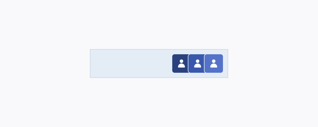
Three Telerik and Kendo UI Avatars using consistent sizing, fill mode, and border radius in a container that wraps them.
Use Avatars of equal size, border radius, and content type if they are part of the same group.
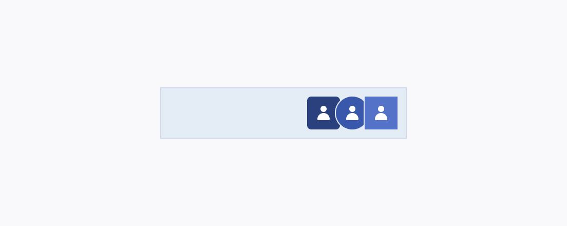
Three Telerik and Kendo UI Avatars using different sizing, fill mode, and border radius in a container that wraps them.
Avoid mixing sizes, border radiuses and different content types within a group of Avatars.
Feedback