Usage Guidelines
The application of color is a vital part of every digital product and interface. When used in a meaningful and consistent way, color reinforces the content hierarchy and keeps the cognitive load low.
This article describes several basic principles that will allow you to improve the user experience.
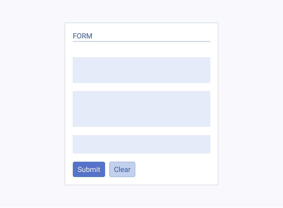
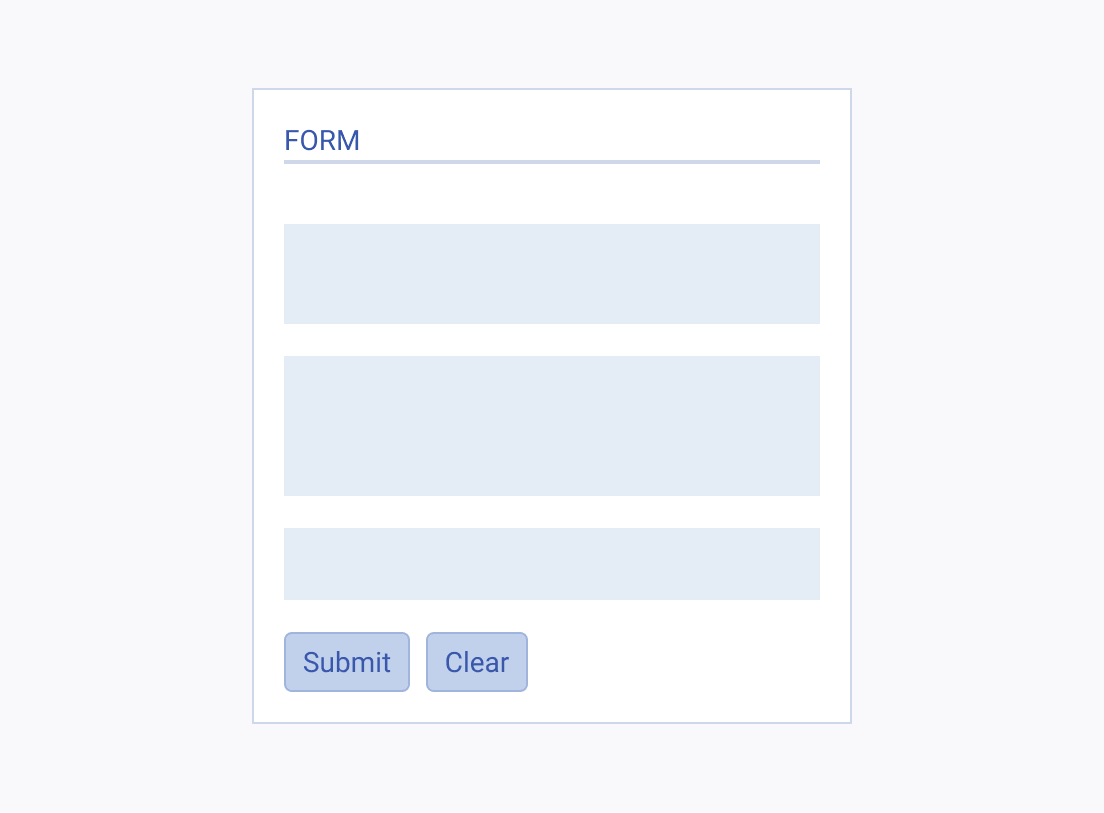
Emphasizing Primary Actions
Color, as one of the most powerful tools, allows you to draw the user's attention and increase usability. The use of accent or primary color serves to emphasize the main call to action.


Providing Sufficient Contrast
Contrast is the difference in lightness between two color values. Provide sufficient contrast to improve readability and to ensure that meaning is not lost for color-blind users. According to WCAG AA contrast minimums, the calculated contrast ratio between the text and the background layer must be:
- At least 4.5:1 for normal text (less than 18 pts; less than 14 pts bold).
- At least 3:1 for large text (more than 18 pts; more than 14 pts bold).


Conveying Meaning
Color can never be the only way to identify statuses or convey meaning. Some color-blind people, for example, cannot tell the difference between certain color combinations. Along with color, always utilize additional means of identification, such as visible text, underlines, borders for visible focus styles, and icons that correspond to the content.


