Usage Guidelines
The Telerik and Kendo UI ScrollView requires you to follow some basic principles when using the component.
Purpose
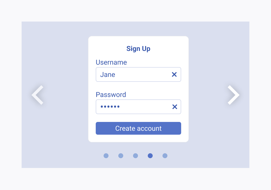
When using ScrollView components, give preference to engaging visual content and remember that text is entirely optional and should be kept brief. In cases where extensive textual content or complex UI design is required, use Card or TileLayout components instead.


Number of Scrollable Items
When using the ScrollView component, maintain a balance between user interest and simplicity. Consider limiting the number of scrollable containers to a manageable number to ensure a seamless and user-friendly experience.


