Usage Guidelines
The Telerik and Kendo UI RadioButton requires you to follow some basic principles when using the component.
Meaning
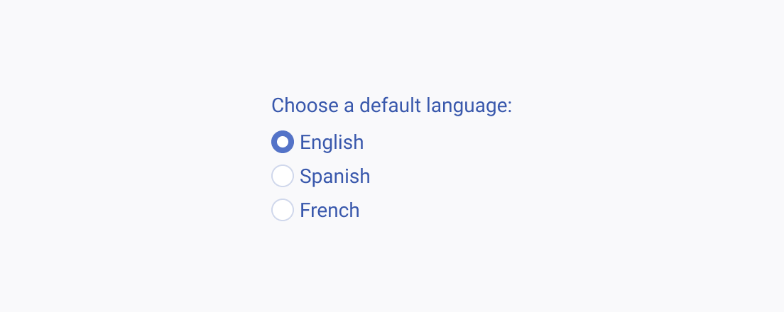
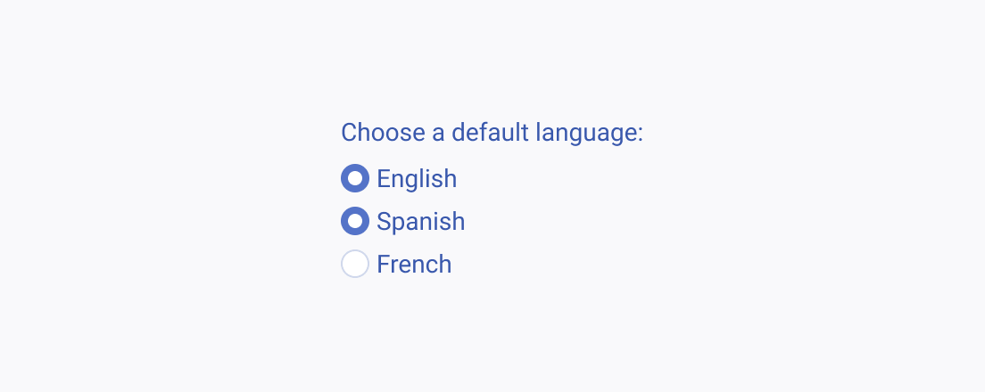
RadioButtons are used for a binary choice or single selection within a list of choices.
Label
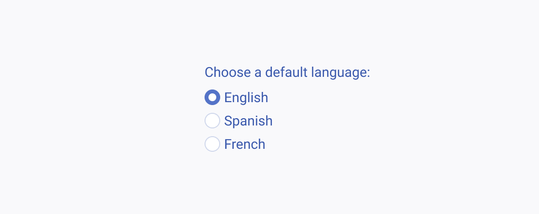
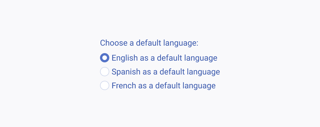
The label of the RadioButton is of primary importance as it conveys the meaning of the option for which the component stands for. Therefore, the text label must be clear, straightforward, and as short as possible.
Alignment
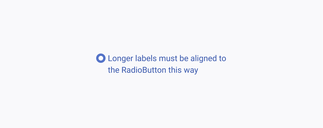
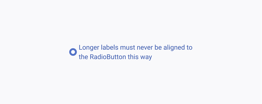
Regardless of how long the label is, the container and the text label of the RadioButton are always aligned to the middle. However, always consider the height of the first row before aligning the RadioButton to its label especially when the label spans more than one row.
