Kendo UI for jQuery
jQuery MultiSelect
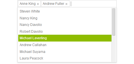
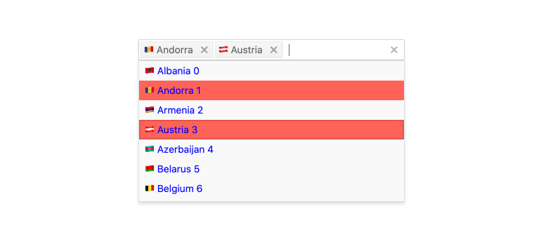
- Allow users to select multiple items from a list. Each item is rendered as a tag with an icon to remove the value.
- Part of the Kendo UI for jQuery library along with 120+ professionally-designed components.
- Includes support, documentation, demos, virtual classrooms, learning resources and more!
-
Overview
jQuery MultiSelect is a form component which allows users to select multiple items from a list of available options. Each selected item is rendered as a tag with a built-in icon to remove the value, giving users a sleek visual interface to preview their list of selected items.
-
Data Binding
MultiSelect can be bound to different types of data, including an array of primitive values or an object. Moreover, the Angular MultiSelect can bind separate fields to the text and underlying value displayed to users.
-
Virtualization
Enable the virtualization feature to allow users to effortlessly scroll through large sets of data without any impact on performance.
-
Floating Label
Provide a smoother and more efficient experience for end-users with the jQuery MultiSelect floating label feature. Add a label that floats above the input and save space while ensuring users don’t lose focus of the form context.
-
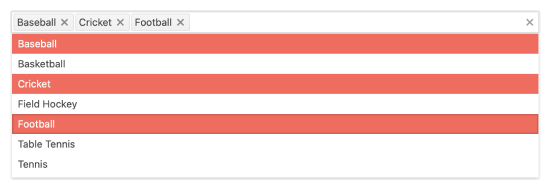
Grouping
Organize data in categories to easily skim datasets. You can define what field in your data is responsible for the group and the component will automatically group the underlying data accordingly.
-
Adaptive Mode
The jQuery MultiSelect UI component supports an adaptive mode that provides a mobile-friendly rendering of the component popup. When enabled, the component will automatically adapt to the current screen size and will change its rendering accordingly.
-
Templates
Much like most of the component in Kendo UI for jQuery, you can use templates to configure the header and footer elements and the individual items to display more than just text.
-
Prefix and Suffix Adornments
Elevate user interactivity leveraging the option for adding prefix and suffix adornments. These are custom items, usually an icon or button, inside the field before or after the input area. Typical prefix adornments are currency symbols or unit indicators, while suffix adornments are often used for password visibility toggles, formatting or clearing the input.
-
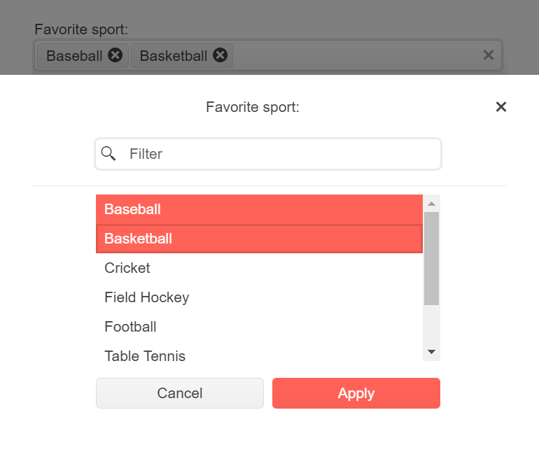
Add New Item
The MultiSelect component includes a text field in which users can input text when looking for items. If the item is not found, the component will automatically present the user with a “Add New Item” button that will update the list.
-
Single or Summary Tag Modes
MultiSelect gives you two options regarding the tags that represent selected items. Single mode is most typical and displays one tag per item selected. Summary mode uses one tag to represent multiple items.
-
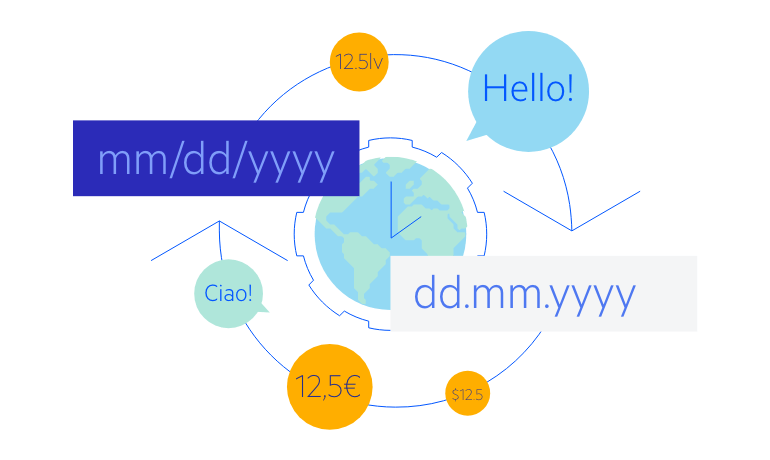
Globalization
MultiSelect fully supports localization of component messages, cultural locals, and right-to-left alignment.
-
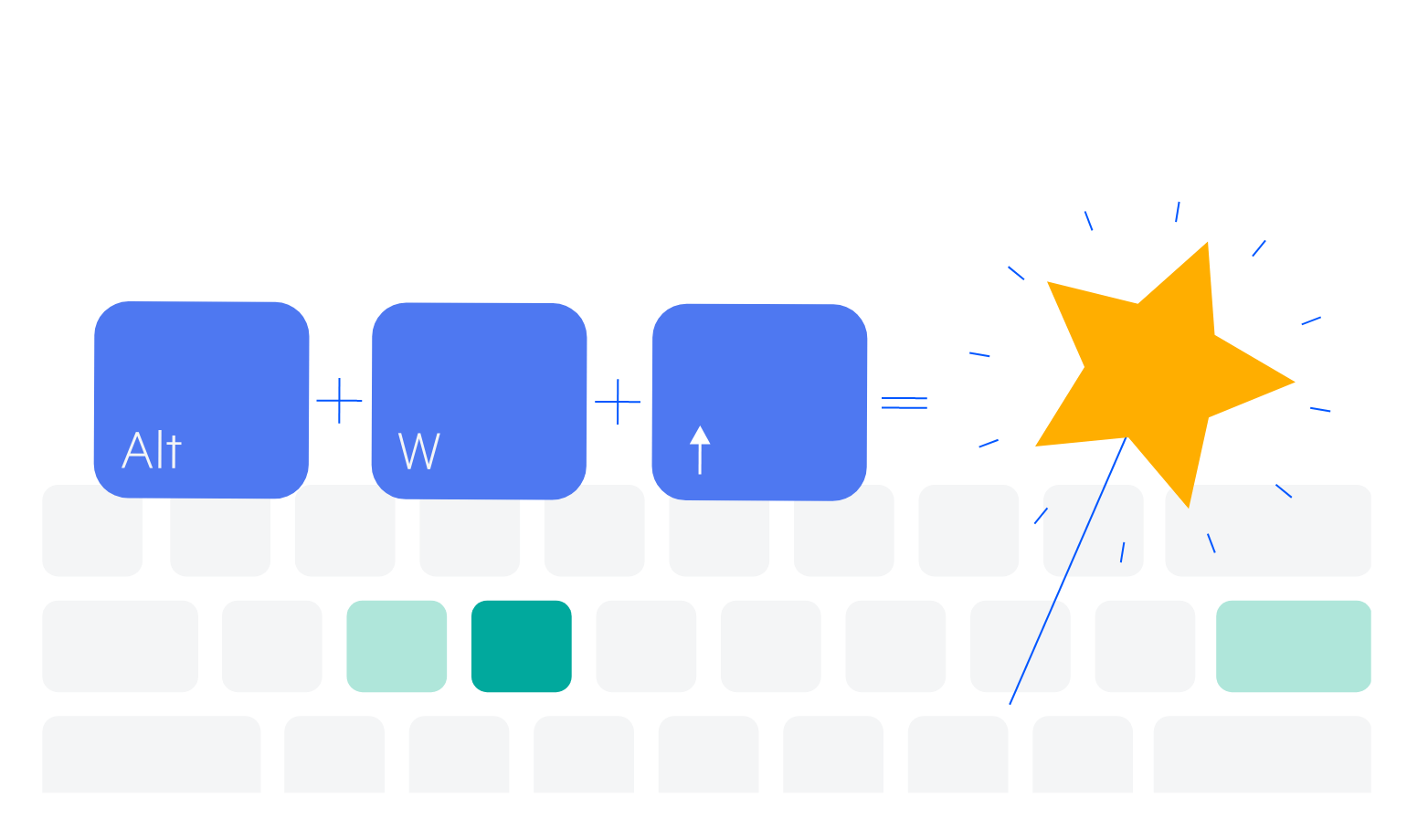
Keyboard Navigation
Improve accessibility and productivity with keyboard-only navigation. This component supports keyboard navigation to help navigate and interact with items.