Kendo UI for jQuery
jQuery Charts
- With an extensive set of jQuery chart types, quickly build beautiful data views with to satisfy any business requirement, no matter how complex.
- Part of the Kendo UI for jQuery library along with 120+ professionally-designed components.
- Includes support, documentation, demos, virtual classrooms, learning resources and more!
-
Overview
The Kendo UI for jQuery Chart component represents your remote or local data in beautiful, professionally designed charts of virtually any type. Easily integrate these charts into your web page by using a jQuery selector and customize the look and feel of the chart with flexible properties for axis, data series, appearance and more. This performance-first component makes dashboard-style data views easier than ever!
-
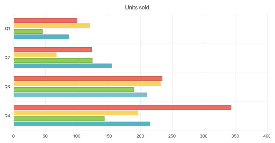
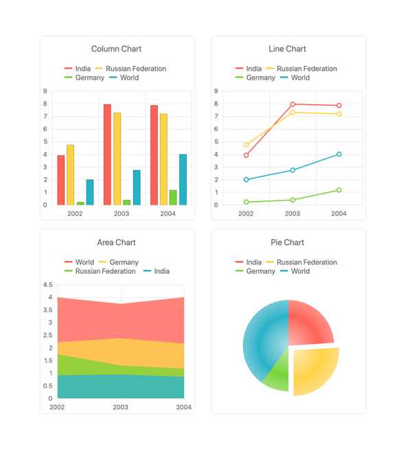
Every Popular Chart Type
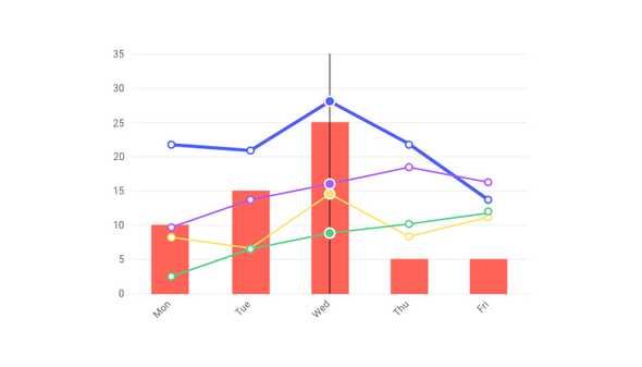
The jQuery Chart components offer a rich variety of charts and series types. You can use each series type independently or add multiple different series to a single chart, rendered together.
-
Date, Numeric, and Logarithmic Axes
Set up your jQuery Charts with the type of axis most logical for your data. By setting the valueAxis property, you can choose between date, numeric, and logarithmic axes. Furthermore, you have complete control of the scale whether is a straightforward range or uses min, max, sum, avg, or count.
See the jQuery Area Chart Date and Logarithmic Axis demos
-
Multiple Axes
Create optimized business reports by visualizing data on multiple axes. Each can have its own type and scale.
-
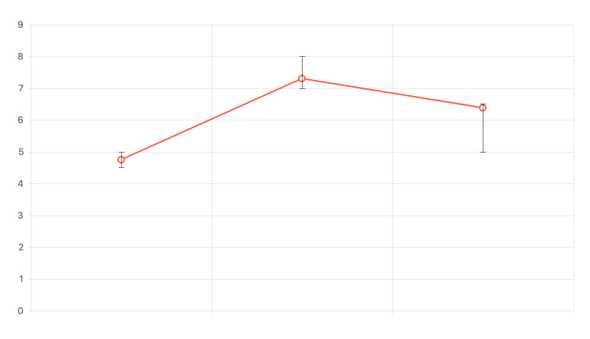
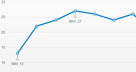
Error Bars
Error bars are a common way to show variability of data and are often used when statistical accuracy is needed. They show high and low deviation thresholds. Set these values manually or through statistical calculations.
-
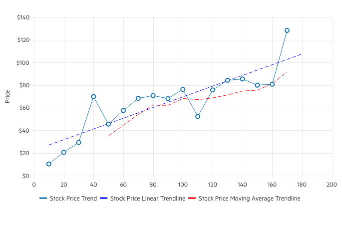
Trendlines
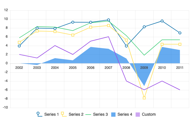
The jQuery Line Charts’ Trend Lines are automatically generated indicators that illustrate data trends over time. The linear trendline, for example, indicates whether a particular quantity is increasing or decreasing over time. The moving average trendline, on the other hand, is used to smooth out the variations in data by averaging all points in a certain period of time.
-
Title, Subtitle and Legend
To further customize the look and feel of the Kendo UI for jQuery Chart component, you can configure the appearance of its title, subtitle or explanatory title and legend. All of these will make your charted data easier to understand.
See the Kendo UI for jQuery Title and Subtitle and Legend documentation
-
Panning and Zooming
Show large data views in limited space by enabling pan and zoom features. Users will be able to click and drag to pan and user SHIFT+drag or the mouse wheel to zoom. For complete control, you can lock the X or Y axis. You can also customize behavior using events fired while the users interact.
-
Pattern Fills
The Kendo UI for jQuery Charts supports customizable pattern fill of the chart series enabling you to spice things up by filling chart elements with different patterns such as diagonal stripes, dots or a grid pattern.
See the jQuery Chart Patterns demo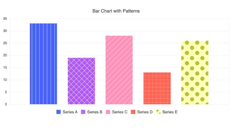
-
Drill Down to More Detailed Data
The drill-down functionality in the Kendo UI for jQuery charts enables users to easily click on a specific chart element, such as bar or pie segment, and navigate to a mode detailed view about the selected item (e.g. breakdown by product).
-
Legend Display
The Kendo UI for jQuery Charts enable you to customize the legend of the component’s series. You have the option to customize either the entire legend or the legend layout for a specific series.
-
Data Binding
The jQuery Charts can display any JSON data from local or remote sources (via REST). You can also bind to grouped data for more advanced scenarios. Thanks to the Kendo UI jQuery DataSource component, binding to data can be as simple as passing in an array or giving the URL to your remote services.
-
SVG and Canvas Rendering
All Kendo UI for jQuery Chart components can be rendered either as a SVG element or a Canvas element through a single configuration potion, the `renderAs` property. With this, developers can pick and choose element they prefer to display on the page without having to rewrite their chart implementations.
-
Notes
Notes help you display additional information about your data view. You can set them manually or tie them to a data value, category, axis, or data item. To keep your view looking consistent, you can define templates that can be reused between charts and views.
-
Panes
Panes allow you to subdivide your view of a categorical chart for easier viewing by colorizing certain portions of the background color of the chart area. The most common pane configuration is setting background color to make categories stand out from one another.
-
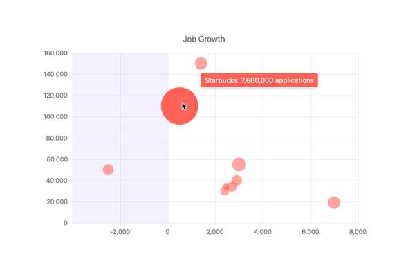
Tooltips
Tooltips helps your users get information by displaying data in a popup when hovering over a data point. They are designed to match the data series by default but are also customizable.
-
Export
The jQuery Chart provides multiple export options. You can export to PDF, SVG, or image files and allow the user to download them or you can programmatically save them to a server.
-
No Data Template
This ready-to-use template improves the user experience in those tricky empty-state scenarios when there is no data to visualize.
-
Appearance
Don’t worry about styling each element of your view. The jQuery Chart includes a set of predefined themes you apply through a simple theme property. These themes are customizable for cases where changes are needed.
-
Animation
Provide an enjoyable user experience buy showing data series animations when a chart initially loads or when data changes.
-
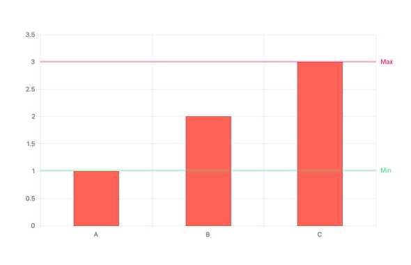
Plot Bands
Plot Bands enable highlighting of a specific range on any axis (both X and Y) to showcase additional information related to the displayed series. This can be very useful when trying to showcase a range of good or bad numbers, or just providing focus to a certain area of the jQuery Chart.