
UI for WPF
WPF Wizard
- Ease complex tasks for users by breaking down and differentiating processes with the Telerik Wizard component for WPF. Helps ease the process of developing an install package with built-in buttons, navigation, pages, commands and more.
- Part of the Telerik UI for WPF library along with 160+ professionally-designed UI controls.
- Includes support, documentation, demos, virtual classrooms, Visual Studio Extensions and more!
-
Step-by-Step Dialogs
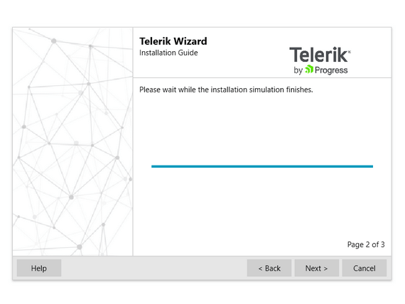
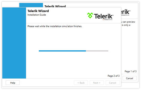
RadWizard for WPF enables the seamless generation of multi-step wizard dialogs. Complex data entries are broken down into easy step-by-step UI for your application end users.
-
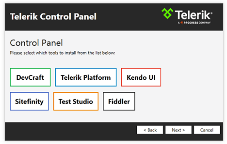
Fully Customizable
RadWizard is fully customizable, enabling you to easily modify all elements of the WizardPage, including the Content, SideHeader and Header elements. Just use the DataTemplates to set all the elements.
-
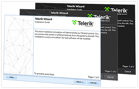
Built-In Themes
In addition to customizable elements and navigation, RadWizard provides yet another option for customization. The control comes with more than 15 predefined themes to use for easy personalization.
-
Dynamic Localization
Today’s global business environment makes multilingual and culturally-aware applications a must. Telerik RadWizard for WPF provides dynamic localization support for all languages included in the UI for WPF suite out of the box. Furthermore, the control takes advantage of all languages supported by the .NET framework
