
UI for WPF
WPF WatermarkTextBox
- The Telerik WatermarkTextBox enables you to define a placeholder, thus providing additional information on an empty text input control. With support for customizable watermark content, different watermark behaviors and selection on focus.
- Part of the Telerik UI for WPF library along with 160+ professionally-designed UI controls.
- Includes support, documentation, demos, virtual classrooms, Visual Studio Extensions and more!

-
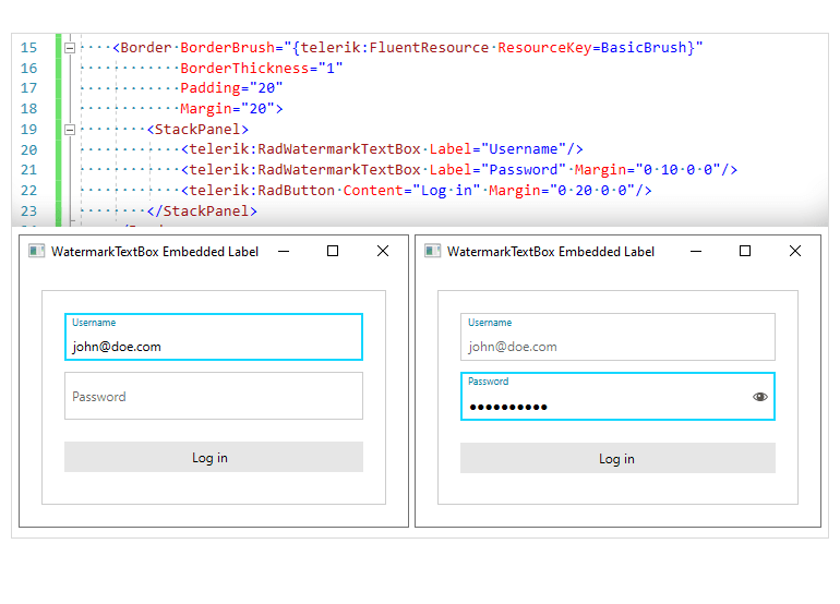
Added Support for an Embedded Label
The Telerik UI for WPF TextBox is equipped with an embedded label functionality. The label plays the role of a placeholder and displays as a watermark content when the TextBox control is unfocused and there is no text input in the field. Once the control gets focused and the text is entered, the label is positioned on top of the input area.
-
Better User Experience
The RadWatermarkTextBox control represents a TextBox that shows watermark content when empty and not focused. This control enables you to display useful information in TextBoxes that are not focused, and contain no text. Search fields, for example, when empty or not in focus (not clicked on), can display hints to the user as to what information he or she needs to enter. Focusing/clicking on the text box removes that content. Make your text boxes user friendly with this handy control.
-
Built-In Themes
Style the look and feel of RadWatermarkTextBox by using any of the 10+ built-in professionally designed themes that come with UI for WPF. Themes include the new Office 2013 theme, Windows8 and Windows8Touch themes as well as many others.
-
Coded UI Support
You can easily maintain and test your application because RadWatermarkTextBox for WPF supports Level 3 Coded UI.
