
UI for WPF
WPF ProgressBar
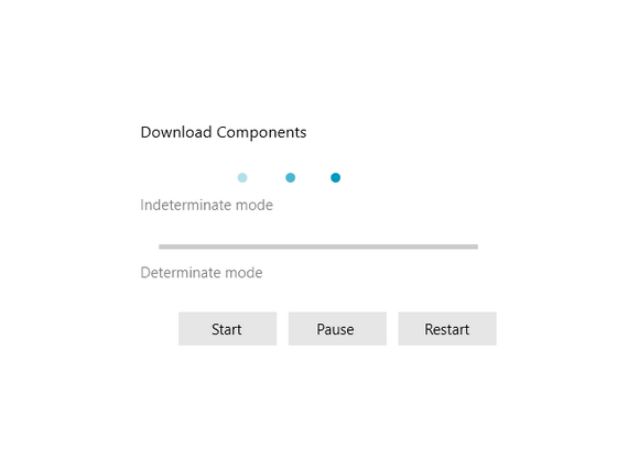
- The ProgressBar allows you to completely convey the progress of various tasks by turning a simpler functionality into a visual experience. Supports indeterminate state, easy range and value configuration and orientation customization.
- Part of the Telerik UI for WPF library along with 165+ professionally-designed UI controls.
- Includes support, documentation, demos, virtual classrooms, Visual Studio Extensions and more!
-
Value Control With a Rich Event Model
Control the value of the progress bar to help display progress to users, complete with a rich event model for updating other parts of your user interface.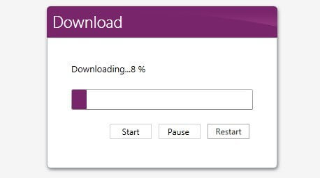
-
Easy Integration With Other Controls
Easily integrate with other WPF UI controls for more custom scenarios, complete with the ability to fully re-style the control to better fit your application.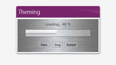
-
Indeterminate Mode for Long-Running Processes
Use indeterminate mode to showcase a long-running process to users when displaying a numeric process won't quite work.
