
UI for WPF
WPF PanelBar
- Build versatile navigation systems such as left/right side menus and Outlook style panels and easily pack a lot of content into a small areas without compromising on UX with the Telerik PanelBar for WPF.
- Part of the Telerik UI for WPF library along with 160+ professionally-designed UI controls.
- Includes support, documentation, demos, virtual classrooms, Visual Studio Extensions and more!
-
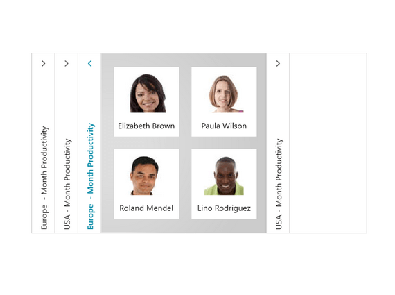
Efficient Use of Space
Use PanelBar to easily pack a lot of content into a small area and still ensure that intuitive navigation elements are not lost.

-
Single and Multiple Expansion of Items
Take advantage of the support for single and multiple expansion of items, which enables you to ensure a seamless user experience in your applications.

-
Hierarchy Binding
Ensure a fully featured smooth navigation experiences for your end users by binding hierarchies with a minimal amount of effort.
