
UI for WinForms
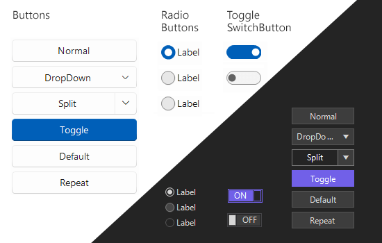
WinForms Buttons
- The Telerik UI for WinForms Buttons is a feature-rich set of fully customizable buttons.
- Part of the Telerik UI for WinForms library along with 165+ professionally-designed UI controls.
- Includes support, documentation, demos, virtual classrooms, Visual Studio Extensions and more!
-
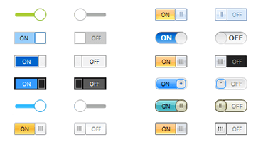
ToggleSwitch
The ToggleSwitch control is a button that represents two states: on and off. It mimics the control used on mobile devices to turn functionality on and off. The control is fully customizable, from its On and Off texts to the animations and toggle mode, which can be triggered with Click, Drag or ClickAndDrag.
-
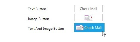
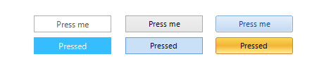
Regular Button
Telerik Button is a simple button control which replaces the standard Windows Forms Button, but gives you full control over its visual appearance. UI customization is possible through the provided themes, or you can add rotation, shapes, transparency, images, text, and backgrounds by setting a few intuitive properties.
-
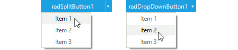
Dropdown and Split Buttons
The Telerik DropDownButton and the Telerik SplitButton are buttons that provide menu-like interface model within a button. They can be very handy for creating more simplistic UI where extensive menus and/or comboboxes are not needed. Themes and interface customizations are supported, as with all Telerik buttons.
-
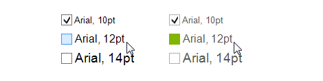
Check Box
The CheckBox in Telerik UI for WinForms by Progress replaces the Windows Forms CheckBox control, 3-state management (checked, unchecked, undetermined), and extended design options (image and multi-line text support, animations, shapes and so on). A variety of themes are provided out of the box.
-
Radio Button
The Telerik RadioButton replaces the Windows Forms RadioButton control and adds state management and endless design options, including custom radio shapes, image scaling, theming, etc.

-
Toggle Button
The Telerik ToggleButton is a button that mimics the functionality of the check box, but allows more flexibility in its design. It offers state management similar to that of the RadCheckBox with the addition of a special ToggleStateChanging event which provides extra control over its state.
-
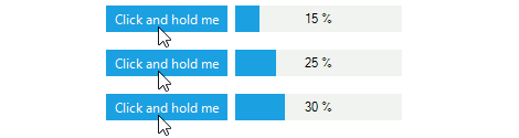
Repeat Button
The Telerik Windows Forms RepeatButton offers press-and-hold functionality built directly into the ButtonClick event, giving you interactive UI design with minimal effort.
-
Granular Customization of all Elements
Telerik Controls for WinForms provide designers with the ability to alter, at design time or run time, any property of any control. Because all Telerik controls are composed of primitives, this customization can be applied at a very fine level of detail. Changes in response to events can be animated, so that a property moves smoothly through a range of values in response to a mouse movement or other event. Property values (such as colors or fonts) can be inherited from parent elements to child elements, or override them at the child element level.
-
Localization and Right-to-Left Language Support
The Buttons offer full localization support and support for Right-to-Left languages and localization. See Localization and Right-to-Left Support for the full list of Telerik UI for WinForms controls supporting RTL languages and localization. -
Also Available...
The Buttons controls are also available for these popular frameworks:
-
Extensive VS.NET Design-time Support
The Buttons in Telerik UI for WinForms provide rich design-time support, making customizations and configurations very easy. Some key capabilities include:
- Applying themes in design time and switching between them is easy; the ThemeName command in the Smart tag automatically detects the present themes
- Visual Style Builder, Element Hierarchy Editor and Shape Editor productivity tools provide full control over the UI
-
Appearance
The control is shipped with a rich set of themes that allow you to easily build slick interfaces with the look-and-feel of some of the latest Windows and Office versions. The themes can be easily switched using a single property.
The Buttons are also capable of displaying rich text formatting by using standard HTML tags, such as <i>, <b> and <u>. This is supported on a framework level.
